...
The determination of the sub-seasonal forecast signal is reflective of this and was designed to deliver a simple to understand categorical information on the anomalies and uncertainties present in the forecast, relative to the underlying climatology.
There have been seven forecast anomaly categories defined by the sub-seasonal climatological distribution (Figure 1). From the 660 reforecast values in the climate sample, 99 climate percentiles are determined (y-axis), which represent equally likely (1% chance) segments of the river discharge value range that occurred in the 20-year climatological sample. In Figure 1 shows an example climate distribution, with only the deciles (every 10%), the two quartiles (25%, 50% and 75%), of which the middle (50%) is also called median, and few of the extreme percentiles are plotted near the minimum and maximum of the climatological range (black crosses).indicated by black crosses. Each of these percentiles have an equivalent river discharge value on the x-axis. From one percentile to the next, the river discharge value range is divided into 100 equally likely bins, some of which is indicated in Figure 1, such as bin1 of values below the 1st percentile, bin2 of values between the 1st and 2nd percentiles or bin 100 of river discharge values above the 99th percentiles, etc.
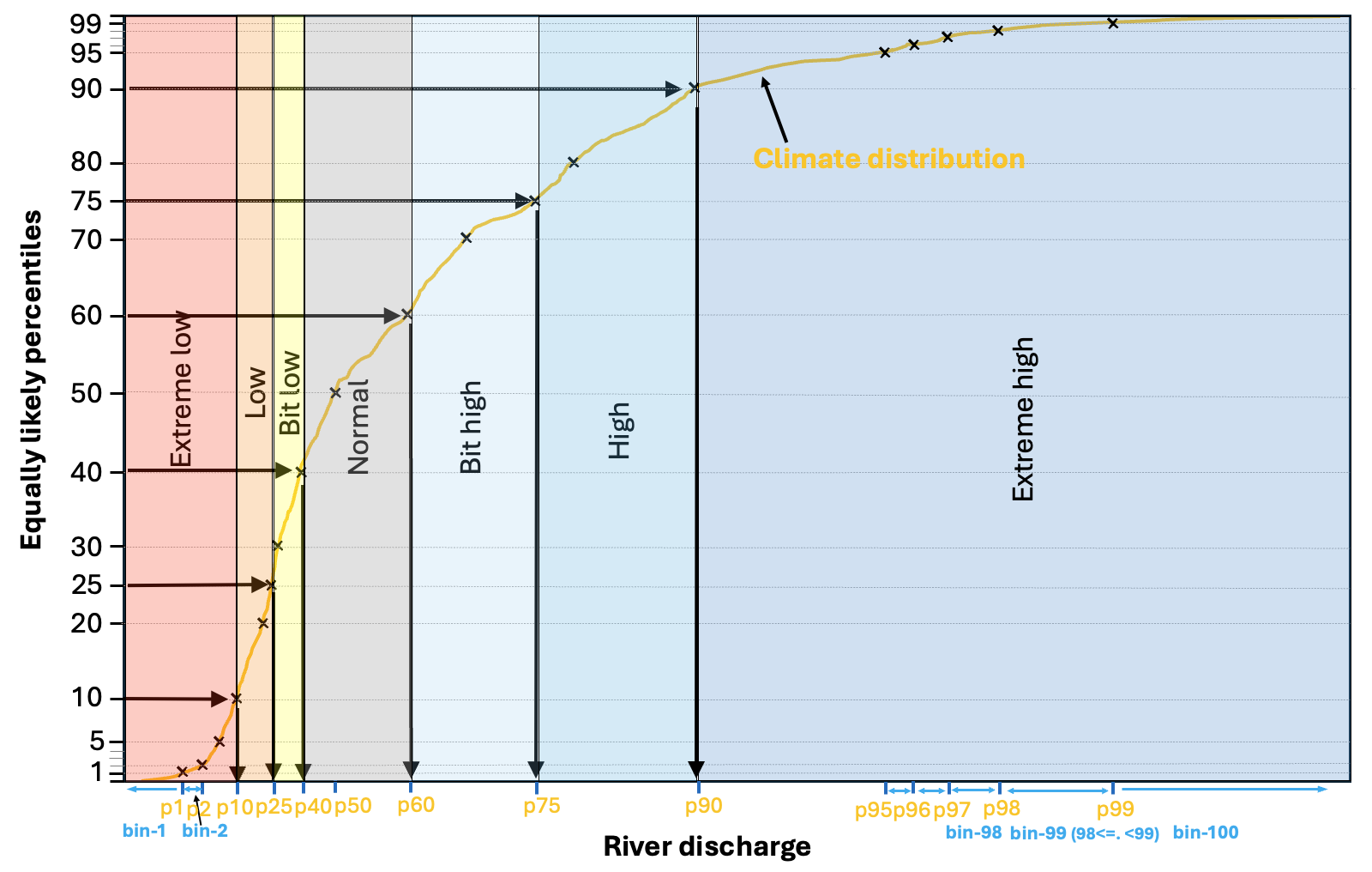
Figure 1. Schematic of the forecast anomaly categories, defined by the climatological distribution.
The weekly mean river flow values will
...
Based on the percentiles and the related 100 bins, there are seven anomaly categories defined. These are indicated in Figure 1 by shading. The two most extreme categories are the bottom and top 10% of the climatological distribution (<10% as red and 90%< as blue). Then the moderately low and high river discharge categories from 10-25% (orange) and 75-90% (middle-dark blue). The smallest negative and positive anomalies are defined by 25-40% and 60-75% and displayed by yellow and light blue colours in Figure 1. Finally, the normal condition category is defined from 40-60%, so the middle 1/5th of the distribution, coloured grey in Figure 1.
The forecast has 51 ensemble members, which all are sorted into one of the 100 bins along the climate distribution. This bin number will be the extremity of each ensemble member, with values from 1 to 100.
This means, we rank the verifying WB, or the forecast values (every member) in the 99-value percentile model climatology. So, for example +3 would mean, the forecast is between the 52nd and 53rd percentiles, while -21 would mean the forecast is between the 29th and 30th percentiles. The lowest value is -50 (forecast is below the 1st percentile), while the largest is +50 (forecast is larger than the 99th percentile)
...
- So, we should use 7 categories of the severity, with the 40/60th, 25/75th and 10/90th percentiles defining the 7 categories. One near normal, and 3/3 for above and below normal conditions.
- Alternatively, we could maybe go for the simpler 5-category quintiles, which is only 5 categories, so the colour selection would be simpler. GloFAS is currently using this upper/lower 20% quintile approach. But for example, EFAS does use the 10/90% percentiles. I agree with EFAS, and I really think the 10/90% percentile upper/low deciles are important to use as real extreme categories. Just in case the conditions get that extreme, which they do, even if mostly and only in the first part of the forecast horizon.
...
.
- For the real time forecasts, instead we will have a 51-value ensemble of ranks (-50 to 50). So, for defining the dominant category, we have options:
- Most populated: We either choose the most populated of the 7 categories. But this will be more problematic for very uncertain cases, when little shifts in the distribution could potentially mean large shift in the categories. For example assuming a distribution of 8/7/8/7/7/7/7 and 6/7/7/7/8/9/7. These two are very much possible for the longer ranges. It is a question anyway, which one to choose in the first example, Cat1 or Cat5, they are equally likely. But then, in the 2nd case we have Cat6 as winner. But the two cases are otherwise very similar.
- ENS-mean: Alternatively, we can rather use the ensemble mean, and rank the ensemble mean value and define the severity category that way. for the above example, this would not mean a big difference, as the ensemble mean is expected to be quite similar for both forecast distributions, so the two categories will also be either the same, or maybe only one apart. I think this is what we need to do!
...