...
The generation of the sub-seasonal and seasonal forecast signal relies on few major steps, illustrated by a flowchart in Figure 1. The forecast anomaly and uncertainty signals are derived by comparing the real time forecast (top left section in Figure 1) to the 99-value percentile climatology (bottom left section). The climatology is generated using reforecasts over a 20-year period, which provides range-dependent climate percentiles that change with the lead time. The climate generation is described in the bottom left corner of Figure 1.
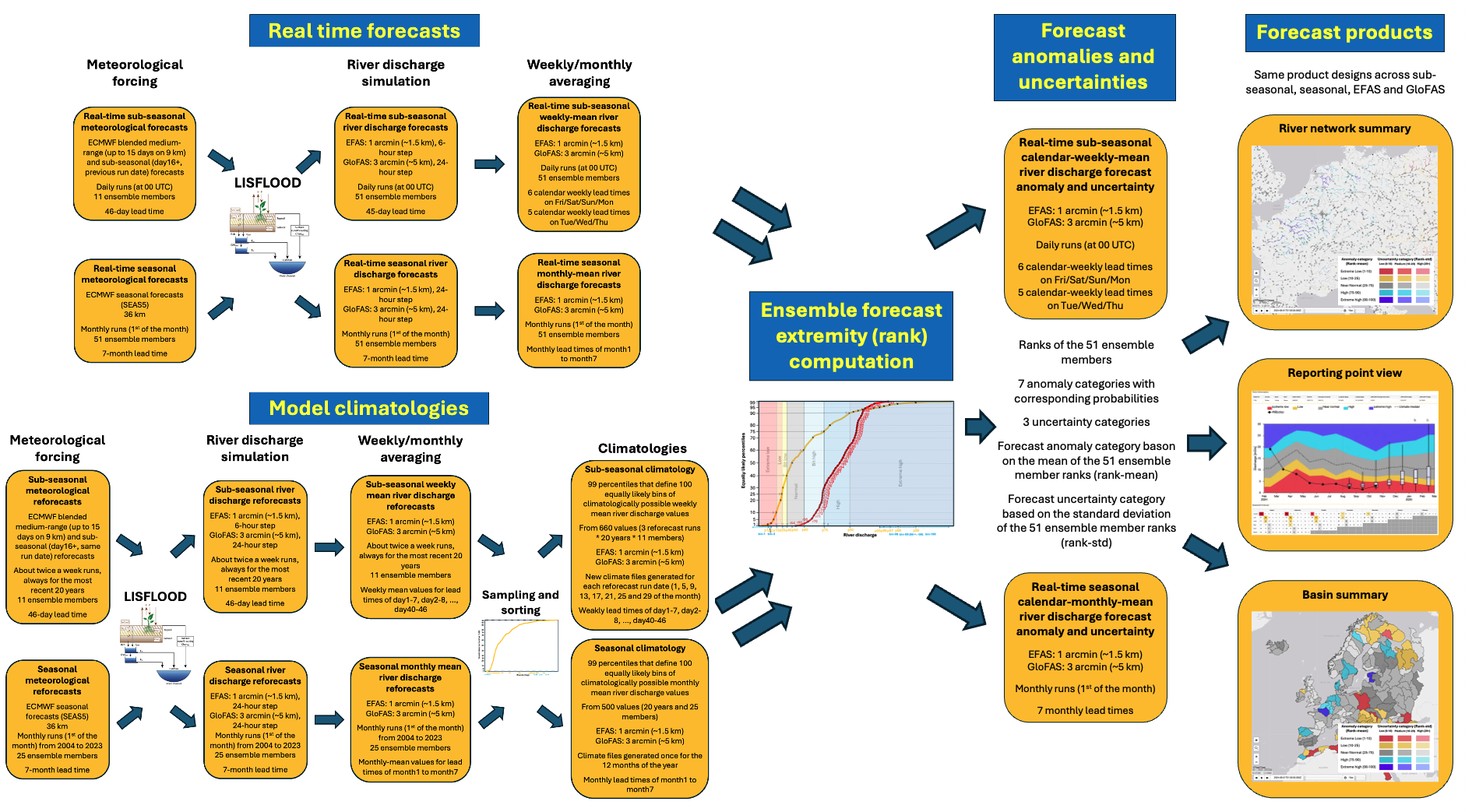

Figure 1. Flowchart of the sub-seasonal and seasonal anomaly and uncertainty signal generation methodology.
...
The river network map highlights the combined forecast anomaly/uncertainty signal on the rivers, including all river pixels above 250 km2 in EFAS and 1000 km2 in GloFAS. The forecast signal (or overall expected anomaly for a given lead time) is indicated by colouring , with each displayed on the river pixel coloured at any time, reflecting the level of anomaly forecasted. Five . Five anomaly categories ('Near normal' combining the three middle categories of the 7-category version) are shown with different colours, with the uncertainty level supplementing it by one of the three predefined intensities.
From the river network summary map, the reporting point popup products can be accessed by clicking on the point markers on the river network layer (See more on the reporting points at CEMS-Flood diagnostic and web reporting points and Placeholder CEMS-flood sub-seasonal and seasonal basins and representative stations). The pop-up window product contains metadata information about the stations, a hydrograph with the evolution of the climatological, antecedent and latest forecast conditions, and the probability evolution table which shows discharge probability for each of the 7 categories from the most recent forecast runs (. The probability table shows probability values for the extended 7-category version, , and highlights with colour the overall expected anomaly category. Note the probability table is divided in seven anomaly categories with the larger 'Near normal' category ( shown on the river network and basin summary maps and the hydrograph ) extended into 3 categories; and highlights the overall expected anomaly category (as one of the 7)3 categories.
Basin summary map
The basin summary map is a geographical summary of the river network map, after averaging the signal in the predefined basins (see Placeholder CEMS-flood sub-seasonal and seasonal basins and representative stations) and synthesising the more complex and geographically variable information presented on the river pixels in the river network layer.
...