| Section | ||||||||||||||||||
|---|---|---|---|---|---|---|---|---|---|---|---|---|---|---|---|---|---|---|
|
| Note | ||
|---|---|---|
| ||
In practise many cases are aggregated in order to evaluate the forecast behaviour of the ensemble. However, it is always useful to complement such assessments with case studies of individual events, like the one in this exercise, to get a more complete picture of IFS performance and identify weaker aspects that need further exploration. |
Obtaining the exercises
The exercises described below are available as a set of Metview macros with the accompanying data. This is available as a downloadable tarfile for use with Metview (if installed). It is also available as part of the OpenIFS/Metview virtual machine, which can be run on different operating systems.
For more details of the OpenIFS virtual machine and how to get the workshop files, please contact: openifs-support@ecmwf.int.
ECMWF operational forecasts
At the time of this case study in 2012, ECMWF operational forecasts consisted of:
...
Please follow this link to see more details on changes to the ECMWF IFS forecast system (http://www.ecmwf.int/en/forecasts/documentation-and-support/changes-ecmwf-model)
Virtual machine
If using the OpenIFS/Metview virtual machine with these exercises the recommended memory is at least 6Gb, the minimum is 4Gb. If using 4Gb, do not use more than 2 parameters per plot.
These exercises use a relatively large domain with high resolution data. Some of the plotting options can therefore require significant amounts of memory. If the virtual machine freezes when running metview, please try increasing the memory assigned to the VM.
Starting up metview
To begin:
| Code Block | ||
|---|---|---|
| ||
metview |
| Info |
|---|
Please enter the folder 'openifs_2016' to begin working. |
Saving images and printing
To save images during these exercises for discussion later, you can either use:
...
| Code Block | ||
|---|---|---|
| ||
ksnapshot |
Exercise 1. The ECMWF analysis
| Info | ||
|---|---|---|
| ||
|
Hurricane Nadine and the cut-off low
| Panel | ||||||
|---|---|---|---|---|---|---|
| ||||||
For these tasks, use the metview icons in the row labelled 'Analysis'
an_1x1.mv : this plots horizontal maps of parameters from the ECMWF analyses overlaid on one plot. an_2x2.mv : this plots horizontal maps of parameters from the ECMWF analyses four plots to a page (two by two). an_xs.mv : this plots vertical cross-sections of parameters from the ECMWF analyses. |

Task 1: Mean-sea-level pressure and track
Right-click the mouse button on the 'an_1x1.mv' icon and select the 'Visualise' menu item (see figure right)
...
| Warning | ||
|---|---|---|
| ||
Please close any unused plot windows if using a virtual machine. This case study uses high resolution data over a relatively large domain. Multiple plot windows can therefore require significant amounts of computer memory which can be a problem for virtual machines with restricted memory. |
Task 2: MSLP and 500hPa geopotential height
This task creates Figure 2. from Pantillon et al.
...
| Panel | ||||
|---|---|---|---|---|
| ||||
Compare an animation of the z500 and mslp fields with Figure 1. from Pantillon et al. 1. When does the cut-off low form (see z500)? 2. How close do Nadine and the cut-off low get in the analyses? 3. Instead of z500, plot the PV at 320K (similar to Fig.13 in Pantillon). What is different about the upper level structure of Nadine and the cut-off low? |
Task 3: Changing geographical area
Right-click the mouse button on the 'an_1x1.mv' icon and select the 'Edit' menu item.
...
Animate the storm on this smaller geographical map.
Task 4: Wind fields, sea-surface temperature (SST)
The 'an_2x2.mv' icon allows for plotting up to 4 separate figures on a single frame. This task uses this icon to plot multiple fields.
...
| Panel | ||||
|---|---|---|---|---|
| ||||
What do you notice about the SST field? |
Task 5: Satellite images
Open the folder 'satellite' by doubling clicking (scroll the window if it is not visible).
...
Use the an_1x1.mv and/or the an_2x2.mv macros to compare the ECMWF analyses with the satellite images.
Task 6: Cross-sections
The last task in this exercise is to look at cross-sections through Hurricane Nadine and the cut-off low.
...
| Info | ||
|---|---|---|
| ||
You have learnt how to use the macros, alter fields for plotting and animate fields. The next exercises use similar macros. |
Exercise 2: The operational HRES forecast
Recap
The ECMWF operational deterministic forecast is called HRES. At the time of this case study, the model ran with a spectral resolution of T1279, equivalent to 16km grid spacing.
...
Before looking at the ensemble forecasts, first understand the performance of the operational HRES forecast of the time.
Available forecast
Data is provided for a single 5 day forecast starting from 20th Sept 2012, as used in the paper by Pantillon et al.
HRES data is provided at the same resolution as the operational model, in order to give the best representation of the Hurricane and cut-off low interations. This may mean that some plotting will be slow.
Fields available
A new field is total precipitation : tp.
The fields (parameters) available in the analyses are available in the forecast data.
Questions to consider
| Panel | ||
|---|---|---|
| ||
|
Available plot types
| Panel |
|---|
For this exercise, you will use the metview icons in the row labelled 'HRES forecast' as shown above. hres_rmse.mv : this plots the root-mean-square-error growth curves for the operational HRES forecast compared to the ECMWF analyses.
hres_to_an_diff.mv : this plots a single parameter as a difference map between the operational HRES forecast and the ECMWF analysis. Use this to understand the forecast errors. |

Forecast performance
Task 1: Forecast error
In this task, we'll look at the difference between the forecast and the analysis by using "root-mean-square error" (RMSE) curves as a way of summarising the performance of the forecast.
...
| Panel | ||||
|---|---|---|---|---|
| ||||
1. What do the RMSE curves show? 2. Why are the curves different between the two regions? |
Task 2: Compare forecast to analysis
Use the hres_to_an_diff.mv icon and plot the difference map between the HRES forecast and the analysis for z500 and mslp.
...
If time: look at other fields to study the forecast. For example, jet position, total precipitation (tp), PV (320K)
Task 3: Precipitation over France
This task produces a plot similar to Figure 2 in Pantillon et al.
...
| Panel | ||||
|---|---|---|---|---|
| ||||
How does the timing and distribution of the precipitation from the forecast compare to the observations shown in the paper by Pantillon? |
Suggested plots for discussion
The following is a list of parameters and plots that might be useful to produce for later group discussion. Choose a few plots and use both the HRES forecast and the analyses.
...
| Panel | ||||||
|---|---|---|---|---|---|---|
| ||||||
Potential temperature + potential vorticity, and Humidity and + vertical motion : to characterize the cold core and warm core structures of Hurricane Nadine and the cut-off low. PV + vertical velocity (+ relative humidity) : a classical cross-section to see if a PV anomaly is accompanied with vertical motion or not. |
...
| Info | ||
|---|---|---|
| ||
You have seen how the ECMWF operational HRES forecast of 2012-09-20 00Z performed compared to the analysis. The next exercises look at the ECMWF ensemble. |
Exercise 3 : The operational ensemble forecasts
Recap
- ECMWF operational ensemble forecasts treat uncertainty in both the initial data and the model.
- Initial analysis uncertainty: sampled by use of Singular Vectors (SV) and Ensemble Data Assimilation (EDA) methods. Singular Vectors are a way of representing the fastest growing modes in the initial state.
- Model uncertainty: sampled by use of stochastic parametrizations In IFS this means Stochastically Perturbed Physical Tendencies (SPPT) and the spectral backscatter scheme (SKEB)
- Ensemble mean : the average of all the ensemble members. Where the spread is high, small scale features can be smoothed out in the ensemble mean.
- Ensemble spread : the standard deviation of the ensemble members and represents how different the members are from the ensemble mean.
Ensemble exercise tasks
This exercise has more tasks than the previous ones.
Visualising ensemble forecasts can be done in various ways. During this exercise, in order to understand the errors and uncertainties in the forecast, we will use a number of visualisation techniques.
General questions
| Panel |
|---|
|
Available plot types
| Panel |
|---|
For these exercises please use the Metview icons in the row labelled 'ENS'. ens_rmse.mv : this is similar to the oper_rmse.mv in the previous exercise. It will plot the root-mean-square-error growth for the ensemble forecasts. ens_to_an.mv : this will plot (a) the mean of the ensemble forecast, (b) the ensemble spread, (c) the HRES deterministic forecast and (d) the analysis for the same date. ens_to_an_runs_spag.mv : this plots a 'spaghetti map' for a given parameter for the ensemble forecasts compared to the analysis. Another way of visualizing ensemble spread. stamp.mv : this plots all of the ensemble forecasts for a particular field and lead time. Each forecast is shown in a stamp sized map. Very useful for a quick visual inspection of each ensemble forecast. stamp_diff.mv : similar to stamp.mv except that for each forecast it plots a difference map from the analysis. Very useful for quick visual inspection of the forecast differences of each ensemble forecast.
Additional plots for further analysis:
pf_to_cf_diff.mv : this useful macro allows two individual ensemble forecasts to be compared to the control forecast. As well as plotting the forecasts from the members, it also shows a difference map for each. ens_to_an_diff.mv : this will plot the difference between an ensemble forecast member and the analysis for a given parameter. |


Getting started
| Panel | ||||||||
|---|---|---|---|---|---|---|---|---|
| ||||||||
Please refer to the handout showing the storm tracks labelled 'ens_oper' during this exercise. It is provided for reference and may assist interpreting the plots. Each page shows 4 plots, one for each starting forecast lead time. The position of the symbols represents the centre of the storm valid 28th Oct 2013 12UTC. The colour of the symbols is the central pressure. The actual track of the storm from the analysis is shown as the red curve with the position at 28th 12Z highlighted as the hour glass symbol. The HRES forecast for the ensemble is shown as the green curve and square symbol. The lines show the 12hr track of the storm; 6hrs either side of the symbol. Note the propagation speed and direction of the storm tracks. The plot also shows the centres of the barotropic low to the North. Q. What can be deduced about the forecast from these plots?
|
Task 1: RMSE "plumes"
This is similar to task 1 in exercise 2, except now the RMSE curves for all the ensemble members from a particular forecast will be plotted. All 4 forecast dates are shown.
...
- Explore the plumes from other variables.
- Do you see the same amount of spread in RMSE from other pressure levels in the atmosphere?
Task 2: Ensemble spread
In the previous task, we have seen that introducing uncertainty into the forecast by starting from different initial conditions and enabling the stochastic parameterizations in IFS can result in significant differences in the RMSE (for this particular case and geographical region).
...
- change the 'run=' value to look at the mean and spread for other forecast lead times.
- set the 'members=' option to change the number of members in the spread plots.
e.g. try a "reduced" ensemble by only using the first 5 ensemble members: "members=[1,2,3,4,5]".
Task 3: Spaghetti plots - another way to visualise spread
A "spaghetti" plot is where a single contour of a parameter is plotted for all ensemble members. It is another way of visualizing the differences between the ensemble members and focussing on features.
...
Experiment with changing the contour value and (if time) plotting other fields.
Task 4: Visualise ensemble members and difference
So far we have been looking at reducing the information in some way to visualise the ensemble.
...
| Info |
|---|
Use 'mapType=1' to see the larger geographical area (please note that due to data volume restrictions, this mapType only works for the MSLP parameter). |
Task 5: Cumulative distribution function at different locations
Recap
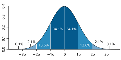
| The probability distribution function of the normal distribution or Gaussian distribution. The probabilities expressed as a percentage for various widths of standard deviations (σ) represent the area under the curve. |
|---|
Figure from Wikipedia. |
...
For a forecast ensemble where all values were the same, the CDF would be a vertical straight line.
Plot the CDF for 3 locations

This exercise uses the cdf.mv icon. Right-click, select 'Edit' and then:
...
Q. What is the difference between the different stations and why? (refer to the ensemble spread maps to answer this)
Q. How does the CDF for Reading change with different forecast lead (run) dates?
Forecasting an event using an ensemble : Work in teams for group discussion
Ensemble forecasts can be used to give probabilities to a forecast issued to the public.
...
For the SCM we thought that it might be interesting to use the SCM for a point near Toulouse that experienced very heavy rainfall during HYMEX. Then we get the students to adjust the entrainment rates (similar to the convection exercises here) to see what impact it has on the precipitation?
Exercise 2.
...
Hello Glenn,

Here are a few comments concerning your previous emails :

2- Véronique Ducrocq could play the role of an HyMeX operation director being the client of the students' forecast. This forecasting exercise could be done by the 8 students following the forecasting option (with me as their "teacher"), whereas the 18 others (informatic or statistic options) could keep doing more sensitivity tests while manipulating the code of the model (with Frédéric and you).
3- It would be very interesting to briefly tackle with the ECMWF Data Targeting System which was one of the observation strategies used during HyMeX SOP1.
I precisely asked Véronique Ducrocq to speak about DTS during her presentation on Day 1.
4- ARPEGE and IFS deterministic charts are available at the French Met School between 18th and 24th sept (except the 20th runs unfortunately !). As far as I was the HyMeX forecaster myself before the 24th sept. event, I would be very interesting in the MSLP fields from the 20th 00UTC run between 25th and 28th sept. , in order to be able to illustrate (in my own Day 3 presentation) the propagation of this impressive "Gibraltar storm" I mentionned into my daily meeting report. A 6h step would be perfect, even if it is only a paper-scanned version...
Appendix
Datasets available
The following datasets are available on the Virtual Machine for this workshop:
Further reading
For more information on the stochastic physics scheme in (Open)IFS, see the article:
Shutts et al, 2011, ECMWF Newsletter 129.
Acknowledgements
We gratefully acknowledge the following for their contributions in preparing these exercises. From ECMWF: Glenn Carver, Sandor Kertesz, Linus Magnusson, Iain Russell, Simon Lang, Filip Vana. From ENM/Meteo-France: Frédéric Ferry, Etienne Chabot, David Pollack and Thierry Barthet for IT support at ENM.
...