...
Using the ens_rmse.mv icon, right-click, select 'Edit' and plot the curves for 'mslp' and 'z500'.
Turn off clustering in the macro.
| Code Block | ||||
|---|---|---|---|---|
| ||||
useClusters="off" |
...
In the previous task, we have seen that introducing uncertainty into the forecast by starting from different initial conditions and enabling the stochastic parameterizations in IFS can result in significant differences in the RMSE (for this particular case and geographical region).
The purpose of this task is to This task will explore the difference in more detail and look in particular another way by looking at the 'ensemble spread'.
Use the ens_to_an.mv icon and plot the MSLP and wind fieldsz500. This will produce plots showing: the mean of all the ensemble forecasts, the spread of the ensemble forecasts, the operational HRES deterministic forecast and the analysis.
This macro can also be used to look at collections of ensemble members. It will be used later in the clustering exercisestasks. For this task, make sure all the members of the ensemble are used.
...
| Panel | ||||
|---|---|---|---|---|
| ||||
|
If time:
- set try setting the 'members=' option to change the number of members in the spread plots.
e.g. try a "reduced" ensemble by only using the first 5 ensemble members: "members=[1,2,3,4,5]".
Task 3: Spaghetti plots - another way to visualise spread
A "spaghetti" plot is where a single contour of a parameter is plotted for all ensemble members. It is another way of visualizing the differences between the ensemble members and focussing on features.
Use the ens_to_an_runs_spag.mv icon. Plot and animate the MSLP field using the default value and z500 fields using your suitable choice for the contour level. This will indicate Find a value that highlights the low pressure centrecentres. Note that not all members may reach the low pressure set by the contour.
Note that this macro may animate slowly because of the computations required.
...
So far we have been looking at reducing the information in some way to visualise the ensemble.
To visualise all the ensemble members as normal maps, we can use stamp maps. These are small, stamp sized contour maps plotted for each ensemble member using a small set of contours.
There are two icons to use, stamp.mv and stamp_diff.mv. Plot the MSLP parameter for the ensemble. Repeat for wind field.
...
z500 and any other fields of interest.
| Panel | ||||
|---|---|---|---|---|
| ||||
|
...
|
If time:
Use the macros to see how the perturbations are evolving; use ens_to_an_diff.mv to compare individual members to the analyses.
...
| Info |
|---|
Use 'mapType=1' to see the larger geographical area (please note that due to data volume restrictions, this mapType only works for the MSLP parameter). |
Task 5: Cumulative distribution function
...
Recap
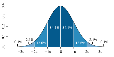
| The probability distribution function of the normal distribution or Gaussian distribution. The probabilities expressed as a percentage for various widths of standard deviations (σ) represent the area under the curve. |
|---|
Figure from Wikipedia. |
...