...
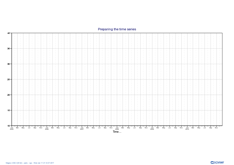
The plot command will create a png repenting showing the projection and represented by the 2 axis.
| Section |
|---|
| Column |
|---|
| 
|
| Column |
|---|
| | Code Block |
|---|
| language | py |
|---|
| title | Setting the time series |
|---|
| collapse | true |
|---|
| # importing Magics module
import Magics.macro as magics
# Setting of the output file name
output = magics.output(output_formats=['png'],
output_name_first_page_number='off',
output_name='odb_graph1')
# Define the cartesian projection
map = magics.mmap(subpage_map_projection = "cartesian",
subpage_x_axis_type = 'date',
subpage_y_axis_type = 'regular',
subpage_x_date_min = '2005-01-01',
subpage_x_date_max = '2010-12-31',
subpage_y_min = 0.,
subpage_y_max = 1000.,
subpage_y_position = 5.)
#define the axis
horizontal_axis = magics.maxis(axis_orientation = "horizontal",
axis_type = 'date',
axis_date_type = "automatic",
axis_grid = "on",
axis_grid_line_style = "solid",
axis_grid_thickness = 1,
axis_grid_colour = "grey",
axis_minor_tick ='on',
axis_minor_grid ='on',
axis_minor_grid_line_style = "dot",
axis_minor_grid_colour = "grey",
axis_title = 'on',
axis_title_text = "Time...",
)
vertical_axis = magics.maxis(axis_orientation = "vertical",
axis_grid = "on",
axis_grid_line_style = "solid",
axis_grid_thickness = 1,
axis_grid_colour = "grey",
)
#Add a text
title = magics.mtext(text_lines=['Preparing the time series'])
# Execute the plot.
magics.plot(output, map, horizontal_axis, vertical_axis, title)
|
|
|
Note the use of axis_type = 'date', axis_date_type = "automatic" in the setting of the horizontal axis. This is a nice feature of Magics that will adjust the labels to show hors, days, months or years according to the length of the time series.
Now we will add the data. The file count.odb contains the following information.
| Code Block |
|---|
|
date@hdr	series
20041231	7124.000000
20050101	112191.000000
20050102	117146.000000
20050103	118529.000000
20050104	115592.000000
20050105	115085.000000
20050106	112501.000000
20050107	116017.000000
20050108	118702.000000
20050109	117507.000000
20050110 119497.000000 |
We will first try to create a basic curve considering the date as a integer.
| Section |
|---|
| Column |
|---|
|  Image Added Image Added
|
| Column |
|---|
| | Code Block |
|---|
| language | py |
|---|
| title | Setting the time series |
|---|
| collapse | true |
|---|
| # importing Magics module
import Magics.macro as magics
#First we read the ODB in a numpay array
# importing ODB
import odb
import numpy
odb = numpy.array([r[:] for r in
odb.sql("select date@hdr, series from '%s'"
% 'count.odb')])
dates = odb[:, 0]
count = odb[:, 1]
# Setting of the output file name
output = magics.output(output_formats=['png'],
output_name_first_page_number='off',
output_name='odb_graph2')
# Define the cartesian projection
map = magics.mmap(subpage_map_projection = "cartesian",
subpage_x_axis_type = 'regular',
subpage_y_axis_type = 'regular',
subpage_x_automatic = 'on',
subpage_y_automatic = 'on',
)
#define the axis
horizontal_axis = magics.maxis(axis_orientation = "horizontal",
axis_type = 'regular',
axis_date_type = "automatic",
axis_grid = "on",
axis_grid_line_style = "solid",
axis_grid_thickness = 1,
axis_grid_colour = "grey",
axis_minor_tick ='on',
axis_minor_grid ='on',
axis_minor_grid_line_style = "dot",
axis_minor_grid_colour = "grey",
axis_title = 'on',
axis_title_text = "Time...",
)
vertical_axis = magics.maxis(axis_orientation = "vertical",
axis_grid = "on",
axis_grid_line_style = "solid",
axis_grid_thickness = 1,
axis_grid_colour = "grey",
)
data = magics.minput(input_x_values = dates, input_y_values = count)
graph = magics.mgraph(graph_line_colour="evergreen")
#Add a text
title = magics.mtext(text_lines=['Adding the data to the time series'])
# Execute the plot.
magics.plot(output, map, horizontal_axis, vertical_axis, data, graph, title)
|
|
|
Note that we have now set subpage_x_axis_type to regular and subpage_x_automatic = on. This will not interpret the date as a date but as a integer, and will use the min and max of the data to setup the limits of the projection.
It is not the plot, but it shows quickly your data.
Now we will interpret the date as date, and the time series should be fine.
| Section |
|---|
| Column |
|---|
|  Image Added Image Added
|
| Column |
|---|
| | Code Block |
|---|
| language | py |
|---|
| title | Setting the time series |
|---|
| collapse | true |
|---|
| # importing Magics module
import Magics.macro as magics
#First we read the ODB in a numpay array
# importing ODB
import odb
import numpy
import datetime
odb = numpy.array([r[:] for r in
odb.sql("select date@hdr, series from '%s'"
% 'count.odb')])
dates = odb[:, 0]
count = odb[:, 1]
#Now we convert the date to the ISO date Format that Magics can understand.
dates = map(lambda x : datetime.datetime.strptime("%s" % x, "%Y%m%d.0"), dates)
dates = map(lambda x : x.strftime("%Y-%m-%d %H:%M"), dates)
# Setting of the output file name
output = magics.output(output_formats=['png'],
output_name_first_page_number='off',
output_name='odb_graph3')
# Define the cartesian projection
map = magics.mmap(subpage_map_projection = "cartesian",
subpage_x_axis_type = 'date',
subpage_y_axis_type = 'regular',
subpage_x_automatic = 'on',
subpage_y_automatic = 'on',
)
#define the axis
horizontal_axis = magics.maxis(axis_orientation = "horizontal",
axis_type = 'date',
axis_date_type = "automatic",
axis_grid = "on",
axis_grid_line_style = "solid",
axis_grid_thickness = 1,
axis_grid_colour = "grey",
axis_minor_tick ='on',
axis_minor_grid ='on',
axis_minor_grid_line_style = "dot",
axis_minor_grid_colour = "grey",
axis_title = 'on',
axis_title_text = "Time...",
)
vertical_axis = magics.maxis(axis_orientation = "vertical",
axis_grid = "on",
axis_grid_line_style = "solid",
axis_grid_thickness = 1,
axis_grid_colour = "grey",
)
data = magics.minput(input_x_type = "date",
input_date_x_values = dates,
input_y_values = count
)
graph = magics.mgraph(graph_line_colour="evergreen")
#Add a text
title = magics.mtext(text_lines=['Adding the data to the time series'])
# Execute the plot.
magics.plot(output, map, horizontal_axis, vertical_axis, data, graph, title)
|
|
|
In the example we are using numpy array to manipulate the ODB, this gives all the computations facilities. Once done, the result can just be passed to Magics using bumpy array.