...
Now, we are going to colour the symbol according to the value of the observation. The advanced mode for symbol plotting offers an easy way to specify range and colours, we add a legend for readability.
| Section |
|---|
| Column |
|---|
|  Image Removed Image Removed Image Added Image Added
|
| Column |
|---|
| | Code Block |
|---|
| language | py |
|---|
| title | Advanced symbol plotting |
|---|
| collapse | true |
|---|
| # importing Magics module
from Magics.macro import *
# Setting of the output file name
output = output(output_formats=['png'],
output_name_first_page_number='off',
output_name='odb_step2')
# Background Coastlines
background = mcoast(
map_coastline_sea_shade_colour='white',
map_coastline_land_shade_colour='cream',
map_grid='on',
map_coastline_land_shade='on',
map_coastline_sea_shade='on',
map_label='on',
map_coastline_colour='tan',
)
# Import odb data
odb = odb_geopoints(odb_filename='geo.odb',
odb_latitude_variable='lat@hdr',
odb_longitude_variable='lon@hdr',
odb_value_variable='obsvalue@body',
)
# Define the symbol plotting
symbol = msymb(symbol_type='marker',
symbol_colour='navy',
symbol_advanced_table_selection_type='list',
symbol_advanced_table_level_list=[50000., 75000., 90000., 100000.,
100500., 101000., 101500., 102000., 102500., 103000.,
103500., 104000., 105000.],
symbol_advanced_table_min_level_colour='blue',
symbol_advanced_table_max_level_colour='red',
symbol_advanced_table_colour_direction='clockwise',
symbol_table_mode='advanced',
legend='on'
)
#Adding some text
lines = ['Using odb colouring the sumbol according to the value of the observation...',
'select lat@hdr, lon@hdr, obsvalue@body where (source='ispdv2.2') and (varno=110),]
title = mtext(
text_lines=lines,
text_html='true',
text_justification='left',
text_font_size=0.7,
text_colour='charcoal',
)
#adding some legend
legend = mlegend(legend='on', legend_text_colour='navy some legend
legend = mlegend(legend='on', legend_text_colour='navy',
legend_display_type='continuous')
#Create the plot
plot(output, background, odb, symbol, title,legend)
|
|
|
Loading the data into a numpy array and passing them to Magics
Note the facilities offered by numpy to perform some computations and the histogram legend facilities of Magics.
| Section |
|---|
| Column |
|---|
|  Image Added Image Added
|
| Column |
|---|
| | Code Block |
|---|
| language | py |
|---|
| title | Using numpy array |
|---|
| collapse | true |
|---|
|
# importing Magics module
from Magics.macro import *
#Loading ODB in a numpy array
import odb
import numpy
import datetime

odb = numpy.array([r[:] for r in
               odb.sql("select lat@hdr, lon@hdr, obsvalue@body from '%s'"
               % 'geo.odb')])

lat = odb[:, 0]
lon = odb[:, 1]
#Here we convert the values from Pascal to HectoPascal.
values = odb[:, 2]/100

# Setting of the output file name
output = output(output_formats=['png'],
                output_name_first_page_number='off',
                output_name='odb_step3')


# Background Coastlines
background = mcoast(
    map_coastline_sea_shade_colour='white',
    map_coastline_land_shade_colour='cream',
    map_grid='on',
    map_coastline_land_shade='on',
    map_coastline_sea_shade='on',
    map_label='on',
    map_coastline_colour='tan',
    )

#Set the input data
input = minput(input_latitude_values=lat,
               input_longitude_values=lon,
               input_values=values)

# Define the symbol plotting
symbol = msymb(symbol_type='marker',
               symbol_colour='navy',
               symbol_advanced_table_selection_type='interval',
               symbol_advanced_table_interval=5.,
               symbol_advanced_table_min_level_colour='blue',
               symbol_advanced_table_max_level_colour='red',
               symbol_advanced_table_colour_direction='clockwise',
               symbol_table_mode='advanced',
               legend='on'
               )
#Adding some text
lines = ['Using odb colouring the sumbol according to the value of the observation...', "select lat@hdr, lon@hdr, obsvalue@body where (source='ispdv2.2') and (varno=110)",
         '<magics_title/>']

title = mtext(
    text_lines=lines,
    text_html='true',
    text_justification='left',
    text_font_size=0.7,
    text_colour='charcoal',
    )

#adding some legend
legend = mlegend(legend='on', legend_text_colour='navy',
                 legend_display_type='histogram',
                 legend_displaylabel_typefrequency='continuous'5)


#Create the plot
plot(output, background, odbinput, symbol, title,legend)
|
|
|
Creating a time series from
...
an ODB data.
In this example, we will first setup a cartesian projection for the time series: the x axis will show the date from January 2005 to December 2010, and the y axis will represent the number of observation for each day, i.e. a range from 0 to 1000.
...
The plot command will create a png showing the projection represented by the 2 axis.
| Section |
|---|
| Column |
|---|
| 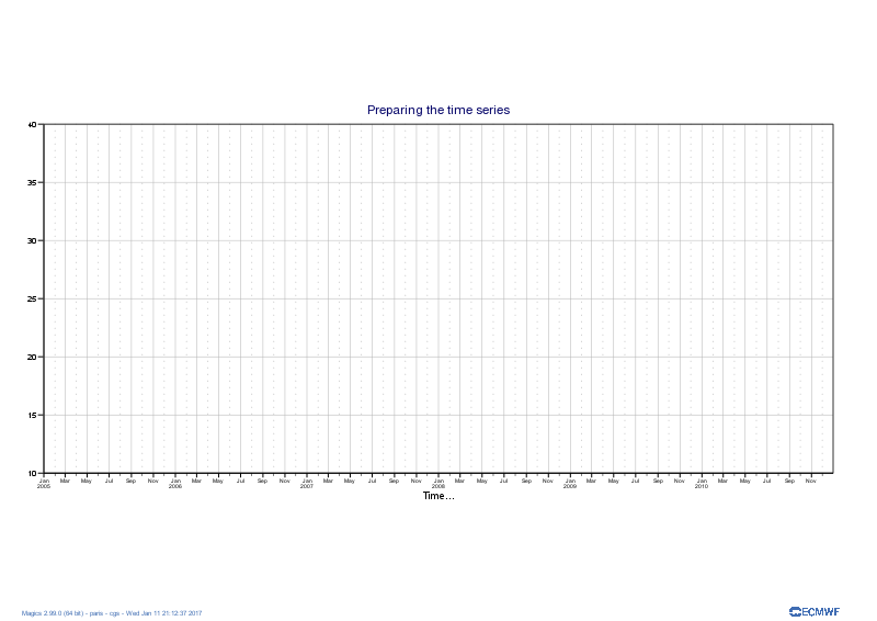 Image Removed Image Removed Image Added Image Added
|
| Column |
|---|
| | Code Block |
|---|
| language | py |
|---|
| title | Setting the time series |
|---|
| collapse | true |
|---|
| # importing Magics module
import Magics.macro as magics
# Setting of the output file name
output = magics.output(output_formats=['png'],
output_name_first_page_number='off',
output_name='odb_graph1')
# Define the cartesian projection
map = magics.mmap(subpage_map_projection = "cartesian",
subpage_x_axis_type = 'date',
subpage_y_axis_type = 'regular',
subpage_x_date_min = '2005-01-01',
subpage_x_date_max = '2010-12-31',
subpage_y_min = 0.,
subpage_y_max = 1000.,
subpage_y_position = 5.)
#define the axis
horizontal_axis = magics.maxis(axis_orientation = "horizontal",
axis_type = 'date',
axis_date_type = "automatic",
axis_grid = "on",
axis_grid_line_style = "solid",
axis_grid_thickness = 1,
axis_grid_colour = "grey",
axis_minor_tick ='on',
axis_minor_grid ='on',
axis_minor_grid_line_style = "dot",
axis_minor_grid_colour = "grey",
axis_title = 'on',
axis_title_text = "Time...",
)
vertical_axis = magics.maxis(axis_orientation = "vertical",
axis_grid = "on",
axis_grid_line_style = "solid",
axis_grid_thickness = 1,
axis_grid_colour = "grey",
)
#Add a text
title = magics.mtext(text_lines=['Preparing the time series'])
# Execute the plot.
magics.plot(output, map, horizontal_axis, vertical_axis, title)
|
|
|
Note the use of axis_type = 'date', axis_date_type = "automatic" in the setting of the horizontal axis. This is a nice feature of Magics that will adjust the labels to show horshours, days, months or years according to the length of the time series.
...
We will first try to create a basic curve considering the date as a integer.
| Section |
|---|
| Column |
|---|
|  Image Removed Image Removed Image Added Image Added
|
| Column |
|---|
| | Code Block |
|---|
| language | py |
|---|
| title | Setting the time series Plotting quickly the data from a numpy array |
|---|
| collapse | true |
|---|
| # importing Magics module
import Magics.macro as magics
#First we read the ODB in a numpay array
# importing ODB
import odb
import numpy
odb = numpy.array([r[:] for r in
odb.sql("select date@hdr, series from '%s'"
% 'count.odb')])
dates = odb[:, 0]
count = odb[:, 1]
# Setting of the output file name
output = magics.output(output_formats=['png'],
output_name_first_page_number='off',
output_name='odb_graph2')
# Define the cartesian projection
map = magics.mmap(subpage_map_projection = "cartesian",
subpage_x_axis_type = 'regular',
subpage_y_axis_type = 'regular',
subpage_x_automatic = 'on',
subpage_y_automatic = 'on',
)
#define the axis
horizontal_axis = magics.maxis(axis_orientation = "horizontal",
axis_type = 'regular',
axis_date_type = "automatic",
axis_grid = "on",
axis_grid_line_style = "solid",
axis_grid_thickness = 1,
axis_grid_colour = "grey",
axis_minor_tick ='on',
axis_minor_grid ='on',
axis_minor_grid_line_style = "dot",
axis_minor_grid_colour = "grey",
axis_title = 'on',
axis_title_text = "Time...",
)
vertical_axis = magics.maxis(axis_orientation = "vertical",
axis_grid = "on",
axis_grid_line_style = "solid",
axis_grid_thickness = 1,
axis_grid_colour = "grey",
)
data = magics.minput(input_x_values = dates, input_y_values = count)
graph = magics.mgraph(graph_line_colour="evergreen")
#Add a text
title = magics.mtext(text_lines=['Adding the data to the time series'])
# Execute the plot.
magics.plot(output, map, horizontal_axis, vertical_axis, data, graph, title)
|
|
|
...
Now we will interpret the date as date, and the time series should be fine.
| Section |
|---|
| Column |
|---|
|  Image Removed Image Removed Image Added Image Added
|
| Column |
|---|
| | Code Block |
|---|
| language | py |
|---|
| title | Setting Interpreting the time series date |
|---|
| collapse | true |
|---|
| # importing Magics module
import Magics.macro as magics
#First we read the ODB in a numpay array
# importing ODB
import odb
import numpy
import datetime
odb = numpy.array([r[:] for r in
odb.sql("select date@hdr, series from '%s'"
% 'count.odb')])
dates = odb[:, 0]
count = odb[:, 1]
#Now we convert the date to the ISO date Format that Magics can understand.
dates = map(lambda x : datetime.datetime.strptime("%s" % x, "%Y%m%d.0"), dates)
dates = map(lambda x : x.strftime("%Y-%m-%d %H:%M"), dates)
# Setting of the output file name
output = magics.output(output_formats=['png'],
output_name_first_page_number='off',
output_name='odb_graph3')
# Define the cartesian projection
map = magics.mmap(subpage_map_projection = "cartesian",
subpage_x_axis_type = 'date',
subpage_y_axis_type = 'regular',
subpage_x_automatic = 'on',
subpage_y_automatic = 'on',
)
#define the axis
horizontal_axis = magics.maxis(axis_orientation = "horizontal",
axis_type = 'date',
axis_date_type = "automatic",
axis_grid = "on",
axis_grid_line_style = "solid",
axis_grid_thickness = 1,
axis_grid_colour = "grey",
axis_minor_tick ='on',
axis_minor_grid ='on',
axis_minor_grid_line_style = "dot",
axis_minor_grid_colour = "grey",
axis_title = 'on',
axis_title_text = "Time...",
)
vertical_axis = magics.maxis(axis_orientation = "vertical",
axis_grid = "on",
axis_grid_line_style = "solid",
axis_grid_thickness = 1,
axis_grid_colour = "grey",
)
data = magics.minput(input_x_type = "date",
input_date_x_values = dates,
input_y_values = count
)
graph = magics.mgraph(graph_line_colour="evergreen")
#Add a text
title = magics.mtext(text_lines=['Adding the data to the time series'])
# Execute the plot.
magics.plot(output, map, horizontal_axis, vertical_axis, data, graph, title)
|
|
|
In
...
the
...
example
...
we
...
are
...
using
...
numpy
...
array
...
to
...
manipulate
...
the
...
ODB,
...
this
...
gives
...
all
...
the
...
computations
...
facilities.
...
Once
...
done,
...
the
...
result
...
can
...
just
...
be
...
passed
...
to
...
Magics
...
using
...
through
...
a
...
numpy
...
array.
...