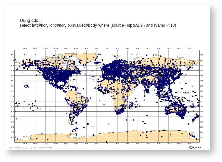
Versions Compared

Key

  • This line was added.
  • This line was removed.
  • Formatting was changed.

...

Section


Column
width350px

Column
width70%
Code Block
languagepy
titleSimple symbol plotting
collapsetrue
# importing Magics module
from Magics.macro import *

# Setting of the output file name
output = output(output_formats=['png'],
                output_name_first_page_number='off',
                output_name="odb_step1")

# Background Coastlines
background = mcoast(
    map_coastline_sea_shade_colour='white',
    map_coastline_land_shade_colour='cream',
    map_grid='on',
    map_coastline_land_shade='on',
    map_coastline_sea_shade='on',
    map_label='on',
    map_coastline_colour='tan',
    )
# Import odb data
odb = odb_geopoints(odb_filename='geo.odb',
                    odb_latitude_variable='lat@hdr',
                    odb_longitude_variable='lon@hdr',
                    )
# Define the symbol plotting
symbol = msymb(symbol_type='marker',
               symbol_colour='navy',
               symbol_marker_index=3,
               symbol_height=0.4,
            )
# Add a title 
lines = ['Using odb...', 
         'select lat@hdr, lon@hdr, obsvalue@body where (source='ispdv2.2') and (varno=110)',
         ]

title = mtext(
    text_lines=lines,
    text_justification='left',
    text_font_size=0.7,
    text_colour='charcoal',
)

#Create the plot
plot(output, background, odb, symbol, title)

Download :


Now, we are going to colour the symbol according to the value of the observation. The advanced mode for symbol plotting offers an easy way to specify range and colours, we add a legend for readability.

Section
Column
width350px

Column
width70%
Code Block
languagepy
titleAdvanced symbol plotting
collapsetrue
# importing Magics module
from Magics.macro import *

# Setting of the output file name
output = output(output_formats=['png'],
                output_name_first_page_number='off',
                output_name='odb_step2')

# Background Coastlines
background = mcoast(
    map_coastline_sea_shade_colour='white',
    map_coastline_land_shade_colour='cream',
    map_grid='on',
    map_coastline_land_shade='on',
    map_coastline_sea_shade='on',
    map_label='on',
    map_coastline_colour='tan',
    )

# Import odb data
odb = odb_geopoints(odb_filename='geo.odb',
                    odb_latitude_variable='lat@hdr',
                    odb_longitude_variable='lon@hdr',
                    odb_value_variable='obsvalue@body',
                    )

# Define the symbol plotting
symbol = msymb(symbol_type='marker',
               symbol_colour='navy',
               symbol_advanced_table_selection_type='list',
               symbol_advanced_table_level_list=[50000., 75000., 90000., 100000., 
							100500., 101000., 101500., 102000., 102500., 103000., 
							103500., 104000., 105000.],
               symbol_advanced_table_min_level_colour='blue',
               symbol_advanced_table_max_level_colour='red',
               symbol_advanced_table_colour_direction='clockwise',
               symbol_table_mode='advanced',
               legend='on'
               )
#Adding some text
lines = ['Using odb colouring the sumbol according to the value of the observation...', 
         'select lat@hdr, lon@hdr, obsvalue@body where (source='ispdv2.2') and (varno=110),]

title = mtext(
    text_lines=lines,
    text_html='true',
    text_justification='left',
    text_font_size=0.7,
    text_colour='charcoal',
    )

#adding some legend
legend = mlegend(legend='on', legend_text_colour='navy',
                 legend_display_type='continuous')


#Create the plot
plot(output, background, odb, symbol, title,legend)

Download :


Loading the data into a numpy array and passing them to Magics

...

Section
Column
width350px

Column
width70%
Code Block
languagepy
titleUsing numpy array
collapsetrue
 
# importing Magics module
from Magics.macro import *
#Loading ODB in a numpy array
import odb
import numpy
import datetime

odb = numpy.array([r[:] for r in
               odb.sql("select lat@hdr, lon@hdr, obsvalue@body from '%s'"
               % 'geo.odb')])

lat = odb[:, 0]
lon = odb[:, 1]
#Here we convert the values from Pascal to HectoPascal.
values = odb[:, 2]/100

# Setting of the output file name
output = output(output_formats=['png'],
                output_name_first_page_number='off',
                output_name='odb_step3')


# Background Coastlines
background = mcoast(
    map_coastline_sea_shade_colour='white',
    map_coastline_land_shade_colour='cream',
    map_grid='on',
    map_coastline_land_shade='on',
    map_coastline_sea_shade='on',
    map_label='on',
    map_coastline_colour='tan',
    )

#Set the input data
input = minput(input_latitude_values=lat,
               input_longitude_values=lon,
               input_values=values)

# Define the symbol plotting
symbol = msymb(symbol_type='marker',
               symbol_colour='navy',
               symbol_advanced_table_selection_type='interval',
               symbol_advanced_table_interval=5.,
               symbol_advanced_table_min_level_colour='blue',
               symbol_advanced_table_max_level_colour='red',
               symbol_advanced_table_colour_direction='clockwise',
               symbol_table_mode='advanced',
               legend='on'
               )
#Adding some text
lines = ['Using odb colouring the sumbol according to the value of the observation...', "select lat@hdr, lon@hdr, obsvalue@body where (source='ispdv2.2') and (varno=110)",
         '<magics_title/>']

title = mtext(
    text_lines=lines,
    text_html='true',
    text_justification='left',
    text_font_size=0.7,
    text_colour='charcoal',
    )

#adding some legend
legend = mlegend(legend='on', legend_text_colour='navy',
                 legend_display_type='histogram',
                 legend_label_frequency=5)


#Create the plot
plot(output, background, input, symbol, title,legend)

Download :


Creating a time series from an ODB data.

...

Section
Column
width350px

Column
width70%
Code Block
languagepy
titleSetting the time series
collapsetrue
# importing Magics module
import Magics.macro as magics


# Setting of the output file name
output = magics.output(output_formats=['png'],
                output_name_first_page_number='off',
                output_name='odb_graph1')


# Define the cartesian projection
map = magics.mmap(subpage_map_projection = "cartesian",
                  subpage_x_axis_type = 'date',
                  subpage_y_axis_type = 'regular',
                  subpage_x_date_min = '2005-01-01',
                  subpage_x_date_max = '2010-12-31',
                  subpage_y_min = 0.,
                  subpage_y_max = 1000.,
                  subpage_y_position = 5.)
#define the axis
horizontal_axis = magics.maxis(axis_orientation = "horizontal",
                               axis_type = 'date',
                               axis_date_type = "automatic",
                               axis_grid = "on",
                               axis_grid_line_style = "solid",
                               axis_grid_thickness = 1,
                               axis_grid_colour = "grey",
                               axis_minor_tick ='on',
                               axis_minor_grid ='on',
                               axis_minor_grid_line_style = "dot",
                               axis_minor_grid_colour = "grey",
                               axis_title = 'on',
                               axis_title_text = "Time...",

                               )
vertical_axis = magics.maxis(axis_orientation = "vertical",
                               axis_grid = "on",
                               axis_grid_line_style = "solid",
                               axis_grid_thickness = 1,
                               axis_grid_colour = "grey",
                            )
#Add a text
title = magics.mtext(text_lines=['Preparing the time series'])

# Execute the plot.
magics.plot(output, map, horizontal_axis, vertical_axis, title)

Download :


Note the use of axis_type = 'date', axis_date_type = "automatic" in the setting of the horizontal axis. This is a nice feature of Magics that will adjust the labels to show hours, days, months or years according to the length of the time series. 

...

Section
Column
width350px

Column
width70%
Code Block
languagepy
titlePlotting quickly the data from a numpy array
collapsetrue
# importing Magics module
import Magics.macro as magics

#First we read the ODB in a numpay array
# importing ODB
import odb
import numpy

odb = numpy.array([r[:] for r in
               odb.sql("select date@hdr, series from '%s'"
               % 'count.odb')])

dates = odb[:, 0]
count = odb[:, 1]

# Setting of the output file name
output = magics.output(output_formats=['png'],
                output_name_first_page_number='off',
                output_name='odb_graph2')


# Define the cartesian projection
map = magics.mmap(subpage_map_projection = "cartesian",
                  subpage_x_axis_type = 'regular',
                  subpage_y_axis_type = 'regular',
                  subpage_x_automatic = 'on',
                  subpage_y_automatic = 'on',
                  )
#define the axis
horizontal_axis = magics.maxis(axis_orientation = "horizontal",
                               axis_type = 'regular',
                               axis_date_type = "automatic",
                               axis_grid = "on",
                               axis_grid_line_style = "solid",
                               axis_grid_thickness = 1,
                               axis_grid_colour = "grey",
                               axis_minor_tick ='on',
                               axis_minor_grid ='on',
                               axis_minor_grid_line_style = "dot",
                               axis_minor_grid_colour = "grey",
                               axis_title = 'on',
                               axis_title_text = "Time...",

                               )
vertical_axis = magics.maxis(axis_orientation = "vertical",
                               axis_grid = "on",
                               axis_grid_line_style = "solid",
                               axis_grid_thickness = 1,
                               axis_grid_colour = "grey",
                            )

data = magics.minput(input_x_values = dates, input_y_values = count)
graph = magics.mgraph(graph_line_colour="evergreen")
#Add a text
title = magics.mtext(text_lines=['Adding the data to the time series'])

# Execute the plot.
magics.plot(output, map, horizontal_axis, vertical_axis, data, graph, title)

Download :


Note that we have now set subpage_x_axis_type to  regular and subpage_x_automatic = on. This will not interpret the date as a date but as a integer, and will use the min and max of the data to setup the limits of the projection.

...

Section
Column
width350px

Column
width70%
Code Block
languagepy
titleInterpreting the date
collapsetrue
# importing Magics module
import Magics.macro as magics

#First we read the ODB in a numpay array
# importing ODB
import odb
import numpy
import datetime

odb = numpy.array([r[:] for r in
               odb.sql("select date@hdr, series from '%s'"
               % 'count.odb')])

dates = odb[:, 0]
count = odb[:, 1]

#Now we convert the date to the ISO date Format that Magics can understand.
dates =  map(lambda x : datetime.datetime.strptime("%s" % x, "%Y%m%d.0"), dates)
dates =  map(lambda x : x.strftime("%Y-%m-%d %H:%M"), dates)


# Setting of the output file name
output = magics.output(output_formats=['png'],
                output_name_first_page_number='off',
                output_name='odb_graph3')


# Define the cartesian projection
map = magics.mmap(subpage_map_projection = "cartesian",
                  subpage_x_axis_type = 'date',
                  subpage_y_axis_type = 'regular',
                  subpage_x_automatic = 'on',
                  subpage_y_automatic = 'on',
                  )
#define the axis
horizontal_axis = magics.maxis(axis_orientation = "horizontal",
                               axis_type = 'date',
                               axis_date_type = "automatic",
                               axis_grid = "on",
                               axis_grid_line_style = "solid",
                               axis_grid_thickness = 1,
                               axis_grid_colour = "grey",
                               axis_minor_tick ='on',
                               axis_minor_grid ='on',
                               axis_minor_grid_line_style = "dot",
                               axis_minor_grid_colour = "grey",
                               axis_title = 'on',
                               axis_title_text = "Time...",

                               )
vertical_axis = magics.maxis(axis_orientation = "vertical",
                               axis_grid = "on",
                               axis_grid_line_style = "solid",
                               axis_grid_thickness = 1,
                               axis_grid_colour = "grey",
                            )
data = magics.minput(input_x_type = "date",
                input_date_x_values = dates, 
                input_y_values = count
                )
graph = magics.mgraph(graph_line_colour="evergreen")
#Add a text
title = magics.mtext(text_lines=['Adding the data to the time series'])

# Execute the plot.
magics.plot(output, map, horizontal_axis, vertical_axis, data, graph, title)
 

Download :


In the example we are using numpy array to manipulate the ODB, this gives all the computations facilities. Once done, the result can just be passed to Magics using through a numpy array. 

...