| Section |
|---|
| Column |
|---|
| 
|
| Column |
|---|
|
| Panel |
|---|
Objectives
- Set-up a cartesian projection for the Cross section
- Configure the axis
- Load a Netcdf netCDF file, and understand the information needed by Magics.
- Apply a shading
- Position the legend box
- Add a text.
You will need to download
|
|
|
Setting of the
...
cartesian projection
We want to show our Cross section in the following cartesian system:
- The vertical coordinate system is a logarithmic axis from 1000 hPa to 200 hPa.
- The horizontal coordinate system is a geoline axis from [50oN, 90oW] to [30oN, 60oW]
Have a look at the subpage documentation to learn how to setup a cartesian projection .
We just have to add 2 axis (1 vertical, 1 horizontal ) to materialise it on the plot. For backward compatibility, we have only one maxis object, the orientation is defined using the parameter axis_orientation.
| Section |
|---|
|
| Section |
|---|
| Column |
|---|
|
| Info |
|---|
|
| Useful subpage parameters |
|---|
subpage_lower_left_longitudemap_projection | | subpage_x_axis_type | | subpage_y_axis_type | | subpage_ | lowerx_ | leftmin_latitude | | subpage_ | upperx_ | rightmin_longitude | | subpage_upperx_rightmax_latitude | | subpage_x_max_longitude | | subpage_y_min | | subpage_y_max |
|
| Code Block |
|---|
| Code Block |
|---|
theme | Confluence |
|---|
| language | python |
|---|
| theme | Confluence |
|---|
| title | Python - Setting a projection |
|---|
| collapse | true |
|---|
| from Magics.macro import *
#setting the output
output = output(
output_formats = ['png'],
output_name = "mapxsect_step1",
output_name_first_page_number = "off"
)
#settings# ofSetting the geographicalcartesian area view
areaprojection = mmap(
subpage_map_projection="cylindrical"'cartesian',
subpage_lowerx_leftaxis_longitude=-110.type='geoline',
subpage_lowery_leftaxis_latitude=20.type='logarithmic',
subpage_upperx_rightmin_longitudelatitude=-3050.,
subpage_upperx_rightmax_latitude=7030.,
)
#Using a default coastlines to see the result
plot(output, area, mcoast()) |
|
| Column |
|---|
|  Image Removed Image Removed
|
|
Setting the coastlines
Until now you have used the mcoast to add coastlines to your plot. The mcoast object comes with a lot of parameters to allow you to style your coastlines layer.
The full list of parameters can be found in the Coastlines documentation.
In this first exercise, we will like to see:
- The land coloured in cream.
- The coastlines in grey.
- The grid as a grey dash line.
...
...
| Useful Coastlines parameters |
|---|
map_coastline_land_shade |
| map_coastline_land_shade_colour |
| map_coastline_colour |
| map_grid_colour |
| map_grid_line_style |
subpage_x_min_longitude=-90.,
        subpage_x_max_longitude=-60.,
        subpage_y_min=1020.,
        subpage_y_max=200.,
        )
# Vertical axis
vertical = maxis(
        axis_orientation='vertical',
        )
# Horizontal axis
horizontal = maxis(
        axis_orientation='horizontal',
        )

plot(output, projection, horizontal, vertical) |
|
| Column |
|---|
|  Image Added Image Added
|
|
Adjusting the axis
By specialising the axis, you can improve your axis visualisation.
Have a look at the Axis Documentation to browse the possibilities.
Now, try to improve the readability of the line by specialising the horizontal axis.
| Section |
|---|
| Column |
|---|
|
| Info |
|---|
|
| Useful axis parameters |
|---|
axis_type | | axis_tick_label_height | | axis_tick_label_colour | | axis_grid | | axis_title |
|
| Code Block |
|---|
| language | python |
|---|
| theme | Confluence |
|---|
| title | Python - adjusting the axis |
|---|
| collapse | true |
|---|
| from Magics.macro import *
#setting the output
output = output(
output_formats = ['png'],
output_name = "xsect_step2",
output_name_first_page_number = "off"
)
# Setting the cartesian view
projection = mmap(
subpage_map_projection='cartesian',
subpage_x_axis_type='geoline',
subpage_y_axis_type='logarithmic',
subpage_x_min_latitude=50.,
subpage_x_max_latitude=30.,
subpage_x_min_longitude=-90.,
subpage_x_max_longitude=-60.,
subpage_y_min=1020.,
subpage_y_max=200.,
)
# Vertical axis
vertical = maxis(
axis_orientation='vertical',
axis_grid='on',
axis_type='logarithmic',
axis_tick_label_height=0.4,
axis_tick_label_colour='charcoal',
axis_grid_colour='charcoal',
axis_grid_line_style='dash',
axis_title='on',
axis_title_text='Pressure',
axis_title_height=0.6,
)
# Horizontal axis
horizontal = maxis(
axis_orientation='horizontal',
axis_type='geoline',
axis_tick_label_height=0.4,
axis_tick_label_colour='charcoal',
axis_grid='on',
axis_grid_colour='charcoal',
axis_grid_thickness=1,
axis_grid_line_style='dash',
)
plot(output, projection, horizontal, vertical) |
|
| Column |
|---|
| 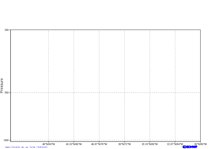 Image Added Image Added
|
|
Loading the netCDF data
In this exercise, we want to visualise a matrix stored in a netCDF file. netCDF is a very generic format, and can contain a lot of data. We will need to set up some information in order to explain to Magics which variable to plot, and how to interpret it.
The mnetcdf data action comes with a parameter list that can be found in the netCDF Input Page.
But first, let's see what is inside our netCDF Data
| Code Block |
|---|
|
netCDF section {
dimensions:
        levels = 85 ;
        longitude = 144 ;
        latitude = 144 ;
        p15220121030000000000001_1 = 2 ;
        p15220121030000000000001_2 = 144 ;
        orography_x_values = 144 ;
        orography_y1_values = 144 ;
        orography_y2_values = 144 ;
variables:
        double levels(levels) ;
        double longitude(longitude) ;
        double latitude(latitude) ;
double p13820121030000000000001(levels, longitude) ; |
We want to display the variable p13820121030000000000001, and inform Magics that the dimensions of the matrix are described in the 2 variables levels and longitude.
The range of the vorticity values is quite small, then we would like to apply a scaling factor of 100000.
We will then just apply a basic contouring.
| Section |
|---|
| Column |
|---|
|
| Info |
|---|
|
| Useful netCDF parameters |
|---|
netcdf_filename | | netcdf_value_variable | | netcdf_field_scaling_factor | | netcdf_y_variable | | netcdf_x_variable | | netcdf_x_auxiliary_variable |
|
| Code Block |
|---|
| language | python |
|---|
| theme | Confluence |
|---|
| title | Python - Loading a Netcdf |
|---|
| collapse | true |
|---|
| from Magics.macro import *
#setting the output
output = output(
output_formats = ['png'],
output_name = "xsect_step3",
output_name_first_page_number = "off"
)
# Setting the cartesian view
projection = mmap(
subpage_map_projection='cartesian',
subpage_x_axis_type='geoline',
subpage_y_axis_type='logarithmic',
subpage_x_min_latitude=50.,
subpage_x_max_latitude=30.,
subpage_x_min_longitude=-90.,
subpage_x_max_longitude=-60.,
subpage_y_min=1020.,
subpage_y_max=200.,
)
# Vertical axis
vertical = maxis(
axis_orientation='vertical',
axis_grid='on',
axis_type='logarithmic',
axis_tick_label_height=0.4,
axis_tick_label_colour='charcoal',
axis_grid_colour='charcoal',
axis_grid_thickness=1,
axis_grid_reference_line_style='solid',
axis_grid_reference_thickness=1,
axis_grid_line_style='dash',
axis_title='on',
axis_title_text='Pressure',
axis_title_height=0.6,
)
# Horizontal axis
horizontal = maxis(
axis_orientation='horizontal',
axis_type='geoline',
axis_tick_label_height=0.4,
axis_tick_label_colour='charcoal',
axis_grid='on',
axis_grid_colour='charcoal',
axis_grid_thickness=1,
axis_grid_line_style='dash',
)
# Definition of the netCDF data and interpretation
data = mnetcdf(netcdf_filename = "section.nc",
netcdf_value_variable = "p13820121030000000000001",
netcdf_field_scaling_factor = 100000.,
netcdf_y_variable = "levels",
netcdf_x_variable = "longitude",
netcdf_x_auxiliary_variable = "latitude"
)
contour = mcont()
plot(output, projection, horizontal, vertical, data, contour) |
|
| Column |
|---|
| 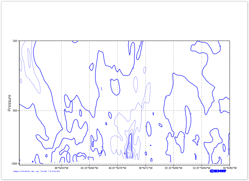 Image Added Image Added
|
|
Creating a nice shading
Now, we just create a nice polygon shading.
The list of levels we want to use is : [-200., -100., -75., -50., -30., -20., -15., -13., -11., -9., -7., -5., -3., -1., 1., 3., 5., 7., 9., 11., 13., 15., 20., 30., 50., 75., 100., 200].
and the list of colours is : ["rgb(0,0,0.3)", "rgb(0,0,0.5)", "rgb(0,0,0.7)", "rgb(0,0,0.9)", "rgb(0,0.15,1)", "rgb(0,0.3,1)", "rgb(0,0.45,1)", "rgb(0,0.6,1)", "rgb(0,0.75,1)", "rgb(0,0.85,1)", "rgb(0.2,0.95,1)", "rgb(0.45,1,1)", "rgb(0.75,1,1)", "none", "rgb(1,1,0)","rgb(1,0.9,0)", "rgb(1,0.8,0)", "rgb(1,0.7,0)", "rgb(1,0.6,0)", "rgb(1,0.5,0)", "rgb(1,0.4,0)", "rgb(1,0.3,0)", "rgb(1,0.15,0)", "rgb(0.9,0,0)", "rgb(0.7,0,0)", "rgb(0.5,0,0)", "rgb(0.3,0,0)"],
Do not forget to turn the legend on ...
You could quickly check Contour Documentation
| Section |
|---|
| Column |
|---|
|
| Info |
|---|
|
| Useful contour parameters |
|---|
contour_level_selection_type | | contour_level_list | | contour_shade | contour_shade_method | contour_shade_colour_method | | contour_shade_colour_list | | legend |
|
| Code Block |
|---|
| language | python |
|---|
| theme | Confluence |
|---|
| title | Python - Using a shading |
|---|
| collapse | true |
|---|
| from Magics.macro import *
#setting the output
output = output(
output_formats = ['png'],
output_name = "xsect_step3",
output_name_first_page_number = "off"
)
# Setting the cartesian view
projection = mmap(
subpage_map_projection='cartesian',
subpage_x_axis_type='geoline',
subpage_y_axis_type='logarithmic',
subpage_x_min_latitude=50.,
subpage_x_max_latitude=30.,
subpage_x_min_longitude=-90.,
subpage_x_max_longitude=-60.,
subpage_y_min=1020.,
subpage_y_max=200.,
)
# Vertical axis
vertical = maxis(
axis_orientation='vertical',
axis_grid='on',
axis_type='logarithmic',
axis_tick_label_height=0.4,
axis_tick_label_colour='charcoal',
axis_grid_colour='charcoal',
axis_grid_thickness=1,
axis_grid_reference_line_style='solid',
axis_grid_reference_thickness=1,
axis_grid_line_style='dash',
axis_title='on',
axis_title_text='Pressure',
axis_title_height=0.6, |
|
|
| Code Block |
|---|
| theme | Confluence |
|---|
| language | python |
|---|
| title | Python - Coastlines |
|---|
| collapse | true |
|---|
|
from Magics.macro import *
#setting the output
output = output(
                output_formats = ['png'],
                output_name = "map_step2",
                output_name_first_page_number = "off"
        )
#settings of the geographical area
area = mmap(subpage_map_projection="cylindrical",
        subpage_lower_left_longitude=-110.,
        subpage_lower_left_latitude=20.,
        subpage_upper_right_longitude=-30.,
        subpage_upper_right_latitude=70.,
    )
 #settings of the caostlines
coast = mcoast(map_coastline_land_shade = "on",
      map_coastline_land_shade_colour = "cream",
      map_grid_line_style = "dash",
      map_grid_colour = "grey",
      map_label = "on",
      map_coastline_colour = "grey")
plot(output, area, coast) |
| Column |
|---|
|
Image Removed |
Visualising the Mean Sea Level Pressure field
The visualisation of any data in Magics is done by combining 2 kind of objects. One, the Data Action, is used to define the data and explain to Magics how to interpret it, the other one is called Visual Action and will define the type of visualisation and its attributes.
In this example our data are in a grib file msl.grib. The Data Action to be used is mgrib in is documented in Grib Input Documentation.
The Visualisation we want to apply is a basic contouring, using black for the lines and an interval of 5 hPa, between isolines. We also want to add a automatic legend, with our own text "Mean Sea Level Pressure". Follow the link to access the Contouring Documentation.
| Section |
|---|
| Column |
|---|
| | Info |
|---|
| mgrib action to load the data |
|---|
| grib_input_file_name |
| mcont action to define a contouring |
|---|
| contour_line_colour | | contour_line_thickness | | contour_highlight_colour | | contour_highlight_thickness | | contour_hilo | | contour_level_selection_type | | contour_interval | | legend | | contour_legend_text |
| Code Block |
|---|
| theme | Confluence |
|---|
| language | python |
|---|
| title | Python - Msl Visualisation |
|---|
| collapse | true |
|---|
| from Magics.macro import *
#setting the output
output = output(
output_formats = ['png'],
output_name = "map_step3",
output_name_first_page_number = "off"
)
#settings of the geographical area
area = mmap(subpage_map_projection="cylindrical"# Horizontal axis
horizontal = maxis(
axis_orientation='horizontal',
subpage_lower_left_longitude=-110.axis_type='geoline',
subpageaxis_lowertick_leftlabel_latitudeheight=200.4,
subpageaxis_uppertick_rightlabel_longitude=-30.colour='charcoal',
subpage_upper_right_latitude=70.axis_grid='on',
)
#settings of the caostlines
coast = mcoast(map_coastline_land_shade = "on"axis_grid_colour='charcoal',
map axis_coastline_land_shade_colour = "cream"grid_thickness=1,
map axis_grid_line_style = "'dash"',
map_grid_colour = "grey",
map_label)
# Definition of the netCDF data and interpretation
data = mnetcdf(netcdf_filename = "onsection.nc",
mapnetcdf_coastlinevalue_colourvariable = "greyp13820121030000000000001"),
#Loading the msl Grib data
msl = mgrib(gribnetcdf_inputfield_filescaling_name="msl.grib")
#Defining the controur
contour = mcont(contour_highlight_colour= "blackfactor = 100000.,
netcdf_y_variable = "levels",
netcdf_x_variable = "longitude",
contour_highlight_thickness= 4,netcdf_x_auxiliary_variable = "latitude"
)
contour = mcont(contour_highlight= "off",
contour_hilo= "off",
contour_label= "off",
legend='on',
contour_level_interval= 5list= [-200., -100.,
-75., -50., -30., -20.,
-15., -13., contour_label= "on",
-11., -9., -7., -5., -3., -1., 1., 3., 5.,
contour_label_frequency= 2,
7., 9., 11., 13., 15., 20., 30., 50., 75., 100., 200],
contour_labellevel_selection_heighttype= 0.4"level_list",
contour_shade= "on",
contour_levelshade_selectioncolour_type= "interval",list= ["rgb(0,0,0.3)", "rgb(0,0,0.5)",
"rgb(0,0,0.7)", "rgb(0,0,0.9)", "rgb(0,0.15,1)",
contour_line_colour= "black", "rgb(0,0.3,1)", "rgb(0,0.45,1)", "rgb(0,0.6,1)",
"rgb(0,0.75,1)", contour_line_thickness= 2"rgb(0,0.85,1)", "rgb(0.2,0.95,1)",
legend='on',
"rgb(0.45,1,1)", "rgb(0.75,1,1)", "none", "rgb(1,1,0)",
contour_legend_text= "Mean Sea Level Pressure",
)
plot(output, area, coast, msl, contour) |
|
| Column |
|---|
| Image Removed |
|
Visualising the precipitation field
The goal of this exercise is to discover a bit more the diverse styles of visualisation offered by the mcont object.
We are pre-processed grib field containing the precipitation accumulated in the last 6 hours of the valid time. We want to disable the automatic scaling appled by Magics and use our own scaling factor, in this case 1000.
Here we will work with shading, and we will use a different technique to setup the levels we want to contour.
We want to use the following list of levels for contouring [0.5, 2., 4., 10., 25., 50., 100., 250.]
and the following list of colours ["cyan", "greenish_blue", "blue", "bluish_purple", "magenta", "orange", "red", "charcoal"]
...
...
mgrib action to load the data |
|---|
| grib_input_file_name |
| grib_automatic_scaling |
| grib_scaling_factor |
| mcont action to define a contouring |
|---|
| contour_level_selection_type |
| contour_level_list |
| contour_shade |
| contour_shade_method |
| contour_shade_colour_method |
| contour_level_selection_type |
| contour_shade_colour_list |
| legend |
"rgb(1,0.9,0)", "rgb(1,0.8,0)", "rgb(1,0.7,0)",
        "rgb(1,0.6,0)", "rgb(1,0.5,0)", "rgb(1,0.4,0)",
        "rgb(1,0.3,0)", "rgb(1,0.15,0)", "rgb(0.9,0,0)",
        "rgb(0.7,0,0)", "rgb(0.5,0,0)", "rgb(0.3,0,0)"],
    contour_shade_colour_method= "list",
    contour_shade_method= "area_fill")
plot(output, projection, horizontal, vertical, data, contour) |
|
| Column |
|---|
| 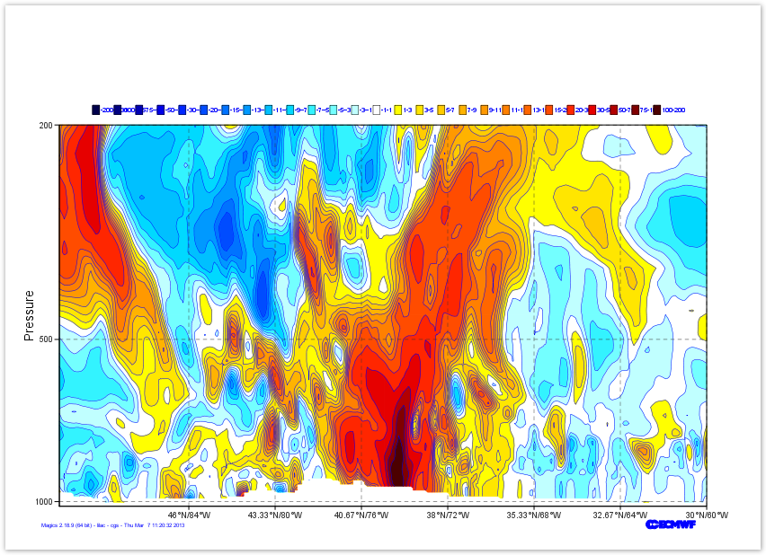 Image Added Image Added
|
|
Position the legend
By default, the legend is is positioned at the top of the plot. In this exercise we want to put see our legend on a column mode on the right of the plot.
The Information about the positional mode can be found in the Legend Documentation
| Section |
|---|
| Column |
|---|
|
| Info |
|---|
|
| Useful legend parameters |
|---|
legend | | legend_display_type | legend_box_mode | | legend_box_x_position | legend_box_y_position | legend_box_x_length | | legend_box_y_length | | legend_box_blanking | | legend_border |
|
| Code Block |
|---|
| language | python |
|---|
| theme | Confluence |
|---|
| title | Python - Position the legend |
|---|
| collapse | true |
|---|
| from Magics.macro import *
#setting the output
output = output(
output_formats = ['png'],
output_name = "xsect_step5",
output_name_first_page_number = "off"
)
# Setting the cartesian view
projection = mmap(
subpage_map_projection='cartesian',
subpage_x_axis_type='geoline',
subpage_y_axis_type='logarithmic',
subpage_x_min_latitude=50.,
subpage_x_max_latitude=30.,
subpage_x_min_longitude=-90.,
subpage_x_max_longitude=-60.,
subpage_y_min=1020.,
subpage_y_max=200.,
)
# Vertical axis
vertical = maxis(
axis_orientation='vertical',
axis_grid='on',
axis_type='logarithmic',
axis_tick_label_height=0.4,
axis_tick_label_colour='charcoal',
axis_grid_colour='charcoal',
axis_grid_thickness=1,
axis_grid_reference_line_style='solid',
axis_grid_reference_thickness=1,
axis_grid_line_style='dash',
axis_title='on',
axis_title_text='Pressure' |
|
|
| Code Block |
|---|
| theme | Confluence |
|---|
| language | python |
|---|
| title | Python - Use of Shading |
|---|
| collapse | true |
|---|
|
#setting the output
output = output(
                output_formats = ['png'],
                output_name = "map_step4",
                output_name_first_page_number = "off"
        )
#settings of the geographical area
area = mmap(subpage_map_projection="cylindrical",
        subpage_lower_left_longitude=-110.,
        subpage_lower_left_latitude=20.,
        subpage_upper_right_longitude=-30.,
        subpage_upper_right_latitude=70.,
    )
 #settings of the caostlines
coast = mcoast(map_coastline_land_shade = "on",
      map_coastline_land_shade_colour = "cream",
      map_grid_line_style = "dash",
      map_grid_colour = "grey",
      map_label = "on",
      map_coastline_colour = "grey")
#definition of the input data
precip = mgrib(grib_input_file_name="precip.grib",
    grib_automatic_scaling='off',
    grib_scaling_factor=1000.)
shading = mcont( contour_highlight= "off",
    contour_hilo= "off",
    contour_label="off",
    contour_level_list=[0.5, 2., 4., 10., 25., 50., 100., 250.],
    contour_level_selection_type= "level_list",
    contour_shade= "on",
    contour_shade_method= "area_fill",
    contour_shade_colour_method= "list",
    contour_shade_colour_list= ["cyan", "greenish_blue", "blue", "bluish_purple", "magenta", "orange", "red", "charcoal"],
    legend="on")

plot(output, area, coast, precip, shading) |
| Column |
|---|
|
Image Removed |
Overlaying the 2 layers and playing with legend
Here, we want to demonstrate the plot command.
The actions added to the plot command will be executed sequentially, and their result will be displayed from the background to the foreground .
Then, try to put the shaded layer (precipitation) behind the contoured layer (msl)
and try to improve the legend to make it look continuous, by checking the Legend Documentation.
| Section |
|---|
| Column |
|---|
| | Info |
|---|
| | Useful legend parameters |
|---|
legend | | legend_display_type | | legend_text_colour | | legend_text_font_size |
| Code Block |
|---|
| theme | Confluence |
|---|
| language | python |
|---|
| title | Python - Overlay |
|---|
| collapse | true |
|---|
| from Magics.macro import *
#setting the output
output = output(
output_formats = ['png'],
axis_title_height=0.6,
output_name = "map_step5",
)
# Horizontal axis
horizontal = maxis(
output_name_first_page_number = "off"axis_orientation='horizontal',
)
#settings of the geographical area
area = mmap(subpage_map_projection="cylindrical"axis_type='geoline',
axis_tick_label_height=0.4,
subpageaxis_lowertick_leftlabel_longitude=-110.colour='charcoal',
subpage_lower_left_latitude=20.axis_grid='on',
subpageaxis_uppergrid_right_longitude=-30.colour='charcoal',
subpageaxis_uppergrid_right_latitude=70.thickness=1,
)
#settings of the caostlines
coast = mcoast(map_coastline_land_shade = "on",
axis_grid_line_style='dash',
map_coastline_land_shade_colour = "cream",
map_grid_line_style)
# Definition of the netCDF data and interpretation
data = mnetcdf(netcdf_filename = "dashsection.nc",
mapnetcdf_gridvalue_colourvariable = "greyp13820121030000000000001",
map_labelnetcdf_field_scaling_factor = "on"100000.,
mapnetcdf_coastliney_colourvariable = "greylevels"),
#definition of the input data
precip = mgrib(gribnetcdf_input_file_name="precip.grib",
x_variable = "longitude",
gribnetcdf_x_automaticauxiliary_scaling='off', variable = "latitude"
grib_scaling_factor=1000.)
#definition of shading
shading contour = mcont( contour_highlight= "off",
contour_hilo= "off",
contour_label= "off",
legend='on',
contour_level_list= [0-200.5, 2-100., 4-75., 10-50., 25-30., 50., 100-20., 250.],
contour_level_selection_type= "level_list",
contour_shade= "on",
contour_shade_method= "area_fill",
contour_shade_colour_method= "list",
contour_shade_colour_list= ["cyan", "greenish_blue", "blue", "bluish_purple", "magenta", "orange", "red", "charcoal"],
legend="on")
#definition of msl
msl = mgrib(grib_input_file_name="msl.grib")
#Definition of the black contouring
contour = mcont( contour_highlight_colour= "black -15., -13., -11., -9., -7., -5., -3., -1., 1., 3., 5.,
7., 9., 11., 13., 15., 20., 30., 50., 75., 100., 200],
contour_level_selection_type= "level_list",
contour_shade= "on",
contour_shade_colour_list= ["rgb(0,0,0.3)", "rgb(0,0,0.5)",
"rgb(0,0,0.7)", contour_highlight_thickness= 4,"rgb(0,0,0.9)", "rgb(0,0.15,1)",
contour_hilo= "off","rgb(0,0.3,1)", "rgb(0,0.45,1)", "rgb(0,0.6,1)",
contour_interval= 5.,"rgb(0,0.75,1)", "rgb(0,0.85,1)", "rgb(0.2,0.95,1)",
contour_label= "on",
contour_label_frequency= 2,"rgb(0.45,1,1)", "rgb(0.75,1,1)", "none", "rgb(1,1,0)",
"rgb(1,0.9,0)", "rgb(1,0.8,0)", "rgb(1,0.7,0)",
contour_label_height= 0.4,
"rgb(1,0.6,0)", "rgb(1,0.5,0)", "rgb(1,0.4,0)",
contour_legend_text= "Mean Sea Level Pressure","rgb(1,0.3,0)", "rgb(1,0.15,0)", "rgb(0.9,0,0)",
contour_level_selection_type= "interval""rgb(0.7,0,0)", "rgb(0.5,0,0)", "rgb(0.3,0,0)"],
contour_lineshade_colour_method= "blacklist",
contour_lineshade_thicknessmethod= 2,
"area_fill")
legend = mlegend(legend='on'
',
)
#Definition of the legend
legend = mlegend(legend='on',
legend_display_type='continuous',
legend_text_colour='charcoal',
legend_text_displayfont_type='continuous'size=0.4,
legend_box_mode = "positional",
legend_box_x_position = 27.00,
legend_text_colour='charcoal',
box_y_position = 3.00,
legend_box_x_length = 2.00,
legend_textbox_fonty_sizelength =0 13.400,
legend_box_blanking = "on",
legend_border = )"on",
plotlegend_border_colour='charcoal')
plot(output, areaprojection, coasthorizontal, precipvertical, shading, msldata, contour, legend) |
| 200px | Image Removed |
|
Adding the position of New York City
To demonstrate the use of symbols plotting, we are going to add a big red dot where New York City is.We will the add the text NYC in black on top of the dot.
The position of New York is [41oN, 74oE], we can give this position to Magics using the minput object, documented in Input Data Page.
The symbol is performed using the msymb object. You can find the full options in the Symbol Documentation.
| 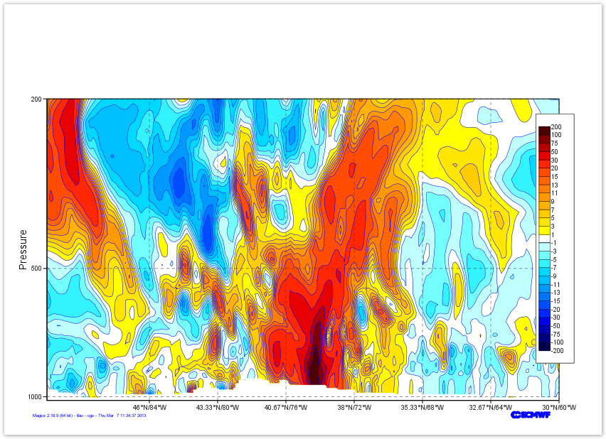 Image Added Image Added
|
|
|
add a Title
Last thing to do here .. We add a title to the top..
Here we will use a combination of User text and automatic text ( read from the netCDF global attribute title)
To get the automatic title, you have to use the following tag <magics_title/>
Check the Text Plotting Page for more information
| Section |
|---|
| Section |
|---|
| Column |
|---|
|
| Info |
|---|
|
| Useful input parameters |
|---|
input_x_values | | input_y_values | | Text parameters |
|---|
text_lines | | Useful Symbol parameters |
|---|
| symbol_colour | | symbol_marker_index | | symbol_height | symbol_type | | symbol_text_list | | symbol_text_font_sizesymbol_ | | text_font_colour | | symbol_text_font_style | | symbol_text_position | |
|
| Code Block |
|---|
| code | | theme | Confluence | language | python |
|---|
| title | Python - Adding New-York CityPosition the legend |
|---|
| collapse | true |
|---|
| from Magics.macro import *
#setting the output
output = output(
output_formats = ['png'],
output_name = "map_step6",from Magics.macro import *
#setting the output
output = output(
output_name_first_page_numberformats = "off"['png'],
)
output_name
#---------------------------------------
# definition of the previsous layers
# ...
# ...
#---------------------------------------
#definition of New-York city
new_york = minput(= "xsect_step6",
output_name_first_page_number = "off"
)
# Setting the input_x_valuescartesian view
projection = mmap(
= [-74.]subpage_map_projection='cartesian',
input_y_valuessubpage_x_axis_type='geoline',
= [41.]subpage_y_axis_type='logarithmic',
subpage_x_min_latitude=50.,
)
#definition of the symbol
point = msymb( subpage_x_max_latitude=30.,
subpage_x_min_longitude=-90.,
symbol_type subpage_x_max_longitude=-60.,
"both",
subpage_y_min=1020.,
symbolsubpage_text_listy_max=200.,
= ["NYC"],
)
# Vertical axis
vertical = maxis(
symbol_marker_indexaxis_orientation='vertical',
= 28axis_grid='on',
axis_type='logarithmic',
symbol_colour axis_tick_label_height=0.4,
"red",
axis_tick_label_colour='charcoal',
symbol_heightaxis_grid_colour='charcoal',
= 0.5axis_grid_thickness=1,
symbol_text_font_size = 0.40axis_grid_reference_line_style='solid',
symbol_text_font_colour = "black"axis_grid_reference_thickness=1,
symbol_text_position = "top"axis_grid_line_style='dash',
axis_title='on',
symbolaxis_title_text_font_style = "bold ",
='Pressure',
axis_title_height=0.6,
)
plot(output, area, coast, precip, shading, msl, contour, new_york, point, legend) |
|
| Column |
|---|
| Image Removed |
|
Adding a line to show our next Cross-section
In the next exercise, we will display a Cross-section of the Vorticity across the Storm.
We want to show this line of our plot as a black thick line.
The stating point is [50oN, 90oE], the end point is [30oN, 60oE] : it can be passed to Magics using the minput object, documented in Input Data Page.
To draw the line we will use the mgraph object. All the parameters are available in the Graph Plotting Documentation.
| Section |
|---|
| Column |
|---|
| | Info |
|---|
| | Useful input parameters |
|---|
input_x_values | | input_y_values |
| Useful Graph parameters |
|---|
| graph_line | | graph_line_colour |
| Code Block |
|---|
| theme | Confluence |
|---|
| language | python |
|---|
| title | Python - Adding a line |
|---|
| collapse | true |
|---|
| from Magics.macro import *
#setting the output
output = output(
output_formats = ['png']# Horizontal axis
horizontal = maxis(
axis_orientation='horizontal',
axis_type='geoline',
axis_tick_label_height=0.4,
axis_tick_label_colour='charcoal',
axis_grid='on',
axis_grid_colour='charcoal',
axis_grid_thickness=1,
axis_grid_line_style='dash',
)
# Definition of the netCDF data and interpretation
data = mnetcdf(netcdf_filename = "section.nc",
netcdf_value_variable = "p13820121030000000000001",
netcdf_field_scaling_factor = 100000.,
netcdf_y_variable = "levels",
netcdf_x_variable = "longitude",
output_namenetcdf_x_auxiliary_variable = "map_step7latitude",
)
contour = mcont(contour_highlight= "off",
contour_hilo= "off",
output_name_first_page_number contour_label= "off",
legend='on',
contour_level_list= [-200., -100., )
-75., -50., -30., -20.,
-15., -13.,
#-11., --------------------------------------
# definition of the previous layers
# ...
# ...
#---------------------------------------
#definition of the Xsection Line
xsection = minput(
input_x_values = [-74.],9., -7., -5., -3., -1., 1., 3., 5.,
7., 9., 11., 13., 15., 20., 30., 50., 75., 100., 200],
contour_level_selection_type= "level_list",
contour_shade= "on",
contour_shade_colour_list= ["rgb(0,0,0.3)", "rgb(0,0,0.5)",
"rgb(0,0,0.7)", "rgb(0,0,0.9)", "rgb(0,0.15,1)",
input_y_values = [41.]"rgb(0,0.3,1)", "rgb(0,0.45,1)", "rgb(0,0.6,1)",
)
#definition of the graph
line = mgraph(
graph_line_colour = "black",
"rgb(0,0.75,1)", "rgb(0,0.85,1)", "rgb(0.2,0.95,1)",
"rgb(0.45,1,1)", "rgb(0.75,1,1)", "none", "rgb(1,1,0)",
"rgb(1,0.9,0)", graph_line_thickness "rgb(1,0.8,0)", "rgb(1,0.7,0)",
= 4
"rgb(1,0.6,0)", "rgb(1,0.5,0)", "rgb(1,0.4,0)",
)
plot(output, area, coast, precip, shading, msl, contour, new_york, point, xsection, line, legend) |
|
| Column |
|---|
| Image Removed |
|
Adding a title
We have now a very nice plot... let's add a title at the top.
Text box can be embedded everywhere on a plot, but the default position will be a title at the top of the plot, above an potential legend.
The text facility is documented in the Text Plotting Page.
| Column |
|---|
| | Info |
|---|
| | Useful Text parameters |
|---|
text_lines | | text_font_size | | text_colour | | text_font_style |
| Code Block |
|---|
| theme | Confluence |
|---|
| language | python |
|---|
| title | Python - Adding a text |
|---|
| collapse | true |
|---|
| from Magics.macro import *
#setting the output
output = output(
"rgb(1,0.3,0)", "rgb(1,0.15,0)", "rgb(0.9,0,0)",
"rgb(0.7,0,0)", "rgb(0.5,0,0)", "rgb(0.3,0,0)"],
contour_shade_colour_method= "list",
contour_shade_method= "area_fill")
legend = mlegend(legend='on',
legend_display_type='continuous',
legend_text_colour='charcoal',
legend_text_font_size=0.4,
outputlegend_box_formatsmode = ['png']"positional",
legend_box_x_position = 27.00,
legend_box_y_position = 3.00,
output_namelegend_box_x_length = "map_step8"2.00,
legend_box_y_length = 13.00,
outputlegend_name_first_page_numberbox_blanking = "offon",
legend_border = "on",
legend_border_colour='charcoal')
title = mtext(
#---------------------------------------
# definition of the previous layers
# ...
# ...
#---------------------------------------
#definition of the text
title = mtext(text_lines=['Sandy', '30th of October 2012'],
text_lines= ['Example of Xsection to demonstrate the use of netCDF data...',
'<magics_title/>'],
text_html= 'true',
text_font_size justification= 0.8'left',
text_font_coloursize= "charcoal"0.8,
text_font_stylecolour= 'boldcharcoal',
)
plot(output, areaprojection, coasthorizontal, precipvertical, shading, msldata, contour, new_york, point, xsection, line, legend, title) |
|
| Column |
|---|
| Image Removed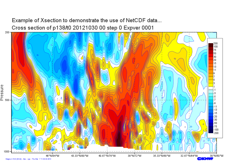 Image Added Image Added |
|
Go to the next step...
Go back to the main page ...
...