
This page summarises the important features of the EFAS sub-seasonal outlook products. Further information on the details of the different steps generating these products is available at CEMS-flood sub-seasonal and seasonal forecast product generation methodology.
'Sub-seasonal Outlook' and 'Sub-seasonal Outlook - Basins' layers
The EFAS sub-seasonal outlook layers show maps of the 'expected to happen' forecast anomaly and related uncertainty for the next 5-6 calendar weeks for all river pixels over 250 km2 (river network layer called 'Sub-seasonal Outlook' on the map viewer) and for 204 major river basins over the EFAS domain (basin layer called 'Sub-seasonal Outlook - Basins' on the map viewer), using colour-coded categories (see Figure 1). The products are updated once a day and published around mid afternoon, showing:
- forecast anomaly expressed in one of 5+2 categories from extreme low to extreme high, which are derived from specific model climatology percentiles
- forecast uncertainty is categorised into low, medium and high levels, based on the spread of the ensemble member extremity levels
The forecast anomaly and uncertainty are based on the extremity levels of the weekly averaged river discharge of the ensemble members in the context of the model climatology. The model climatology is range-dependent (changes with the lead time) and generated from 20 years of reforecast hydrological simulations (2004-2023).
The forecast evolution of the anomaly is also given in popup window products for fixed reporting points (grey squares along the river network) and basin-representative points (black circles, one point for each of the 204 predefined basins).

Figure 1: EFAS sub-seasonal outlook maps on the EFAS-IS map viewer. A lead-time selection panel on the mapviewer allows the users to select the forecast period.
Reporting point pop-up window products
From the river network summary map, the reporting point pop-up products can be accessed by clicking on the point markers on the river network layer (grey squares showing the EFAS fixed reporting points - see more in CEMS-Flood reporting points and dynamic point generation algorithm, and the black circles showing the basin-representative points). The pop-up products contain metadata information about the stations, a hydrograph with the evolution of the climatological, antecedent and forecast conditions, and the probability values for the extended 7-value anomaly categories (the 5 main categories shown on the maps and hydrographs, extended by two additional categories within the 'Near normal' category) and the evolution of these probabilities from previous forecast runs.
The hydrographs are retrospectively updated each week once, when the proxi-observed river discharge values become available for one further week. This happens usually on Mondays or Tuesdays, but sometimes it can be delayed. This means, one extra black dot will appear on the hydrographs showing what actually happened during that week. First, the week right before the forecast period (in few forecast runs it can be 2 weeks) that is missing the black dot, will be updated. Then, one by one, each week, a further black dot will appear in the forecast section of the hydrographs. The users are encouraged to go back and check previous forecasts to see how well earlier forecasts predicted the anomalies.

Figure 2: Discharge hydrograph showing weekly-averaged antecedent, climate and forecast evolution out to 5-6 weeks.

Figure 3: Forecast probability evolution table example with (a) probabilities values (as numbers) for all anomaly categories with the extended 7-category version ('Extreme low' (EL), 'Low' (L), 'Bit low' (BL), 'Normal' (N), 'Bit high' (BH), 'High' (H) and 'Extreme high' (EH), as left to right); (b) ‘expected to happen’ anomaly category as the one coloured cell at each calendar weekly forecast lead time, the colour dependent on the anomaly and on the related forecast uncertainty category (how uncertain the forecast is; either low, medium or high). Each main column (7-column groups) represent a calendar weekly forecast lead time, indicated by the date of the Monday of the week, and the rows show the most recent forecast start dates (the most recent being on top), which are always at 00 UTC of the indicated date. The number of rows differs from forecast run to forecasts run, and varies from 34 (for a Tuesday forecast run) to 40 (for a Monday forecast run).
Different legends to help interpret the forecast signal

Figure 4: Combination of anomaly and uncertainty categories, defined by the mean and standard deviation of the ensemble member ranks, used in the EFAS Seasonal Outlook products. Note, only the 5 main categories are used in the map layers and the hydrograph, with the near-normal categories merged together into 'Near normal'.

Table 1: Anomaly categories defined by the mean of the ensemble member ranks, used for classifying the forecast signal (colours) in the EFAS Seasonal Outlook products.

Table 2: Uncertainty categories defined by the standard deviation of the ensemble member ranks, used for classifying the forecast uncertainty (colour intensity) in the EFAS Seasonal Outlook products.
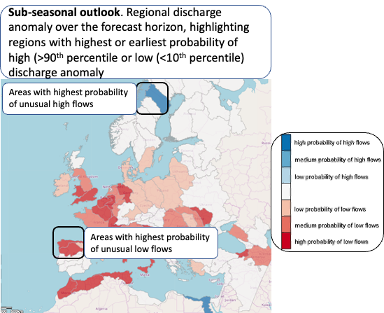
The EFAS Seasonal outlook layer shows the maximum area-averaged probability of unusually high (> 90th percentile, blue) or low (<10th percentile, red) weekly river flow occurring during the 8-week forecast horizon for 74 major river basins over the EFAS domain, using colour-coded categories:
- Dark blue: high (> 90%) probability of high flows
- Medium blue: medium (75-90%) probability of high flows
- Light blue: low probability (50-75%) of high flows
- White: Near normal flow (below 50% for both low and high flow)
- Light red: low probability (50-75%) of low flows
- Medium red: 75-90% probability of low flows
- Dark red: > 90% probability of low flows
Pop-up window
Note that the area-averaged discharge is scale dependant and values will change with resolution change, between EFAS v4 and EFAS v5.
