-
Created by
 Unknown User (nagc), last updated on Mar 07, 2017
20 minute read
Unknown User (nagc), last updated on Mar 07, 2017
20 minute read
Introduction
In these exercises we will look at a case study of a severe storm using a forecast ensemble. During the course of the exercise, we will explore the scientific rationale for using ensembles, how they are constructed and how ensemble forecasts can be visualised. A key question is how uncertainty from the initial data and the model parametrizations impact the forecast.
You will start by studying the evolution of the ECMWF analyses and forecasts for this event. You will then run your own OpenIFS forecast for a single ensemble member at lower resolutions and work in group to study the OpenIFS ensemble forecasts.
Caveat
In practise many cases are aggregated in order to evaluate the forecast behaviour of the ensemble. However, it is always useful to complement such assessments with case studies of extreme events, like the one in this exercise, to get a more complete picture of IFS performance and identify weaker aspects that need further exploration.
Recap
ECMWF operational forecasts consist of:
- HRES : T1279 (16km grid) highest resolution 10 day deterministic forecast
- ENS : T639 (34km grid) resolution ensemble forecast (50 members) is run for days 1-10 of the forecast, T319 (70km) is run for days 11-15.
Saving images and printing
To save images during these exercises for discussion later, you can either use:
"Export" button in Metview's display window under the 'File' menu to save to PNG image format. This will also allow animations to be saved into postscript.
or use the following command to take a 'snapshot' of the screen:
ksnapshot
Printing
For hardcopy prints use the printer ('ps_classroom') at the rear of the classroom and only print if necessary
St Jude wind-storm highlights
The case study will look at one of several severe wind-storms that hit Europe in late 2013 (see handout of ECMWF article by Hewson et al, ECMWF Newsletter 139).
- On the 28th October 2013 a small, severe wind-storm named St Jude in the UK, hit the UK & north-western Europe.
- A total of 19 people were killed across Europe, 5 in the UK.
- The return period of the event based on wind-gust observations show the 10yr return period was exceeded along the North Sea coast.
- From the 23rd October, the ECMWF forecast predicted a greater than 70% probability of a severe wind event (greater than 60kt, 31m/s, at 1km) over southern England. A signal for the storm was evident from the 21st October.
- On the 24th October, the UK MetOffice issued an amber alert for wind-speed across southern England placing the potential impact in the highest category.
- The cyclone first appeared as a cold front wave, over the Atlantic, late on 25th October.
- It deepened and moved rapidly east then northeast, with the storm centre reaching southern Sweden late afternoon on the 28th.
- The most rapid deepening occurred between 06-12UTC on the 28th when the strongest wind gusts were observed.
Outline of exercises
The following schematic shows the flow of the 4 exercises.
We start by looking at the analyses to understand the development and behaviour of the storm. Then we look at the operational ECMWF forecast before then looking at the operational ensemble performance. Finally, the last exercise explores the role and impact of changing the degree of uncertainty represented in the forecasts.

Exercise 1. The ECMWF analysis
Handout
See map of observations of wind-gust during the storm and the timeseries of maximum gusts.
Starting up metview
Before starting metview, you may need to type a command to copy the exercise files to your user account.
metview
Please enter the folder 'openifs_2015' to begin working.
For this task, use the metview icons in the row labelled 'Analysis'

an_1x1.mv : this will plot a selection of parameters overlaid on one plot.
an_2x2.mv : this will plot a selection of parameters four plots to a page (two by two).
Getting started

Task 1: Mean-sea-level pressure & wind gust
Right-click the mouse button on the 'an_1x1.mv' icon and select the 'Visualise' menu item (see figure right)
After a few seconds, this will generate a map showing two parameters: mean-sea-level pressure (MSLP) and 3hrly max wind-gust at 10m (wgust10).
In the plot window, use the play button in the animation controls  to animate the map and follow the development and track of the storm.
You can use the 'Speed' menu to change the animation speed (each frame is every 3 hours).
Task 2: Geographical region
Right-click the mouse button on the 'an_1x1.mv' icon and select the 'Edit' menu item (see figure right).
An edit window appears that shows a number of lines of 'Metview macro' code. During these exercises you can change some of these to alter the parameters and plot types.

With mapType=0, the map will cover a smaller geographical area centred on the UK.
With mapType=1, the map will cover most of the North Atlantic
Change, mapType=0 to mapType=1 then click the play button ![]() at the top of the window (please ask if you are not sure).
at the top of the window (please ask if you are not sure).
Animate the storm on this smaller geographical map.
Task 3: Plot wind fields
Change the fields plotted to include the wind arrows.
Make sure you have the Edit window showing:
#Define plot list (min 1 - max 4)
plot1=["wgust10","mslp","wind10"]            # use square brackets when overlaying multiple parameters per plot
As above, click the play button and then animate the map that appears. You might also want to change the mapType back to 'mapType=1' to show the larger geographical area.
Discuss the storm development and behaviour with your colleagues & team members.
If you prefer to see multiple plots per page rather than overlay them, please use the an_2x2.mv macro.
That completes the first exercise.
If time
- Explore the storm development and passage using the other parameters available on other pressure levels.
Additional plotting tips.
For the an_2x2.mv icon the number of maps appearing in the plot layout can be 1, 2, 3 or 4. This is true of all the icons labelled '2x2'.
an_2x2.mv demonstrates how to plot a four-map layout in a similar fashion to the one-map layout. The only difference here is that you need to define four plots instead of one.
Right-click on the icon and select 'Edit'. Change the plot layout like this:

Note how some plots can be single parameters whilst others can be overlays of two (or more) fields.
Wind parameters can be shown either as arrows or as wind flags ('barbs') by adding 'f' to the end of variable name e.g. "wind10f".
Exercise 2: The operational HRES forecast
Recap
The ECMWF operational deterministic forecast is called HRES. The model runs at a spectral resolution of T1279, equivalent to 16km grid spacing.
Only a single forecast is run at this resolution as the computational resources required are demanding. The ensemble forecasts are run at a lower resolution.
Before looking at the ensemble forecasts, first understand the performance of the operational HRES forecast.
Available forecast dates
Data is provided for multiple forecasts starting from different dates, known as different lead times.
Available lead times for the St Judes storm are forecasts starting from these October 2013 dates: 24th, 25th, 26th and 27th, all at 00UTC.
Some tasks will use all the lead times, others require only one.
Questions
- How does the HRES forecast compare to analysis and observations?
- Was it a good or bad forecast? Why?
- How does the forecast change with the different lead times?
Available plot types

For this exercise, you will use the metview icons in the row labelled 'HRES forecast' as shown above.
hres_rmse.mv : this plots the root-mean-square-error growth curves for the operational HRES forecast for the different lead times.
hres_1x1.mv & hres_2x2.mv : these work in a similar way to the same icons used in the previous task where parameters from a single lead time can be plotted.
hres_to_an_runs.mv : this plots the same parameter from the different forecasts for the same verifying time. Use this to understand how the forecasts differed, particularly for the later forecasts closer to the event.
hres_to_an_diff.mv : this plots a single parameter as a difference between the operational HRES forecast and the ECMWF analysis. Use this to understand the forecast errors from the different lead times.
Parameters & map appearance. These macros have the same choice of parameters to plot and same choice of mapType, either the Atlantic sector or over Europe.
Getting started
Task 1: Forecast error
In this task, we'll look at the difference between the forecast and the analysis by using "root-mean-square error" curves as a way of summarising the performance of the forecast. Root-mean square error curves are a standard measure to determine forecast error compared to the analysis and several of the exercises will use them.
In this task, all 4 forecast dates will be used.
Using the hres_rmse.mv icon, right-click, select 'Edit' and plot the RMSE curves for MSLP (mean-sea-level pressure). Repeat for the 10m wind-gust parameter wgust10.
Repeat for both geographical regions: mapType=0 and mapType=1.
Q. What do the RMSE curves show?
Q. How do they vary according to lead-time?
Task 2: Compare forecast to analysis
a) Use the hres_to_an_runs.mv icon (right-click -> Edit) and plot the MSLP and wind fields. This shows a comparison of 3 of the 4 forecasts to the analysis (the macro can be edited to change the choice of forecasts).
b) Use the hres_to_an_diff.mv icon and plot the difference map between a forecast date and the analysis.
We suggest looking at only one forecast lead-time (run) but when working in teams, different members of the team could choose a different forecast.
If you want to change the default date, edit the following line:
#Model run
run=2013-10-24
Task 3: Team working
As a team, discuss the plots & parameters to address the questions above given what you see in the error growth curves and maps from task 2.
Look at the difference between forecast and analysis to understand the error in the forecast, particularly the starting formation and final error.
Team members can limit to a certain date and choose particular parameters for team discussion.
Remember to save (or print) plots of interest for later group discussion.
Exercise 3 : The operational ensemble forecasts
Recap
- ECMWF operational ensemble forecasts treat uncertainty in both the initial data and the model.
- Initial analysis uncertainty: sampled by use of Singular Vectors (SV) and Ensemble Data Assimilation (EDA) methods. Singular Vectors are a way of representing the fastest growing modes in the initial state.
- Model uncertainty: sampled by use of stochastic parametrizations In IFS this means Stochastically Perturbed Physical Tendencies (SPPT) and the spectral backscatter scheme (SKEB)
- Ensemble mean : the average of all the ensemble members. Where the spread is high, small scale features can be smoothed out in the ensemble mean.
- Ensemble spread : the standard deviation of the ensemble members and represents how different the members are from the ensemble mean.
Ensemble exercise tasks
This exercise has more tasks than the previous ones.
Visualising ensemble forecasts can be done in various ways. During this exercise, in order to understand the errors and uncertainties in the forecast, we will use a number of visualisation techniques.

General questions
- How does the ensemble mean 10m wind fields and MSLP compare to the HRES forecast and analysis?
- Examine the initial diversity in the ensemble and how the ensemble spread and error growth develops. What do the extreme forecasts look like?
- Are there any members that consistently provide a better forecast? Can you identify the members close to observations/analysis both from a qualitative and quantitative approach?
Available plot types

For these exercises please use the Metview icons in the row labelled 'ENS'.
ens_rmse.mv : this is similar to the oper_rmse.mv in the previous exercise. It will plot the root-mean-square-error growth for the ensemble forecasts.
ens_to_an.mv : this will plot (a) the mean of the ensemble forecast, (b) the ensemble spread, (c) the HRES deterministic forecast and (d) the analysis for the same date.
ens_to_an_runs_spag.mv : this plots a 'spaghetti map' for a given parameter for the ensemble forecasts compared to the analysis. Another way of visualizing ensemble spread.
stamp.mv : this plots all of the ensemble forecasts for a particular field and lead time. Each forecast is shown in a stamp sized map. Very useful for a quick visual inspection of each ensemble forecast.
stamp_diff.mv : similar to stamp.mv except that for each forecast it plots a difference map from the analysis. Very useful for quick visual inspection of the forecast differences of each ensemble forecast.
Additional plots for further analysis:

pf_to_cf_diff.mv : this useful macro allows two individual ensemble forecasts to be compared to the control forecast. As well as plotting the forecasts from the members, it also shows a difference map for each.
ens_to_an_diff.mv : this will plot the difference between an ensemble forecast member and the analysis for a given parameter.
Getting started
Please refer to the handout showing the storm tracks labelled 'ens_oper' during this exercise. It is provided for reference and may assist interpreting the plots.
Each page shows 4 plots, one for each starting forecast lead time. The position of the symbols represents the centre of the storm valid 28th Oct 2013 12UTC. The colour of the symbols is the central pressure.
The actual track of the storm from the analysis is shown as the red curve with the position at 28th 12Z highlighted as the hour glass symbol. The HRES forecast for the ensemble is shown as the green curve and square symbol. The lines show the 12hr track of the storm; 6hrs either side of the symbol.
Note the propagation speed and direction of the storm tracks. The plot also shows the centres of the barotropic low to the North.
Q. What can be deduced about the forecast from these plots?
The plots in the handout can also be found in the 'pics' folder.
Task 1: RMSE "plumes"
This is similar to task 1 in exercise 2, except now the RMSE curves for all the ensemble members from a particular forecast will be plotted. All 4 forecast dates are shown.
Using the ens_rmse.mv icon, right-click, select 'Edit' and plot the curves for 'mslp' and 'wgust10'. Note this is only for the European region. The option to plot over the larger geographical region is not available.
Q. What features can be noted from these plumes?
Q. How do these change with different forecast lead times?
Note there appear to be some forecasts that give a lower RMS error than the control forecast. Bear this in mind for the following tasks.
If time
- Explore the plumes from other variables.
- Do you see the same amount of spread in RMSE from other pressure levels in the atmosphere?
Task 2: Ensemble spread
In the previous task, we have seen that introducing uncertainty into the forecast by starting from different initial conditions and enabling the stochastic parameterizations in IFS can result in significant differences in the RMSE (for this particular case and geographical region).
The purpose of this task is to explore the difference in more detail and look in particular at the 'ensemble spread'.
Refer to the storm track plots in the handout in this exercise.
Use the ens_to_an.mv icon and plot the MSLP and wind fields. This will produce plots showing: the mean of all the ensemble forecasts, the spread of the ensemble forecasts, the operational HRES deterministic forecast and the analysis.
Q. How does the mean of the ensemble forecasts compare to the HRES & analysis?
Q. Does the ensemble spread capture the error in the forecast?
Q. What other comments can you make about the ensemble spread?
If time:
- change the 'run=' value to look at the mean and spread for other forecast lead times.
- set the 'members=' option to change the number of members in the spread plots.
e.g. try a "reduced" ensemble by only using the first 5 ensemble members: "members=[1,2,3,4,5]".
Task 3: Spaghetti plots - another way to visualise spread
A "spaghetti" plot is where a single contour of a parameter is plotted for all ensemble members. It is another way of visualizing the differences between the ensemble members and focussing on features.
Use the ens_to_an_runs_spag.mv icon. Plot and animate the MSLP field using the default value for the contour level. This will indicate the low pressure centre. Note that not all members may reach the low pressure set by the contour.
Note that this macro may animate slowly because of the computations required.
Experiment with changing the contour value and (if time) plotting other fields.
Task 4: Visualise ensemble members and difference
So far we have been looking at reducing the information in some way to visualise the ensemble.
To visualise all the ensemble members as normal maps, we can use stamp maps. These are small, stamp sized contour maps plotted for each ensemble member using a small set of contours.
There are two icons to use, stamp.mv and stamp_diff.mv. Plot the MSLP parameter for the ensemble. Repeat for wind field.
Q. Using the stamp and stamp difference maps, study the ensemble. Identify which ensembles produce "better" forecasts.
Q. Can you see any distinctive patterns in the difference maps? Are the differences similar in some way?
If time:
Use the macros to see how the perturbations are evolving; use ens_to_an_diff.mv to compare individual members to the analyses.
Find ensemble members that appear to produce a better forecast and look to see how the initial development in these members differs. Start by using a single lead time and examine the forecast on the 28th.
- Select 'better' forecasts using the stamp plots and use ens_to_an.mv to modify the list of ensembles plots. Can you tell which area is more sensitive in the formation of the storm?
- use the pf_to_cf_diff macro to take the difference between these perturbed ensemble member forecasts from the control to also look at this.
Use 'mapType=1' to see the larger geographical area (please note that due to data volume restrictions, this mapType only works for the MSLP parameter).
Task 5: Cumulative distribution function at different locations
Recap
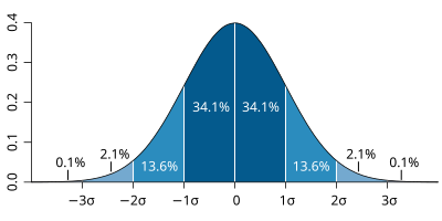
| The probability distribution function of the normal distribution or Gaussian distribution. The probabilities expressed as a percentage for various widths of standard deviations (σ) represent the area under the curve. |
|---|
Figure from Wikipedia. |
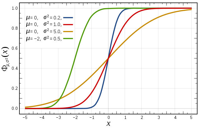
Cumulative distribution function for a normal |
|---|
Figure from Wikipedia. |
Cumulative distribution function (CDF)
The figures above illustrate the relationship between a normal distribution and its associated cumulative distribution function.The CDF is constructed from the area under the probability density function.
The CDF gives the probability that a value on the curve will be found to have a value less than or equal to the corresponding value on the x-axis. For example, in the figure, the probability for values less than or equal to X=0 is 50%.
The shape of the CDF curve is related to the shape of the normal distribution. The width of the CDF curve is directly related to the value of the standard deviation of the probability distribution function. For our ensemble, the width is then related to the 'ensemble spread'.
For a forecast ensemble where all values were the same, the CDF would be a vertical straight line.
Plot the CDF for 3 locations

This exercise uses the cdf.mv icon. Right-click, select 'Edit' and then:
- Plot the CDF of MSLP for the 3 locations listed in the macro.e.g. Reading, Amsterdam, Copenhagen.
- If time, change the forecast run date and compare the CDF for the different forecasts.
Q. What is the difference between the different stations and why? (refer to the ensemble spread maps to answer this)
Q. How does the CDF for Reading change with different forecast lead (run) dates?
Forecasting an event using an ensemble : Work in teams for group discussion
Ensemble forecasts can be used to give probabilities to a forecast issued to the public.
This type of problem is often discussed in terms of risk, or the idea of the cost/loss ratio of a user. Here the loss (L) would be some financial value that would be at loss if the bad weather forecast event happens and no precautionary actions had been taken. The costs (C) would be the financial value associated with precautionary actions in case the event happens. The ratio of the costs to the loss, often called C/L ratio, could then be used for decision making by users. If the costs are substantially smaller than the potential loss, then already a relatively small forecast probability for the event would indicate to take precautionary actions. Whereas for large C/L this is less, or not at all, the case.
Exercise 4. Exploring the role of uncertainty using OpenIFS forecasts
To further understand the impact of the different types of uncertainty (initial and model), some forecasts with OpenIFS have been made in which the uncertainty has been selectively disabled. These experiments use a 40 member ensemble and are at T319 resolution, lower than the operational ensemble.
As part of this exercise you may have run OpenIFS yourself in the class to generate another ensemble; one participant per ensemble member.
Recap
- EDA is the Ensemble Data Assimilation.
- SV is the use of Singular Vectors to perturb the initial conditions.
- SPPT is the stochastic physics parametrisation scheme.
- SKEB is the stochastic backscatter scheme applied to the model dynamics.
Experiments available:
- Experiment id: ens_both. EDA+SV+SPPT+SKEB : Includes initial data uncertainty (EDA, SV) and model uncertainty (SPPT, SKEB)
- Experiment id: ens_initial. EDA+SV only : Includes only initial data uncertainty
- Experiment id: ens_model. SPPT+SKEB only : Includes model uncertainty only
- Experiment id: ens_oifs. SPPT+SKEB only, class ensemble : this is the result of the previous task using the ensemble run by the class
These are at T319 with start dates: 24/25/26/27 Oct at 00UTC for a forecast length of 5 days with 3hrly output.
The aim of this exercise is to use the same visualisation and investigation as in the previous exercises to understand the impact the different types of uncertainty make on the forecast.
A key difference between this exercise and the previous one is that these forecasts have been run at a lower horizontal resolution. In the exercises below, it will be instructive to compare with the operational ensemble plots from the previous exercise.
For this exercise, we suggest either each team focus on one of the above experiments and compare it with the operational ensemble. Or, each team member focus on one of the experiments and the team discuss and compare the experiments.
The different macros available for this exercise are very similar to those in previous exercises.

For this exercise, use the icons in the row labelled 'Experiments'. These work in a similar way to the previous exercises.
ens_exps_rmse.mv : this will produce RMSE plumes for all the above experiments and the operational ensemble.
ens_exps_to_an.mv : this produces 4 plots showing the ensemble spread from the OpenIFS experiments compared to the analysis.
ens_exps_to_an_spag.mv : this will produce spaghetti maps for a particular parameter contour value compared to the analysis.
ens_part_to_all.mv : this allows the spread & mean of a subset of the ensemble members to be compared to the whole ensemble.
Note that the larger geographical area, mapType=1, will only work for MSLP due to data volume restrictions.
For these tasks the Metview icons in the row labelled 'ENS' can also be used to plot the different experiments (e.g. stamp plots). Please see the comments in those macros for more details of how to select the different OpenIFS experiments.
Remember that you can make copies of the icons to keep your changes.
Task 1. RMSE plumes
Use the ens_exps_rmse.mv icon and plot the RMSE curves for the different OpenIFS experiments.
Q. Compare the spread from the different experiments.
Q. The OpenIFS experiments were at a lower horizontal resolution. How does the RMSE spread compare between the 'ens_oper' and 'ens_both' experiments?
If time: change the 'run=' line to select a different forecast lead-time (run).
Task 2. Ensemble spread and spaghetti plots
Use the ens_exps_to_an.mv icon and plot the ensemble spread for the different OpenIFS experiments.
Also use the ens_exps_to_an_spag.mv icon to view the spaghetti plots for MSLP for the different OpenIFS experiments.
Q. What is the impact of reducing the resolution of the forecasts? (hint: compare the spaghetti plots of MSLP with those from the previous exercise).
Q. How does changing the representation of uncertainty affect the spread?
Q. Which of the experiments ens_initial and ens_model gives the better spread?
Q. Is it possible to determine whether initial uncertainty or model uncertainty is more or less important in the forecast error?
If time:
- use the ens_part_to_all.mv icon to compare a subset of the ensemble members to that of the whole ensemble. Use the stamp_map.mv icon to determine a set of ensemble members you wish to consider (note that the stamp_map icons can be used with these OpenIFS experiments. See the comments in the files).
Task 3. What initial perturbations are important
The objective of this task is to identify what areas of initial perturbation appeared to be important for an improved forecast in the ensemble.
Using the macros provided, find an ensemble member(s) that gave a consistently improved forecast and take the difference from the control. Step back to the beginning of the forecast and look to see where the difference originates from.
Use the large geographical area for this task. It is only possible to use the MSLP parameter for this task as it is the only one provided for the ensemble.
Task 4. Non-linear development
Ensemble perturbations are applied in positive and negative pairs. This is done to centre the perturbations about the control forecast.
So, for each computed perturbation, two perturbed initial fields are created e.g. ensemble members 1 & 2 are a pair, where number 1 is a positive difference compared to the control and 2 is a negative difference.
- Choose an odd & even ensemble pair (use the stamp plots). Use the appropriate icon to compute the difference of the members from the ensemble control forecast.
- Study the development of these differences using the MSLP and wind fields. If the error growth is linear the differences will be the same but of opposite sign. Non-linearity will result in different patterns in the difference maps.
- Repeat looking at one of the other forecasts. How does it vary between the different forecasts?
If time:
- Plot PV at 330K. What are the differences between the forecast? Upper tropospheric differences played a role in the development of this shallow fast moving cyclone.
Final remarks
Further reading
For more information on the stochastic physics scheme in (Open)IFS, see the article:
Shutts et al, 2011, ECMWF Newsletter 129.
Acknowledgements
We gratefully acknowledge the following for their contributions in preparing these exercises, in particular from ECMWF: Glenn Carver, Sandor Kertesz, Linus Magnusson, Martin Leutbecher, Iain Russell, Filip Vana, Erland Kallen. From University of Oxford: Aneesh Subramanian, Peter Dueben, Peter Watson, Hannah Christensen, Antje Weisheimer.