...
| Panel | ||
|---|---|---|
| ||
Q. Can you tell which area is more sensitive for the forecast? |
...
Exercise 4. CDF, percentiles and probabilities
| Warning |
|---|
TODO: create a new folder 'CDF_percentiles' and move the macros below into it. |
Recap
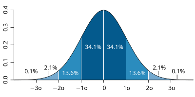
| The probability distribution function of the normal distribution or Gaussian distribution. The probabilities expressed as a percentage for various widths of standard deviations (σ) represent the area under the curve. |
|---|
Figure from Wikipedia. |
...
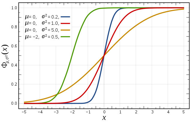
Cumulative distribution function for a normal |
|---|
Figure from Wikipedia. |
Task 1: Cumulative distribution function
...
The figures above illustrate the relationship between a normal distribution and its associated cumulative distribution function. The CDF is constructed from the area under the probability density function.
...
For a forecast ensemble where all values were the same, the CDF would be a vertical straight line.
Plot the CDFs
Enter the folder 'XXXXXXXXX'
| Warning |
|---|
TODO: update image |

This exercise uses the cdf.mv icon. Right-click, select 'Edit' and then:
- Plot the CDF of MSLP for Toulouse for your choice of ensemble (ens_oper or ens_2016).
- Find a latitude/longitude point in the area of intense precipitation on 12Z 24/9/2012 (see Figure 2(c) Pantillon et al) and plot the CDF for MSLP (set station=[lat,lon] in the macro cdf.mv)
Note that only MSLP, 2m temperature (t2) and 10m wind-speed (speed10) are available for the CDF.
| Warning |
|---|
TODO: can we get total precipitation (tp) for the CDF? |
Make sure useClusters='off'.
| Panel | ||
|---|---|---|
| ||
Q. Compare the CDF from the different forecast ensembles; what can you say about the spread? |
...
Task 1. Plot percentiles of total precipitation
To further compare the 2012 and 2016 ensemble forecasts, plots showing the percentile amount and probabilities above a threshold can be made for total precipitation.
Use these icons:
| Warning |
|---|
TODO: update the image below |

Both these macros will use the 6-hourly total precipitation for forecast steps at 90, 96 and 102 hours, plotted over France.
...
.
...
Edit the percentile_tp_compare.mv icon.
Set the percentile for the total precipitation to 75%:
...
In this case, the maps show the probability that total precipitation exceeds a threshold expressed in mm.
Edit the prob_tp_compare.mv and set the probability to 20mm:
...
| Panel | ||
|---|---|---|
| ||
Q. Using these two macros, compare the 2012 and 2016 forecast ensemble. Which was the better forecast for HyMEX flight planning? |
| Warning |
|---|
Fred/Etienne : please advise what you would like the students to do here? Do the above tasks need to change or do we add new tasks? |
Exercise 4: Cluster analysis
...
It is usual to create clusters from z500 as it represents the large-scale flow and is not a noisy field. However, for this particular case study, the stamp map of 'tp' (total precipitation) over France is also very indicative of the distinct forecast scenarios.
...
How to create your own
...
cluster
Right-click 'ens_oper_cluster.example.txt' and select Edit (or make a duplicate)
The file contains two example lines:
| Code Block |
|---|
1#   2  3  4  9  22 33 40
2# 10 11 12 31 49 |
The first line defines the list of members for 'Cluster 1': in this example, members 2, 3, 4, 9, 22, 33, 40.
The second line defines the list of members for 'Cluster 2': in this example, members 10, 11, 12, 31, 49.
Change these two lines!.
Put your choice of ensemble member numbers for cluster 1 and 2 (lines 1 and 2 respectively).
You can create multiple cluster definitions by using the 'Duplicate' menu option to make copies of the file for use in the plotting macros..
The filename is important!
The first part of the name 'ens_oper' refers to the ensemble dataset and must match the name used in the plotting macro.
The 'example' part of the filename can be changed to your choice and should match the 'clustersId'.
As an example a filename of: ens_both_cluster.fred.txt would require 'expId=ens_both', 'clustersId=fred' in the macro.
...
Plot ensembles with your cluster
...
definition
| Warning |
|---|
TODO: students will need to copy their cluster file into each top level folder. Unless the macros are changed to always look for the specific cluster file in the 'Clusters' folder? |
Use the clusters of ensemble members you have created in ens_oper_cluster.example.txt.
Set clustersId='example' in each of the ensemble plotting macros to enable cluster highlighting.
Replot ensembles
...
:
...
Stamp maps: the stamp maps will be reordered such at the ensemble members will be groups according to their cluster. Applies to stamp.mv
...
icon. This will make it easier to see the forecast scenarios according to your clustering.
Spaghetti maps: with clusters enabled, two additional maps are produced which show the contour lines for each cluster
...
.
...
Plot maps of parameters as clusters
| Warning |
|---|
TODO: add image of cluster_hres.mv (renamed from cluster_to_an.mv) here. |
The macro cluster_to_an.mv can be used to plot maps of parameters as clusters and compared to the
...
HRES forecasts. TODO: rename cluster_to_an.mv to cluster_hres.mv and comment out plot of AN.
Use cluster_to_an.mv to plot z500 maps of your two clusters
...
.
...
If your cluster definition file is called 'ens_oper_cluster.example.txt', then Edit cluster_to_an.mv and set:
| Code Block | ||
|---|---|---|
| ||
#ENS members (use ["all"] or a list of members like [1,2,3]
members_1=["cl.example.1"]
members_2=["cl.example.2"] |
If your cluster definition file is has another name, e.g. ens_oper_cluster.fred.txt, then members_1=["cl.fred.1"].
Plot other parameters:
Plot total precipitation for France
...
| borderColor | red |
|---|
...
(mapType=2). Compare with Figure 8. in Pantillon et al.
| Panel | ||||
|---|---|---|---|---|
| ). How similar are your cluster maps?||||
Q. What date/time does the impact of the different clusters become apparent? |
...
Although geopotential height at 500hPa at 00 24/9/2012 is used in the paper by Pantillon et al., the steps described below can be used for any parameter at any step.
| Warning |
|---|
TODO: update macro image below. |

The eof.mv macro computes the EOFs and the clustering.
| Warning |
|---|
Always use the Otherwise cluster_to_an.mv and other plots with clustering enabled will fail or plot with the wrong clustering of ensemble members. If you change step or ensemble, recompute the EOFS and cluster definitions using eof.mv. Note however, that once a cluster has been computed, it can be used for all steps with any parameter, that once a cluster has been computed, it can be used for all steps with any parameter. Note that the EOF analyses is run over the smaller domain over France. This may produce a different clustering to your manual cluster if you used a larger domain. |
| Warning |
|---|
TODO: allow the students to choose 2,3 or 4 clusters from the EOFs. Pass a new variable from the user level to the base_* functions. |
| Panel | ||
|---|---|---|
| ||
Edit 'eof.mv' Set the parameter to use, choice of ensemble and forecast step required for the EOF computation:
Run the macro. The above example will compute the EOFs of geopotential height anomaly at 500hPa using the 2012 operational ensemble at forecast step 00Z on 24/09/2012. A plot will appear showing the first two EOFs (similar to Figure 5 in Pantillon et al.) The geographical area for the EOF computation is: 35-55N, 10W-20E (same as in Pantillon et al). If desired it can be changed in |
...
| Panel | |||||
|---|---|---|---|---|---|
| |||||
Use the cluster definition file computed by eof.mv to the plot ensembles and maps with clusters enabled (as described for task 1above, but this time with the 'eof' cluster file). The macro Use Edit
Run the macro. If time also look at the total precipitation (tp) over France and PV/320K. |
...
| Panel | ||
|---|---|---|
| ||
For those interested: The code that computes the clusters can be found in the Python script: This uses the 'ward' cluster method from SciPy. Other cluster algorithms are available. See http://docs.scipy.org/doc/scipy/reference/generated/scipy.cluster.hierarchy.linkage.html#scipy.cluster.hierarchy.linkage The python code can be changed to a different algorithm or the more adventurous can write their own cluster algorithm! |
...
In this exercise, various methods for presenting the forecast error are presented. The clusters created in the exercise above can also be used.
Task 1: Analyses to 25 (or 28)th Sept.
| Panel |
|---|
hres_rmse.mv : this plots the root-mean-square-error growth curves for the operational HRES forecast compared to the ECMWF analyses. hres_to_an_diff.mv : this plots a single parameter as a difference map between the operational HRES forecast and the ECMWF analysis. Use this to understand the forecast errors. |

...