STILL IN WORK! DO NOT READ IT!!!!
Preparation
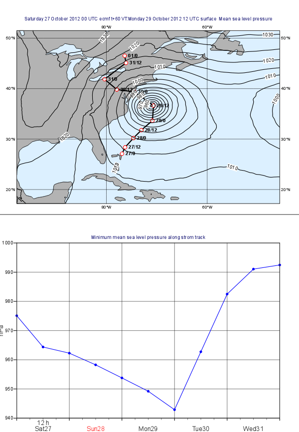
In this exercise we will use Metview to produce the plots aligned on the same page shown above:
...
The storm track data is stored in the CSV file called 'sandy_track.txt'. If you open this file you will see that it contains the date, time and geographical coordinates of the track points.
Create a new table Table Visualiser icon and set it to visualise your CSV file:
...
By returning the visual definition you built a Macro behaves as if it were a real Symbol Plotting icon. So once the Macro is finished drag it into the plot and you should see the labels appearing along the track.
The Curve plot
Setting the View
With a new Geographical Cartesian Viewicon, set up a cylindrical projection with its area defined by its lower-left corner [20oN, 110oW] and its upper-right corner [70oN, 30oW].
Set up a new Coastlines icon with the following:
...
view to cater for the graph by setting
- the x-axis type id date
- the y-axis label is hPa
- the y-axis minimum value is 940 and its maximum is 1000
Compute the minimum pressure along the track
Since this task is fairly complex you will use a Macro for it. The idea goes like this:
- you read the track points from the CSV file
- define a lot-lon box around each point
- read the forecast mean sea level data for the box for the corresponding time
- compute the minimum of the pressure in the box
- from these minimum values you can build the curve data to plot .
Create new Macro and edit it. First, read the CSV file in the very same way as before but this time you need to Now read the date and time (from the first two columns) into separate vectors:
| Code Block |
|---|
val_lat=values(tbl,3)
val_lon=values(tbl,4) |
Next, you need to build the list of labels. Each label is made up from a day and an hour part separated by a slash. Use this loop to construct the list:
| Code Block |
|---|
labels=nil

for i=1 to count(val_date) do
	labels = labels & ["   " & substring(string(val_date[i]),7,8) & "/" & val_time[i] ]
end for |
Finally, define a Symbol Plotting visual definition and return it.
| Info |
|---|
Symbol Plotting in text mode is used to plot string values to the positions of the dataset it is applied to. The rule is that the first string in the list defined by |
The code you need to add is like this:
| Code Block |
|---|
sym = msymb(
	symbol_type	:	"text",
	symbol_text_font_colour : "black",
	symbol_text_font_size: "0.3",
	symbol_text_font_style: "bold",
	symbol_text_list	:	labels
	)

return [sym] |
By returning the visual definition you built a Macro behaves as if it were a real Symbol Plotting icon. So once the Macro is finished drag it into the plot and you should see the labels appearing along the track.
...
Plotting the Mean Sea Level Pressure field
...