STILL IN WORK! DO NOT READ IT!!!!
...
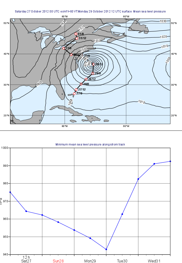
Case description
In this exercise we will use Metview to produce the plots aligned on the same page shown above:
- the plot at the top shows a map with mean sea level pressure forecast fields overlayed with the track of Hurricane Sandy.
- the plot at the bottom contains a graph chart showing the evolution of the minimum of the mean sea level pressure computed forecast along the storm track.
...
You will need to work with icons interactively and write Macro code, as well. First, you will create the two plots independently then align them together in the same page.
| Info |
|---|
This exercise involves:
|
Preparations
XXX Download data
Verify that the data are as expected.
We will prepare the plot interactively using icons. Then, at the end, we will put it all together into a macro. Remember to give your icons useful names!
Creating the map plot
Setting the map View
With a new Geographical View icon, set up a cylindrical projection with its area defined as
...
- the land coloured in grey
- the sea coloured as #dcf0ff
Plotting the Mean Sea Level Pressure field
Plot the GRIB file sandy_msl.grib into this view using a new Contouring icon. Plot black isolines with an interval of 5 hPa between them. Animate through the fields to see how the forecast evolving.
| Info |
|---|
The fields you visualised were taken from the model run at 2012-10-27 0UTC and containing 12 hourly forecast steps from 0 to 120 hours. |
Plotting the storm track
The storm track data is stored in the CSV file called 'sandy_track.txt'. If you open this file you will see that it contains the date, time and geographical coordinates of the track points.
...
Now drag your Table Visualiser icon the plot to overlay the mean sea level forecast with the track.
...
Customising the storm track
The storm track in its current form does not look great so you need to customise it with a Graph Plotting icon by setting the
- the track line to black and thick
- the track points to white filled circles (their marker index is 15) with red outline.
Plotting date/time labels onto the track
To finalise the track plot you need to add the date/time labels to the track points. This can be done with a Symbol Plotting icon by specifying the list of labels you want to plot into the map. Since it would require too much editing you will learn a better (programmatic) way of doing it by using Metview Macro.
...
By returning the visual definition you have built a Macro that behaves as if it were a real Symbol Plotting icon. So once the Macro is finished saved drag it into the plot and you should see the labels appearing along the track.
...
Creating the graph plot
Setting the View
With a new Cartesian View icon, set up a view to cater for the graph by setting
- the x-axis type id date
- the y-axis label is hPa
- the y-axis minimum value is 940 and its maximum is 1000
...
Computing the minimum pressure along the track
Since this task is fairly complex you will use a Macro for it. The idea goes like this:
...
| Code Block |
|---|
val_lat=values(tbl,3) val_lon=values(tbl,4) |
Next, read in the GRIB file containing the mean sea level forecast:
| Code Block |
|---|
g=read("sandy_mslp.grib") |
The curve data requires two lists: one for the dates and one for the values. First you need to initialise these lists:
| Code Block |
|---|
trVal=nil
trDate = nil |
Now the main part of the macro follows: you need to iterate loop through the track points (i.e. using the val_date vector)and build the curve dataset. You can use a loop like this:
| Code Block |
|---|
for i=1 to count(val_date) do ... end for |
Within the loop first or each point construct an area of e.g. 10 degrees wide centred on the the point. Then retrieve the current track point.
| Info |
|---|
Remember an area is a list of South/West/North/East values. The coordinates of the current track point are |
Next, read the forecast data for the current forecast step and the area you defined:
Finally, define a Symbol Plotting visual definition and return it.
| Info |
|---|
Symbol Plotting in text mode is used to plot string values to the positions of the dataset it is applied to. The rule is that the first string in the list defined by |
| Code Block |
|---|
p=read(
		data: g,
		par: "msl",
		step: step,
		area : wbox
) |
Compute the minimum of the field you read in using the minval() macro function:
| Code Block |
|---|
pmin=minval(p) |
Finally, build the list:
| Code Block |
|---|
trVal= trVal & [v/100]
trDate = trDate & [actDate + hour(actTime)] |
Last build an Input Visualiser and return it. The code you need to add is like this:
| Code Block |
|---|
symvis = msymbinput_visualiser ( symbol_type : "text", symbol_text_font_colour : "black", symbol_text_font_size: "0.3", symbol_text_font_style: "bold", symbol_text_list : labels ) input_x_type : "date", input_date_x_values : trDate, input_y_values : trVal ) return [symvis] |
By returning the visual definition you built a Macro behaves as if it were a real Input VisualiserSymbol Plottingicon. So once the Macro is finished drag it into the plot and you should see the labels appearing along the track.
Plotting the Mean Sea Level Pressure field
Drop it.
Customising the storm track
The storm track in its current form does not look great so you need to customise it with a Graph Plotting icon by setting the
- the track line to black and thick
- the track points to white filled circles (their marker index is 15) with red outline.
Plot the GRIB file msl.grib into this view using a new Contouring icon. Plot black isolines with an interval of 5 hPa between them. Since this will be plotted on top of another field, it would also be a good idea to increase the thickness of the isolines. Activate the legend in the Contouring icon and set the legend text for this icon to "MSLP". Animate through the filelds to see how the forecast evolving.
Plotting the Precipitation Field
...