...
The plots we want to produce with Metview are as follows:
 | |
 |
The first three plots show the precipitation forecast for the period of August 24 00UTC - 25 00UTC from various model runs preceding the event by 1, 3 and 5 days, respectively. The last plot shows the observed rainfall for the same period.
...
- top left: the closest forecast to the event
- top right: the forecast run 4 days before the event
- bottom left: the ensemble mean for the ENS (Ensemble Prediction System) forecast run 4 days before the event
- bottom right: the ensemble spread for the ENS forecasts run 4 days before the event
...
Visualising the ensemble mean
The GRIB file fc_pfens.grib contains the control forecast and the 50 perturbed and 1 control forecast member of the ENS (Ensemble Prediction System) run at 7 August 00 TC (four days before the event). We will compute and visualise the mean of the ensemble members to see how the ENS predicted the event. .
The computations will be done in Macro.Create , so create a new Macro and edit it. First, read the GRIB file in:
| Code Block |
|---|
g=read("fc_pfens.grib") |
Our GRIB contains three time steps (84, 90 and 96 hours, respectively) and we would like to compute the ensemble mean for each one separately. To achieve this goal we will write a loop going through the time steps. First, define the fieldset that will contain the results:
...
Within the loop, first, read all the 51 ENS members for the given time step
| Code Block |
|---|
f=read(data: g, step: step ) |
then Next, compute their mean with the mean() macro function
| Code Block |
|---|
f = mean(f) |
We and add this it field to the resulting fieldset:
| Code Block |
|---|
e_mean = e_mean & f |
By doing so the loop's body is completed. We finish the macro by returning the resulting fieldset:
...
By using the return statement our Macro behaves as if it were a fieldset (GRIB file). Drag it into the bottom left map and customise it with the wgust_shade Contouring icon and the title_mean Text Plotting icon. You will see . You would also need a custom Text Plotting icon. Take a copy of the one used for the previous plots (called title_oper) and tailor it to your needs. When you analyse the plot you will notice that the ensemble mean hints for higher wind speeds gusts in the area of questioninterest.
Visualising the ensemble spread
The ensemble spread is the standard deviation of the perturbed forecast ENS members. You can compute it in a very similar way to the ensemble mean. The only difference is that this time you need to use the stdev() function instead of mean(). Now it is your task to write a Macro for it. Once you finished your Macro drag it into the bottom right map and customise it with the wgust_spread_shade Contouring icon and the spread_mean with a custom Text Plotting icon. You will see that the ensemble spread is fairly high in the investigated area indicating that ...
...
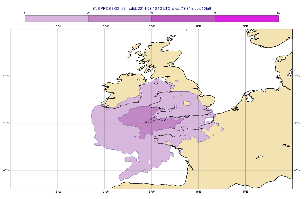
In this part we will estimate the risk of the wind gust being higher than certain thresholds: i.e. we will compute some probabilities. We will write a macro to compute the probability of the wind gust exceeding 22 m/s ,
So create a Macro and edit it. First, read the GRIB file with the perturbed forecasts in:
| Code Block |
|---|
g=read("fc_pf.grib") |
Since this GRIB contains several time steps we need to write a loop to compute the probability for each time step individually. First, define the fieldset that will contain the resulting probabilities:
| Code Block |
|---|
e_prob=nil |
Next, we define the threshold for wind gust (in m/s units). We will store it in a variable:
| Code Block |
|---|
val=22 |
Now we can process the fields in a loop going through the time steps:
| Code Block |
|---|
tsLst=[84,90,96]

loop step in tsLst

    ...your code will go here ...

end loop |
Next, compute the probability in as follows:
| Code Block |
|---|
f=f > val
f=100*mean(f) |
(that is really stormy weather) and generate the plot shown below:
You can compute the probabilities with a Macro very similar to the ones you wrote for the ensemble mean or standard deviation. Basically you need to loop through time steps and for each time steps you need to derive a new field. The difference is that this time you need to compute a probability. Supposing that all the ENS members are stored in fieldset f and the threshold value in variable threshold the computation should go like this:
| Code Block |
|---|
f=f > threshold
f=100*mean(f) |
Here the first line performed a logical operation on the fieldset and resulted in a new fieldset having 1s in each gridpoint where condition met (i.e. the value is larger than the threshold) and 0s in all other gridpoints. The probability is simply the mean of these fields. We multiplied the result by 100 to scale it into the 0-100 range for an easier interpretation.
Now it is your task to write a Macro and compute the probabilities. Once you finished your Macro drag it into the bottom right map and customise it with the wgust_spread_shade Contouring icon and with a custom Text Plotting icon. You will see that the ensemble spread is fairly high in the investigated area indicating that ...
Part 3: Creating a stamp plot
In this part we will look into the individual ENS members and create a plot showing all the ENS members for a given time step on the same page like this:
These plots, for an obvious reason, are called stamp plots. This a complex plot so we will work in Macro again.
Create a new Macro and edit it. Drop your Geographical View and the Coastlines icons into the Macro editor. Once the code is generated and tidied up define a 6x9 layout so that each plot should contain your view:
| Code Block |
|---|
dw=plot_super_page(pages: mxn_layout(my_view,9,6)) |
Next, drop your wgust_shade Contouring icon into the Macro editor and tidy up the generated code, We will apply this icon to all the fields in the stamp-plot.
Continue with reading the GRIB file with the ENS forecasts in:
| Code Block |
|---|
g=read("fc_ens.grib") |
Define a variable to hold the time step we want to plot:
| Code Block |
|---|
step = 90 |
The first plot will contain the control forecast. We need to filter it out with following read() command:
| Code Block |
|---|
f=read(
	data: g,
	step: step,
	type: "cf"
) |
The available space for the title in the plot will be confined so we try to use a very short titlet:
| Code Block |
|---|
title = mtext(
	text_line_1	: "control"
) |
Now we willfor i=1 to 50 do ...your code will go here ... end for
Within the loop, simply read all the members for the given timestep
| Code Block |
|---|
f=read(data: g,
		step: step,
		number: i
) |
then compute their mean with the mean() macro function
| Code Block |
|---|
title = mtext(
		text_line_1	: "member: " &i,
		text_font_size: 0.2
) |
and Here the first line turned set ech gridpoint hiegher value than val 1 and all the others zero, Last, add it to the resulting fieldset:
| Code Block |
|---|
e_prob = e_prob & fplot(dw[i],title,f,wgust_shade) |
We finish the macro by returning the resulting fieldset:
| Code Block |
|---|
return e_probmean |
By using the return statement our Macro behaves as if it were a fieldset (GRIB file). Drag it into the bottom left map and customise it with the probwgust_shade Contouring icon and the title_prob mean Text Plotting icon. You will see that the ensemble mean hints that high wind speed can happen.
Part
...
4: Creating a spaghetti plot
We finish the exercise by looking into predictability of the large scale flow pattern by generating spaghetti plots for 500 hPa geopotential from the same ENS run we investigated before. A spaghetti plot is composed by plotting each ENS member into the same map using a single contouring value. The plot we want to generate is shown below:
These plots, for an obvious reason, are called stamp-plots. This a complex plot so we will work in Macro againWe will create a stamp plot for a selected timestep i.e. we will plot the all the 50 ENS members.
Create a new Macro and edit it. Drop your Geographical View and the Coastlines icons into the Macro editor. Once the code is generated and tidied up define a 6x9 layout so that each plot should contain your view:
| Code Block |
|---|
dw=plot_super_page(pages: mxn_layout(my_view,9,6)) |
Next, drop your wgust_shade Contouring icon into the Macro editor and tidy up the generated code, We will apply this icon to all the fields in the stamp-plot.
Continue with reading Next, read the GRIB file with the perturbed ENS forecasts in:
| Code Block |
|---|
g=read("fc_pfens.grib") |
Since this GRIB contains several time steps we need to write a loop to compute the probability for each time step individually. First, define the fieldset that will contain the resulting probabilities:
| Code Block |
|---|
e_prob=nil |
Next, we define the timestep we want to plot. We will store it in a variable:
| Code Block |
|---|
val=90 |
Now we will
...
Define a variable to hold the time step we want to plot:
| Code Block |
|---|
step = 90 |
The first plot will contain the control forecast. We need to filter it out with following read() command:
| Code Block |
|---|
f=read(
	data: g,
	step: step,
	type: "cf"
) |
The available space for the title in the plot will be confined so we try to use a very short titlet:
| Code Block |
|---|
title = mtext(
	text_line_1	: "control"
) |
Now we willfor i=1 to 50 do ...your code will go here ... end for
Within the loop, simply read all the members for the given timestep
...
By using the return statement our Macro behaves as if it were a fieldset (GRIB file). Drag it into the bottom left map and customise it with the wgust_shade Contouring icon and the title_mean Text Plotting icon. You will see that the ensemble mean hints that high wind speed can happen.