...
| Panel | ||||||||
|---|---|---|---|---|---|---|---|---|
| ||||||||
Please refer to the handout showing the storm tracks labelled 'ens_oper' during this exercise. It is provided for reference and may assist interpreting the plots. Each page shows 4 plots, one for each starting forecast lead time. The position of the symbols is the storm centre valid for 28th Oct 2013 at 12Z. The colour of the symbols is the central pressure. The actual track of the storm from the analysis is show as the red curve with the position at 28th 12Z highlighted as the hour glass symbol. The control forecast for the ensemble is shown as the green curve and square symbol. The lines show the 12hr track of the storm; 6hrs either side of the symbol. Note the propagation speed and direction of the storm tracks. The plot also shows the centres of the barotropic low to the North. Q. What can be deduced about the forecast from these plots? |
...
Note there appear to be some forecasts that give a lower RMS error than the control forecast. Bear this in mind for the following tasks.
If time
- Explore the plumes from other variables.
- Do you see the same amount of spread in RMSE from other pressure levels higher in the atmosphere?
...
Q. Using the stamp and stamp difference maps, study the ensemble. Identify which ensembles produce "better" forecasts.
Q. Can you see any distinctive patterns in the difference maps? Are the differences similar in some way?
If time:
An additional exercise is to find ensemble members that appear to produce a better forecast and look for where the initial forecast differences are significant.
Start by using a single lead time and examine the forecast on the 28th.
- Select use the stamp plots to select 'better' forecasts using the stamp plots and use ens_to_an.mv to modify the list of ensembles plots. Can you tell which area is more senstive sensitive in the formation of the storm?
- use the pf_to_cf_diff macro to take the difference between these perturbed ensemble member forecasts from the control to also look at this.
...
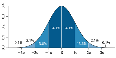
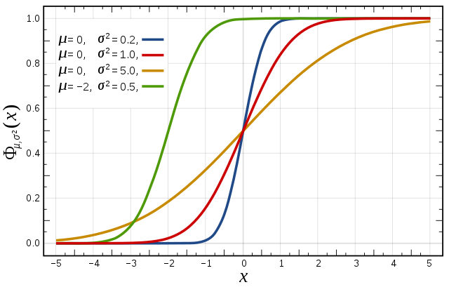
Cumulative distribution function (CDF) The figures to the right illustrate the relationship between a normal distribution and its associated cumulative distribution function.The CDF is constructed from the area under the probability density function. The CDF gives the probability that a value on the curve will be found to have a value less than or equal to the corresponding value on the x-axis. For example, in the figure right, the probability for values less than or equal to X=0 is 50%. The shape of the CDF curve is related to the shape of the normal distribution. The width of the CDF curve is directly related to the value of the standard deviation of the probability distribution function. For our ensemble, the width is then related to the 'ensemble spread'. For a forecast ensemble where all values were the same, the CDF would be a vertical straight line. |
The probability distribution function of the normal distribution |
Cumulative distribution function for a normal Figure from Wikipedia
|
TO BE FINISHED
- Choose 3 locations.e.g. Reading, Amsterdam, Copenhagen.
- Using 10m wind and/or wind gust data plot CDF & RMSE curves using one of the OpenIFS forecasts and the ECMWF analysis data.
- What is the difference and why?
- Repeat for one of the other OpenIFS runs. Are there any differences, if so why?
...