| Section | ||||||||||||||||||
|---|---|---|---|---|---|---|---|---|---|---|---|---|---|---|---|---|---|---|
|
...
| Panel | ||||
|---|---|---|---|---|
| ||||
1. What differences can be seen? 2. How well did the forecast position the Hurricane and cut-off N.Atlantic low? |
Look If time: look at other fields to study the forecast. For example, jet position, total precipitation (tp)., PV (320K)
Task 3: Precipitation over France
...
| Panel | ||||||
|---|---|---|---|---|---|---|
| ||||||
Potential temperature + potential vorticity, and Humidity and vertical motion : to characterize the cold core and warm core structures of Hurricane Nadine and the cut-off low. |
| Info | ||
|---|---|---|
| ||
You have seen how the ECMWF operational HRES forecast of 2012-09-20 00Z performed compared to the analysis. The next exercises look at the ECMWF ensemble. |
Exercise 3 : The operational ensemble forecasts
Recap
- ECMWF operational ensemble forecasts treat uncertainty in both the initial data and the model.
- Initial analysis uncertainty: sampled by use of Singular Vectors (SV) and Ensemble Data Assimilation (EDA) methods. Singular Vectors are a way of representing the fastest growing modes in the initial state.
- Model uncertainty: sampled by use of stochastic parametrizations In IFS this means Stochastically Perturbed Physical Tendencies (SPPT) and the spectral backscatter scheme (SKEB)
- Ensemble mean : the average of all the ensemble members. Where the spread is high, small scale features can be smoothed out in the ensemble mean.
- Ensemble spread : the standard deviation of the ensemble members and represents how different the members are from the ensemble mean.
Ensemble exercise tasks
This exercise has more tasks than the previous ones.
Visualising ensemble forecasts can be done in various ways. During this exercise, in order to understand the errors and uncertainties in the forecast, we will use a number of visualisation techniques.
General questions
| Panel |
|---|
|
Available plot types
| Panel |
|---|
For these exercises please use the Metview icons in the row labelled 'ENS'. ens_rmse.mv : this is similar to the oper_rmse.mv in the previous exercise. It will plot the root-mean-square-error growth for the ensemble forecasts. ens_to_an.mv : this will plot (a) the mean of the ensemble forecast, (b) the ensemble spread, (c) the HRES deterministic forecast and (d) the analysis for the same date. ens_to_an_runs_spag.mv : this plots a 'spaghetti map' for a given parameter for the ensemble forecasts compared to the analysis. Another way of visualizing ensemble spread. stamp.mv : this plots all of the ensemble forecasts for a particular field and lead time. Each forecast is shown in a stamp sized map. Very useful for a quick visual inspection of each ensemble forecast. stamp_diff.mv : similar to stamp.mv except that for each forecast it plots a difference map from the analysis. Very useful for quick visual inspection of the forecast differences of each ensemble forecast.
Additional plots for further analysis:
pf_to_cf_diff.mv : this useful macro allows two individual ensemble forecasts to be compared to the control forecast. As well as plotting the forecasts from the members, it also shows a difference map for each. ens_to_an_diff.mv : this will plot the difference between an ensemble forecast member and the analysis for a given parameter. |


Getting started
| Panel | ||||||||
|---|---|---|---|---|---|---|---|---|
| ||||||||
Please refer to the handout showing the storm tracks labelled 'ens_oper' during this exercise. It is provided for reference and may assist interpreting the plots. Each page shows 4 plots, one for each starting forecast lead time. The position of the symbols represents the centre of the storm valid 28th Oct 2013 12UTC. The colour of the symbols is the central pressure. The actual track of the storm from the analysis is shown as the red curve with the position at 28th 12Z highlighted as the hour glass symbol. The HRES forecast for the ensemble is shown as the green curve and square symbol. The lines show the 12hr track of the storm; 6hrs either side of the symbol. Note the propagation speed and direction of the storm tracks. The plot also shows the centres of the barotropic low to the North. Q. What can be deduced about the forecast from these plots?
|
Task 1: RMSE "plumes"
This is similar to task 1 in exercise 2, except now the RMSE curves for all the ensemble members from a particular forecast will be plotted. All 4 forecast dates are shown.
Using the ens_rmse.mv icon, right-click, select 'Edit' and plot the curves for 'mslp'. Note this is only for the European region. The option to plot over the larger geographical region is not available.
Q. What features can be noted from these plumes?
Q. How do these change with different forecast lead times?
Note there appear to be some forecasts that give a lower RMS error than the control forecast. Bear this in mind for the following tasks.
If time
- Explore the plumes from other variables.
- Do you see the same amount of spread in RMSE from other pressure levels in the atmosphere?
Task 2: Ensemble spread
In the previous task, we have seen that introducing uncertainty into the forecast by starting from different initial conditions and enabling the stochastic parameterizations in IFS can result in significant differences in the RMSE (for this particular case and geographical region).
The purpose of this task is to explore the difference in more detail and look in particular at the 'ensemble spread'.
Refer to the storm track plots in the handout in this exercise.
Use the ens_to_an.mv icon and plot the MSLP and wind fields. This will produce plots showing: the mean of all the ensemble forecasts, the spread of the ensemble forecasts, the operational HRES deterministic forecast and the analysis.
Q. How does the mean of the ensemble forecasts compare to the HRES & analysis?
Q. Does the ensemble spread capture the error in the forecast?
Q. What other comments can you make about the ensemble spread?
If time:
- change the 'run=' value to look at the mean and spread for other forecast lead times.
- set the 'members=' option to change the number of members in the spread plots.
e.g. try a "reduced" ensemble by only using the first 5 ensemble members: "members=[1,2,3,4,5]".
Task 3: Spaghetti plots - another way to visualise spread
A "spaghetti" plot is where a single contour of a parameter is plotted for all ensemble members. It is another way of visualizing the differences between the ensemble members and focussing on features.
Use the ens_to_an_runs_spag.mv icon. Plot and animate the MSLP field using the default value for the contour level. This will indicate the low pressure centre. Note that not all members may reach the low pressure set by the contour.
Note that this macro may animate slowly because of the computations required.
Experiment with changing the contour value and (if time) plotting other fields.
Task 4: Visualise ensemble members and difference
So far we have been looking at reducing the information in some way to visualise the ensemble.
To visualise all the ensemble members as normal maps, we can use stamp maps. These are small, stamp sized contour maps plotted for each ensemble member using a small set of contours.
There are two icons to use, stamp.mv and stamp_diff.mv. Plot the MSLP parameter for the ensemble. Repeat for wind field.
Q. Using the stamp and stamp difference maps, study the ensemble. Identify which ensembles produce "better" forecasts.
Q. Can you see any distinctive patterns in the difference maps? Are the differences similar in some way?
If time:
Use the macros to see how the perturbations are evolving; use ens_to_an_diff.mv to compare individual members to the analyses.
Find ensemble members that appear to produce a better forecast and look to see how the initial development in these members differs. Start by using a single lead time and examine the forecast on the 28th.
- Select 'better' forecasts using the stamp plots and use ens_to_an.mv to modify the list of ensembles plots. Can you tell which area is more sensitive in the formation of the storm?
- use the pf_to_cf_diff macro to take the difference between these perturbed ensemble member forecasts from the control to also look at this.
| Info |
|---|
Use 'mapType=1' to see the larger geographical area (please note that due to data volume restrictions, this mapType only works for the MSLP parameter). |
Task 5: Cumulative distribution function at different locations
Recap
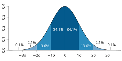
| The probability distribution function of the normal distribution or Gaussian distribution. The probabilities expressed as a percentage for various widths of standard deviations (σ) represent the area under the curve. |
|---|
Figure from Wikipedia. |
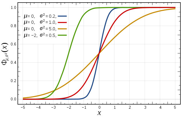
Cumulative distribution function for a normal |
|---|
Figure from Wikipedia. |
Cumulative distribution function (CDF)
The figures above illustrate the relationship between a normal distribution and its associated cumulative distribution function.The CDF is constructed from the area under the probability density function.
The CDF gives the probability that a value on the curve will be found to have a value less than or equal to the corresponding value on the x-axis. For example, in the figure, the probability for values less than or equal to X=0 is 50%.
The shape of the CDF curve is related to the shape of the normal distribution. The width of the CDF curve is directly related to the value of the standard deviation of the probability distribution function. For our ensemble, the width is then related to the 'ensemble spread'.
For a forecast ensemble where all values were the same, the CDF would be a vertical straight line.
Plot the CDF for 3 locations

This exercise uses the cdf.mv icon. Right-click, select 'Edit' and then:
...
| Info | ||
|---|---|---|
| ||
You have seen how the ECMWF operational HRES forecast of 2012-09-20 00Z performed compared to the analysis. The next exercises look at the ECMWF ensemble. |
Exercise 3 : The operational ensemble forecasts
Recap
- ECMWF operational ensemble forecasts treat uncertainty in both the initial data and the model.
- Initial analysis uncertainty: sampled by use of Singular Vectors (SV) and Ensemble Data Assimilation (EDA) methods. Singular Vectors are a way of representing the fastest growing modes in the initial state.
- Model uncertainty: sampled by use of stochastic parametrizations In IFS this means Stochastically Perturbed Physical Tendencies (SPPT) and the spectral backscatter scheme (SKEB)
- Ensemble mean : the average of all the ensemble members. Where the spread is high, small scale features can be smoothed out in the ensemble mean.
- Ensemble spread : the standard deviation of the ensemble members and represents how different the members are from the ensemble mean.
Ensemble exercise tasks
This exercise has more tasks than the previous ones.
Visualising ensemble forecasts can be done in various ways. During this exercise, in order to understand the errors and uncertainties in the forecast, we will use a number of visualisation techniques.
General questions
| Panel |
|---|
|
Available plot types
| Panel |
|---|
For these exercises please use the Metview icons in the row labelled 'ENS'. ens_rmse.mv : this is similar to the oper_rmse.mv in the previous exercise. It will plot the root-mean-square-error growth for the ensemble forecasts. ens_to_an.mv : this will plot (a) the mean of the ensemble forecast, (b) the ensemble spread, (c) the HRES deterministic forecast and (d) the analysis for the same date. ens_to_an_runs_spag.mv : this plots a 'spaghetti map' for a given parameter for the ensemble forecasts compared to the analysis. Another way of visualizing ensemble spread. stamp.mv : this plots all of the ensemble forecasts for a particular field and lead time. Each forecast is shown in a stamp sized map. Very useful for a quick visual inspection of each ensemble forecast. stamp_diff.mv : similar to stamp.mv except that for each forecast it plots a difference map from the analysis. Very useful for quick visual inspection of the forecast differences of each ensemble forecast.
Additional plots for further analysis:
pf_to_cf_diff.mv : this useful macro allows two individual ensemble forecasts to be compared to the control forecast. As well as plotting the forecasts from the members, it also shows a difference map for each. ens_to_an_diff.mv : this will plot the difference between an ensemble forecast member and the analysis for a given parameter. |
Getting started
| Panel | ||||||||
|---|---|---|---|---|---|---|---|---|
| ||||||||
Please refer to the handout showing the storm tracks labelled 'ens_oper' during this exercise. It is provided for reference and may assist interpreting the plots. Each page shows 4 plots, one for each starting forecast lead time. The position of the symbols represents the centre of the storm valid 28th Oct 2013 12UTC. The colour of the symbols is the central pressure. The actual track of the storm from the analysis is shown as the red curve with the position at 28th 12Z highlighted as the hour glass symbol. The HRES forecast for the ensemble is shown as the green curve and square symbol. The lines show the 12hr track of the storm; 6hrs either side of the symbol. Note the propagation speed and direction of the storm tracks. The plot also shows the centres of the barotropic low to the North. Q. What can be deduced about the forecast from these plots?
|
Task 1: RMSE "plumes"
This is similar to task 1 in exercise 2, except now the RMSE curves for all the ensemble members from a particular forecast will be plotted. All 4 forecast dates are shown.
Using the ens_rmse.mv icon, right-click, select 'Edit' and plot the curves for 'mslp'. Note this is only for the European region. The option to plot over the larger geographical region is not available.
Q. What features can be noted from these plumes?
Q. How do these change with different forecast lead times?
Note there appear to be some forecasts that give a lower RMS error than the control forecast. Bear this in mind for the following tasks.
If time
- Explore the plumes from other variables.
- Do you see the same amount of spread in RMSE from other pressure levels in the atmosphere?
Task 2: Ensemble spread
In the previous task, we have seen that introducing uncertainty into the forecast by starting from different initial conditions and enabling the stochastic parameterizations in IFS can result in significant differences in the RMSE (for this particular case and geographical region).
The purpose of this task is to explore the difference in more detail and look in particular at the 'ensemble spread'.
Refer to the storm track plots in the handout in this exercise.
Use the ens_to_an.mv icon and plot the MSLP and wind fields. This will produce plots showing: the mean of all the ensemble forecasts, the spread of the ensemble forecasts, the operational HRES deterministic forecast and the analysis.
Q. How does the mean of the ensemble forecasts compare to the HRES & analysis?
Q. Does the ensemble spread capture the error in the forecast?
Q. What other comments can you make about the ensemble spread?
If time:
- change the 'run=' value to look at the mean and spread for other forecast lead times.
- set the 'members=' option to change the number of members in the spread plots.
e.g. try a "reduced" ensemble by only using the first 5 ensemble members: "members=[1,2,3,4,5]".
Task 3: Spaghetti plots - another way to visualise spread
A "spaghetti" plot is where a single contour of a parameter is plotted for all ensemble members. It is another way of visualizing the differences between the ensemble members and focussing on features.
Use the ens_to_an_runs_spag.mv icon. Plot and animate the MSLP field using the default value for the contour level. This will indicate the low pressure centre. Note that not all members may reach the low pressure set by the contour.
Note that this macro may animate slowly because of the computations required.
Experiment with changing the contour value and (if time) plotting other fields.
Task 4: Visualise ensemble members and difference
So far we have been looking at reducing the information in some way to visualise the ensemble.
To visualise all the ensemble members as normal maps, we can use stamp maps. These are small, stamp sized contour maps plotted for each ensemble member using a small set of contours.
There are two icons to use, stamp.mv and stamp_diff.mv. Plot the MSLP parameter for the ensemble. Repeat for wind field.
Q. Using the stamp and stamp difference maps, study the ensemble. Identify which ensembles produce "better" forecasts.
Q. Can you see any distinctive patterns in the difference maps? Are the differences similar in some way?
If time:
Use the macros to see how the perturbations are evolving; use ens_to_an_diff.mv to compare individual members to the analyses.
Find ensemble members that appear to produce a better forecast and look to see how the initial development in these members differs. Start by using a single lead time and examine the forecast on the 28th.
- Select 'better' forecasts using the stamp plots and use ens_to_an.mv to modify the list of ensembles plots. Can you tell which area is more sensitive in the formation of the storm?
- use the pf_to_cf_diff macro to take the difference between these perturbed ensemble member forecasts from the control to also look at this.
| Info |
|---|
Use 'mapType=1' to see the larger geographical area (please note that due to data volume restrictions, this mapType only works for the MSLP parameter). |
Task 5: Cumulative distribution function at different locations
Recap
| The probability distribution function of the normal distribution or Gaussian distribution. The probabilities expressed as a percentage for various widths of standard deviations (σ) represent the area under the curve. |
|---|
Figure from Wikipedia. |
Cumulative distribution function for a normal |
|---|
Figure from Wikipedia. |
Cumulative distribution function (CDF)
The figures above illustrate the relationship between a normal distribution and its associated cumulative distribution function.The CDF is constructed from the area under the probability density function.
The CDF gives the probability that a value on the curve will be found to have a value less than or equal to the corresponding value on the x-axis. For example, in the figure, the probability for values less than or equal to X=0 is 50%.
The shape of the CDF curve is related to the shape of the normal distribution. The width of the CDF curve is directly related to the value of the standard deviation of the probability distribution function. For our ensemble, the width is then related to the 'ensemble spread'.
For a forecast ensemble where all values were the same, the CDF would be a vertical straight line.
Plot the CDF for 3 locations
This exercise uses the cdf.mv icon. Right-click, select 'Edit' and then:
- Plot the CDF of MSLP for the 3 locations listed in the macro.e.g. Reading, Amsterdam, Copenhagen.
- If time, change the forecast run date and compare the CDF for the different forecasts.
Q. What is the difference between the different stations and why? (refer to the ensemble spread maps to answer this)
Q. How does the CDF for Reading change with different forecast lead (run) dates?
Forecasting an event using an ensemble : Work in teams for group discussion
Ensemble forecasts can be used to give probabilities to a forecast issued to the public.
| Panel | ||
|---|---|---|
| ||
| To be done... |
Notes from Frederic: email 7/4/16
Q. What is the difference between the different stations and why? (refer to the ensemble spread maps to answer this)
Q. How does the CDF for Reading change with different forecast lead (run) dates?
Forecasting an event using an ensemble : Work in teams for group discussion
Ensemble forecasts can be used to give probabilities to a forecast issued to the public.
| Panel | ||
|---|---|---|
| ||
| To be done... |
- Plot and animate MSL + 500hPa maps showing track of Nadine
> 1 : Nadine MSLP and T2m (or better SST) tracking 15-20 september
> 2 : Satellite views on the 20th (provided by Etienne, if possible to put on the VM)
> 3 : Studying of the horizontal maps (analysis + forecasts)
> 4 : Studying and building of the vertical x-sections (analysis + forecasts)
Notes from Frederic: email 7/4/16
day 1
day 2
...
I suggest to focus on the period before the 20-25 September and to studyAgreed. The first exercise will be to examine the track & changes in the storm using the analyses.
Nadine and the cutoff, not yet at the impact o the Mediteranean area (we
leave that for later)
*Here are some inputs concerning Day2 and Nadine's study on day 2:
*1)* T1279 Analysis 0920 + t+96 deterministic forecast 0924 (t+96h) -->Agreed.
focusing on the interaction between Nadine and the cutoff. Maybe an
extra plot of the forecasted rainfall at t+96 over France ?
*2)* Ens T639 forecasts : I saw that T639 is the 2012 operationalI think the exercises we used last year will fit well here. I will start drafting the exercises on the wiki and ask you to help and comment.
ensemble resolution, so we will see the same bifurcation in the
scenarios as explained in Pantillon : the visualization of the spread,
the plumes, the spaghettis, ... will help here. I am sure you have great
ideas on this topic. Maybe we can propose some horizontal maps of each
(or some) members ?
I presume the exercises should be in English? Or should we do a side-by-side English/French version?
*3)* PCA and clustering : if you manage to put it in Metview this willWe think our PCA code can be used to reproduce fig 5. We thought we could also reproduce fig 6 but instead of dots plot the ensemble number. Then the students can build the clusters (Fig. 7) but grouping the ensemble members together?
be great lo look at the 2 distinct patterns. I asked Florian Pantillon
his NCL sources to do the trick. I'll use it to build an extra NCL
exercice with PCA, clustering and compositing, if we have time. The file
format needed will be netcdf.
We (here) need to try this and see how far we can reproduce the rest of the figures in the paper.
*4)* Ensemble runs : initial (EDA+SV) and model (SPPT+SKEB) : same as
last year
SST experiment might be too much, except if we shorten the ensemble study...See above. My preference after talking with people here is to use the comparison between 2012 operational ensemble and 2016 operational ensemble. The lower res (T319) ensembles; control (EDA+SV), (SPPT_SKEB) ensembles for this case are running now and we can include the data (as long as filesize does not become an issue). But honestly, I do not think there will be time. I will leave it to you to decide!
We counted 7hrs total for the practicals (not including the SCM). Part of that time the students will need to prepare some plots for the discussion on Friday.
I am concerned about the time available. Perhaps my talk on weds 9.30-10 could be shortened to 15mins.
*Day 3For the SCM we thought that it might be interesting to use the SCM for a point near Toulouse that experienced very heavy rainfall during HYMEX. Then we get the students to adjust the entrainment rates (similar to the convection exercises here) to see what impact it has on the precipitation?
SCM experiments
Exercise 2.
As I am writing I am beginning to wonder if we should not make 2 groups : one for task 4 and one for task 5. Tasks 1-3 would be for all students. This would allow to keep the CDO task. What do you think ?
...
*2)* Ens T639 forecasts : I saw that T639 is the 2012 operational
ensemble resolution, so we will see the same bifurcation in the
scenarios as explained in Pantillon : the visualization of the spread,
the plumes, the spaghettis, ... will help here. I am sure you have great
ideas on this topic. Maybe we can propose some horizontal maps of each
(or some) members ?
I think the exercises we used last year will fit well here. I will start drafting the exercises on the wiki and ask you to help and comment.
*3)* PCA and clustering : if you manage to put it in Metview this will
be great lo look at the 2 distinct patterns. I asked Florian Pantillon
his NCL sources to do the trick. I'll use it to build an extra NCL
exercice with PCA, clustering and compositing, if we have time. The file
format needed will be netcdf.
We think our PCA code can be used to reproduce fig 5. We thought we could also reproduce fig 6 but instead of dots plot the ensemble number. Then the students can build the clusters (Fig. 7) but grouping the ensemble members together?
*4)* Ensemble runs : initial (EDA+SV) and model (SPPT+SKEB) : same as
last year
SST experiment might be too much, except if we shorten the ensemble study...
See above. My preference after talking with people here is to use the comparison between 2012 operational ensemble and 2016 operational ensemble. The lower res (T319) ensembles; control (EDA+SV), (SPPT_SKEB) ensembles for this case are running now and we can include the data (as long as filesize does not become an issue). But honestly, I do not think there will be time. I will leave it to you to decide!
*Day 3
SCM experiments
For the SCM we thought that it might be interesting to use the SCM for a point near Toulouse that experienced very heavy rainfall during HYMEX. Then we get the students to adjust the entrainment rates (similar to the convection exercises here) to see what impact it has on the precipitation?
Exercise 2.
Extended deterministic forecast : 20-28 September just for MSLP : Etienne told me that the ECMWF model of the 20 000UTC proposed a very extreme situation on the 28th, with a storm over Gibraltar. This would be a way to illustrate the limits of a deterministic approach.
.
...