...
Use the ens_to_an.mv icon and plot the MSLP and z500. This will produce plots showing: the mean of all the ensemble forecasts, the spread of the ensemble forecasts, the operational HRES deterministic forecast and the analysis.
Animate this plot to see how the spread grows.
This macro can also be used to look at collections of ensemble members. It will be used later in the clustering tasks. For this task, make sure all the members of the ensemble are used.
...
Plot the MSLP and z500 fields in the ensemble and other fields of interest.
The stamp map is slow to plot as it reads a lot of data. Rather than animate each forecast step, a particular date can be set by changing the 'steps' variable.
| Code Block | ||||
|---|---|---|---|---|
| ||||
#Define forecast steps
steps=[2012-09-24 00:00,"to",2012-09-24 00:00,"by",6] |
| Panel | ||||
|---|---|---|---|---|
| ||||
| ||||
| Panel | ||||
| ||||
|
...
- Select 'better' forecasts using the stamp plots and use ens_to_an.mv to modify the list of ensembles plots. Can you tell which area is more sensitive in the formation of the storm?
- use the pf_to_cf_diff macro to take the difference between these perturbed ensemble member forecasts from the control to also look at this.
| Info |
|---|
Use 'mapType=1' to see the larger geographical area (please note that due to data volume restrictions, this mapType only works for the MSLP parameter). |
Task 5: Cumulative distribution function
Recap
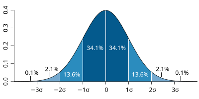
| The probability distribution function of the normal distribution or Gaussian distribution. The probabilities expressed as a percentage for various widths of standard deviations (σ) represent the area under the curve. |
|---|
Figure from Wikipedia. |
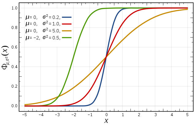
Cumulative distribution function for a normal |
|---|
Figure from Wikipedia. |
Cumulative distribution function (CDF)
The figures above illustrate the relationship between a normal distribution and its associated cumulative distribution function.The CDF is constructed from the area under the probability density function.
The CDF gives the probability that a value on the curve will be found to have a value less than or equal to the corresponding value on the x-axis. For example, in the figure, the probability for values less than or equal to X=0 is 50%.
The shape of the CDF curve is related to the shape of the normal distribution. The width of the CDF curve is directly related to the value of the standard deviation of the probability distribution function. For our ensemble, the width is then related to the 'ensemble spread'.
For a forecast ensemble where all values were the same, the CDF would be a vertical straight line.
Plot the CDF for 3 locations

This exercise uses the cdf.mv icon. Right-click, select 'Edit' and then:
...
Q. What is the difference between the different stations and why? (refer to the ensemble spread maps to answer this)
Q. How does the CDF for Reading change with different forecast lead (run) dates?
Forecasting Forecasting an event using an ensemble : Work in teams for group discussion
...