...
| Section | ||||||||||||||||||
|---|---|---|---|---|---|---|---|---|---|---|---|---|---|---|---|---|---|---|
|
...
The exercises described below are available as a set of Metview macros with the accompanying data. This is available as a downloadable tarfile for use with Metview (if installed). It is also available as part of the OpenIFS/Metview virtual machine, which can be run on different operating systems.
...
At the time of this case study in 2012, ECMWF operational forecasts consisted of:
...
At the time of this workshop (in 2016), the ECMWF operational forecasts has been upgraded compared to 2012 and consisted of:
...
If using the OpenIFS/Metview virtual machine with these exercises the recommended memory is at least 6Gb, the minimum is 4Gb. If using 4Gb, do not use more than 2 parameters per plot.
These exercises use a relatively large domain with high resolution data. Some of the plotting options can therefore require significant amounts of memory. If the virtual machine freezes when running metview, please try increasing the memory assigned to the VM.
Starting up metview
To begin:
| Code Block | ||
|---|---|---|
| ||
metview & |
| Info |
|---|
Please enter the folder 'openifs_2016' to begin working. |
...
or use the following command to take a 'snapshot' of the screen:
| Code Block | ||||
|---|---|---|---|---|
| ||||
ksnapshot |
Exercise 1. The ECMWF analysis
...
| title | Learning objectives |
|---|
...
Hurricane Nadine and the cut-off low
...
Task 1: Mean-sea-level pressure and track
Plot. Right-click the mouse button on the 'an_1x1.mv' icon and select the 'Visualise' menu item (see figure right)
After a pause, this will generate a map showing mean-sea-level pressure (MSLP).

Plot track of Nadine. Drag the mv_track.mv icon onto the map.
This will add the track of Hurricane Nadine. Although the full track of the tropical storm is shown from the 10-09-2012 to 04-10-2016, the ECMWF analyses (for the purpose of this study) only show 15-09-2012 to 25-09-2012.
In the plot window, use the play button in the animation controls  to animate the map and follow the development and track of Hurricane Nadine.
...
| Panel | ||||
|---|---|---|---|---|
| ||||
Compare the animation of the z500 and mslp fields with Figure 1. from Pantillon et al.1.
|
Task 3: Changing geographical area
Right-click the mouse button on the on 'an_1x1.mv' icon and select the select 'Edit' menu item.
In the edit window that appears
| Panel | |||||||
|---|---|---|---|---|---|---|---|
| |||||||
With With With |
...
The 'an_2x2.mv' icon allows for plotting up to 4 separate figures on a single frame. This task uses this icon to plot multiple fields.
Right-click on the 'an_2x2.mv' icon and select the 'Edit' menu item.
| Code Block | ||||
|---|---|---|---|---|
| ||||
#Define plot list (min 1- max 4) plot1=["mslp"] plot2=["wind10"] plot3=["speed500","z500"] plot4=["sst"] |
Click the play button ![]() at the top of the window to run this macro with the existing plots as shown above.
at the top of the window to run this macro with the existing plots as shown above.
Note that each Each plot can be a single field or overlays of different fields as in the an_1x1.mv macro.
Wind parameters can be shown either as arrows or as wind flags ('barbs') by adding '.flag' to the end of variable name e.g. "wind10.flag".
...
Right click on the icon 'an_xs.mv', select 'Edit' and push the play ![]() button.This generates a plot with a map of MSLP, a red line and underneath a cross-section plot along that red-line.
button.This generates a plot with a map of MSLP, a red line and underneath a cross-section plot along that red-line.
The default plot shows potential vorticity (PV), wind vectors and potential temperature roughly through the centre of the Hurricane and the cut-off low.
Changing forecast time
Cross-section data is only available every 24hrs.
The red line on the map of MSLP shows the location of the cross-section.
| Panel | ||||
|---|---|---|---|---|
| ||||
Look at the PV field, how do the vertical structures of Nadine and the cut-off low differ? |
Changing forecast time
Cross-section data is only available every 24hrs.
This means the 'This means the 'steps' value in the macros is only valid for the times: [2012-09-20 00:00], [2012-09-21 00:00], [2012-09-22 00:00], [2012-09-23 00:00], [2012-09-24 00:00], [2012-09-25 00:00]
To change the date/time of the plot, edit the macro and change the line:
| Code Block | ||
|---|---|---|
| ||
steps=[2012-09-22 00:00] |
Changing fields
A smaller set reduced number of fields is available for cross-sections: temperature (t), potential temperature (pt), relative humidity (r), potential vorticity (pv), vertical velocity (w), wind-speed (speed; sqrt(u*u+v*v)) and wind vectors (wind3).
Changing cross-section location
| Code Block | ||
|---|---|---|
| ||
#Cross section line [ South, West, North, East ] line = [30,-29,45,-15] |
The cross-section location (red line) can be changed in this macro by defining the end points of the line as shown above.
Remember that if the forecast time is changed, the storm centres will move and the cross-section line will need to be repositioned to follow specific features. This is not computed automatically, but must be changed by altering the coordinates above.
| Panel | ||||
|---|---|---|---|---|
| ||||
Look at the PV field, how do the vertical structures of Nadine and the cut-off low differ? |
...
| icon | false |
|---|
![]() This completes the first exercise.
This completes the first exercise.
...
...
Exercise 2: The operational HRES forecast
...
HRES data is provided at the same resolution as the operational model, in order to give the best representation of the Hurricane and cut-off low interations. This may mean that some plotting will be slow.
...
Available parameters
A new fieldparameter is total precipitation : tp.
The fields ( parameters ) available in the analyses are available in the forecast data.
...
| Panel | ||||||||
|---|---|---|---|---|---|---|---|---|
| ||||||||
|
| Panel | ||||||
|---|---|---|---|---|---|---|
| ||||||
Potential temperature + potential vorticity, & Humidity + vertical motion : to characterize the cold core and warm core structures of Hurricane Nadine and the cut-off low. PV + vertical velocity (+ relative humidity) : a classical cross-section to see if a PV anomaly is accompanied with vertical motion or not. |
| Info | |
|---|---|
| icon | false |
...
Exercise 3 : The operational ensemble forecasts
...
In this case study, there are two operational ensemble datasets and additional datasets created with the OpenIFS model, running at lower resolution, where the initial and model uncertainty are switched off in turn. The OpenIFS ensembles are discussed in more detail in later exercises. Please see below for more details.
An ensemble forecast consists of:
- Control forecast (unperturbed)
- Perturbed ensemble members. Each member will use slightly different initial data conditions and include model uncertainty pertubations.
...
ens_2016: This dataset is a reforecast of the 2012 event using the ECMWF operational ensemble from of March 2016. Two key differences between the 2016 and 2012 operational ensembles are: higher horizontal resolution, and coupling of NEMO ocean model to provide SST from the start of the forecast.
Note that the The analysis was not rerun for 20-Sept-2012. This means the reforecast using the 2016 ensemble will be using the original 2012 analyses. Also only 10 ensemble data assimilation (EDA) members were used in use at that time2012, whereas 25 would be used in the are in use for 2016 operational ensembleensembles, so each EDA member will be used multiple times for this reforecast. This will impact on the spread and clustering seen in the tasks in this exercise.
...
Visualising ensemble forecasts can be done in various ways. During this exercise we will use a number of visualisation techniques in order to understand the errors and uncertainties in the forecast,
Key parameters: MSLP and z500. We suggest concentrating on viewing these fields. If time, visualize other parameters (e.g. PV320K).

Available plot types
| Panel |
|---|
For these exercises please use the Metview icons in the row labelled 'ENS'. ens_rmse.mv : this is similar to the hres_rmse.mv in the previous exercise. It will plot the root-mean-square-error growth for the ensemble forecasts. ens_to_an.mv : this will plot (a) the mean of the ensemble forecast, (b) the ensemble spread, (c) the HRES deterministic forecast and (d) the analysis for the same date. ens_to_an_runs_spag.mv : this plots a 'spaghetti map' for a given parameter for the ensemble forecasts compared to the analysis. Another way of visualizing ensemble spread. stamp.mv : this plots all of the ensemble forecasts for a particular field and lead time. Each forecast is shown in a stamp sized map. Very useful for a quick visual inspection of each ensemble forecast. stamp_diff.mv : similar to stamp.mv except that for each forecast it plots a difference map from the analysis. Very useful for quick visual inspection of the forecast differences of each ensemble forecast.
Additional plots for further analysis:
pf_to_cf_diff.mv : this useful macro allows two individual ensemble forecasts to be compared to the control forecast. As well as plotting the forecasts from the members, it also shows a difference map for each. ens_to_an_diff.mv : this will plot the difference between the ensemble control, ensemble mean or an individual ensemble member and the analysis for a given parameter. |


...
Choose your ensemble dataset by setting the value of 'expId', either 'ens_oper' or 'ens_2016' for this exercise. One of the OpenIFS ensembles could also be used but it's recommended one of the operational ensembles is studied first.
| Code Block | ||||
|---|---|---|---|---|
| ||||
#The experiment. Possible values are: # ens_oper = operational ENS # ens_2016 = 2016 operational ENS expId="ens_oper" |
...
Right-click the ens_rmse.mv icon, select 'Edit' and plot the curves for 'mslp' and 'z500'.
Change 'expID' for your choice of ensemble.
| Code Block | ||||
|---|---|---|---|---|
| ||||
useClustersclustersId="off" |
Clustering will be used in later tasks.
| Panel | ||||
|---|---|---|---|---|
| ||||
|
...
This task will explore the difference in another way by looking at the 'ensemble spread'.
Use the ens_to_an.mv icon and plot the MSLP and z500. This will produce plots showing: the mean of all the ensemble forecasts, the spread of the ensemble forecasts, the operational HRES deterministic forecast and the analysis.
...
This macro can also be used to look at collections clusters of ensemble members. It will be used later in the clustering tasks. For this task, make sure all the members of the ensemble are used.
| Code Block | ||||
|---|---|---|---|---|
| ||||
#ENS members (use ["all"] or a list of members like [1,2,3] members=["all"] #[1,2,3,4,5] or #["all"] or ["cl1cl.example.1"] |
| Panel | ||||
|---|---|---|---|---|
| ||||
|
If time:
- The 'members=' option is used to change the number of members in the spread plots. Try creating your own cluster: e.g. "members=[1,3,4,5,7,8,9]".
Task 3: Spaghetti plots - another way to visualise spread
Task 3: Spaghetti plots - another way to visualise spread
A "spaghetti" plot is where A "spaghetti" plot is where a single contour of a parameter is plotted for all ensemble members. It is another way of visualizing the differences between the ensemble members and focussing on features.
Use the ens_to_an_runs_spag.mv icon. Plot and animate the MSLP and z500 fields using your suitable choice for the contour level. Find a value that highlights the low pressure centres. Note that not all members may reach the low pressure set by the contour.
The red contour line shows the control forecast of the ensemble.
Note that this macro may animate slowly because of the computations required.
...
| Code Block | ||||
|---|---|---|---|---|
| ||||
#Define forecast steps steps=[2012-09-24 00:00,"to",2012-09-24 00:00,"by",6] |
Make sure useClustersclustersId="off" for this task.
Precipitation over France
...
| Panel | ||||
|---|---|---|---|---|
| ||||
|
Compare ensemble members to analysis
...
| Panel |
|---|
Find ensemble members that appear to produce a better forecast and look to see how the initial development in these members differs.
|
...
Task 5: Cumulative distribution function
Recap
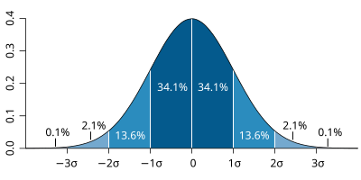
| The probability distribution function of the normal distribution or Gaussian distribution. The probabilities expressed as a percentage for various widths of standard deviations (σ) represent the area under the curve. |
|---|
Figure from Wikipedia. |
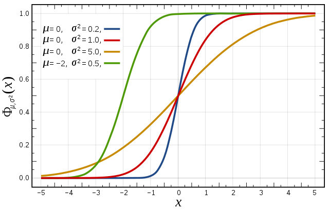
Cumulative distribution function for a normal |
|---|
Figure from Wikipedia. |
Cumulative distribution function (CDF)
The figures above illustrate the relationship between a normal distribution and its associated cumulative distribution function.The CDF is constructed from the area under the probability density function.
...
For a forecast ensemble where all values were the same, the CDF would be a vertical straight line.
Plot the CDFs

This exercise uses the cdf.mv icon. Right-click, select 'Edit' and then:
...
Make sure useClusters='off'.
| Panel | ||||
|---|---|---|---|---|
| ||||
|
...
Forecasting during HyMEX : Work in teams for group discussion
...
The stamp maps are useful for this task.
From the stamp.map of total precipitation (tp) over Francez500 at 24/9/2012 (t+96), identify ensemble members that represent the two most likely forecast scenarios.
...
...
| Excerpt Include | ||||||
|---|---|---|---|---|---|---|
|
Introduction
In these exercises we will look at a case study of a severe storm using a forecast ensemble. During the course of the exercise, we will explore the scientific rationale for using ensembles, how they are constructed and how ensemble forecasts can be visualised. A key question is how uncertainty from the initial data and the model parametrizations impact the forecast.
You will start by studying the evolution of the ECMWF analyses and forecasts for this event. You will then run your own OpenIFS forecast for a single ensemble member at lower resolutions and work in group to study the OpenIFS ensemble forecasts.