| Scroll pdf ignore | ||||||||||||||||||||||||||||
|---|---|---|---|---|---|---|---|---|---|---|---|---|---|---|---|---|---|---|---|---|---|---|---|---|---|---|---|---|
|
Case description
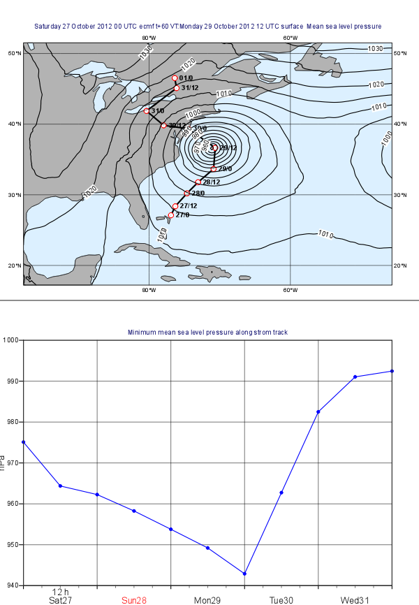
In this exercise we will use Metview to produce the plots shown above:
- the plot at the top shows a map with mean sea level pressure forecast fields overlayed with the track of Hurricane Sandy.
- the plot at the bottom contains a graph chart showing the evolution of the minimum of the mean sea level pressure forecast along the storm track.
We will work both work interactively with icons interactively and write Macro code. First, we will create the two plots independently then align them together in the same page.
...
| Info |
|---|
As you can see we specified the table delimiters exactly in the same way as we did for the Table Visualiser icon. |
In the code above, the object referenced by variable tbl contains all the columns from the CSV file. Now read the date and time (from the first two columns) into separate vectors:
...
Next, we build the list of labels. Each label is made up from a day and an hour part separated by a slash. We convert the date into a string and then take the last two characters to get the day. Use this loop to construct the list of labels:
| Code Block |
|---|
labels=nil

for i=1 to count(val_date) do
    dPart = substring(string(val_date[i]),7,8)
    tPart = val_time[i]
    label =  "   " & dPart & "/" & tPart
    labels = labels & [label]
end for |
...
Create new Macro and edit it. First, read the CSV file in the very same way as before. However, this time, on top of date and time, we also need to read latitude and longitude into vectors:
| Code Block |
|---|
val_latlon=values(tbl,3) val_lonlat=values(tbl,4) |
Next, read in the GRIB file containing the mean sea level forecast:
...
| Code Block |
|---|
p=read( data: g, step: (i-1)*2412, area : wbox ) |
Here we used the fact the forecasts steps are stored in hours units in the GRIB file.
Next, compute the minimum of the field in the subarea using the minval() macro function:
| Code Block |
|---|
pmin=minvalminvalue(p) |
Finally, build the lists list for the values (scaling Pa units stored in the GRIB to hPa units):
| Code Block |
|---|
trVal= trVal & [vpmin/100] |
And also build the list of dates:
| Code Block |
|---|
trDatedt = trDate & [date(val_date[i]) + hour(val_time[i]) trDate = trDate & [dt] |
Having finished the body of the loop the last step in our Macro is to define an Input Visualiser and return it. The code you we need to add is like this:
| Code Block |
|---|
vis = input_visualiser (
    input_x_type        : "date",
    input_date_x_values : trDate,
    input_y_values      : trVal
)

return [vis] |
| Info |
|---|
By returning the visualiser |
...
our Macro |
...
behaves as if it were an Input Visualiser icon. |
Now visualise your Cartesian View icon and drag your Macro into it.
...
With a new Display Window icon design an A4 portrait layout with two views: your Geographical View icon should go top and your Cartesian View icon into the bottom. Now visualise your this icon and populate the views with the data.
Extra Work
Adding new curves to the x-y plot
On top of the minimum pressure try to add the maximum and average pressure to the graph plot. Use a different colour to each curve and add a custom legend as well.
Hints:
- first, just try to add your Graph Plotting definition to the Macro. In the end return both the Input Visualiser and the Graph Plotting as a list like this
| Code Block |
|---|
return [vis,graph] |
If you visualise the Macro your Graph Plotting settings will be directly applied to the resulting curve.
- next, compute the maximum of the pressure (with the
maxvalue()function) in the loop and store its values in another list. Build an input visualiser out of it (e.g. call itvis_max). Add a Graph Plotting for it (e.g. call it graph_max) using a different colour. In the end you need to return a longer list like this:
| Code Block |
|---|
return [vis,graph,vis_max,graph_max] |
- the average pressure curve (with the
average()function) can be derived in a very similar manner
add a Legend with disjoint mode. Set legend_text_composition to user_text_only and carefully set the legend_user_lines to provide a textual description to each curve in the legend. Add your legend to the back of the list you return from the Macro.
Doing the whole task in Macro
Try to write a single Macro that is doing all the tasks in one go and directly produces the composite plot with the map and graph in the end