-
Created by
 Iain Russell, last updated on Mar 07, 2019
12 minute read
Iain Russell, last updated on Mar 07, 2019
12 minute read
A Simple Data Visualisation
When you first start Metview, you will see something like this:

This sort of window is called a Metview desktop.
To get started, copy a GRIB data file into your Metview directory (~/metview); if you are attending the training course at ECMWF, then you should carefully type the following command in a terminal window:
cp ~trx/mv_data/t1000.grb $HOME/metview/training/day_1
If you navigate Metview to the training/day_1 you should now see a new GRIB icon in your Metview window:
![]()
If it does not appear immediately, press F5 (or View | Reload).
Move the icon into the folder 'a quick tour' by dragging and dropping it there. Enter the folder and do this exercise there.
When you right-click on an icon, a context-sensitive menu appears.

Choose examine to quickly see the structure of the GRIB file.
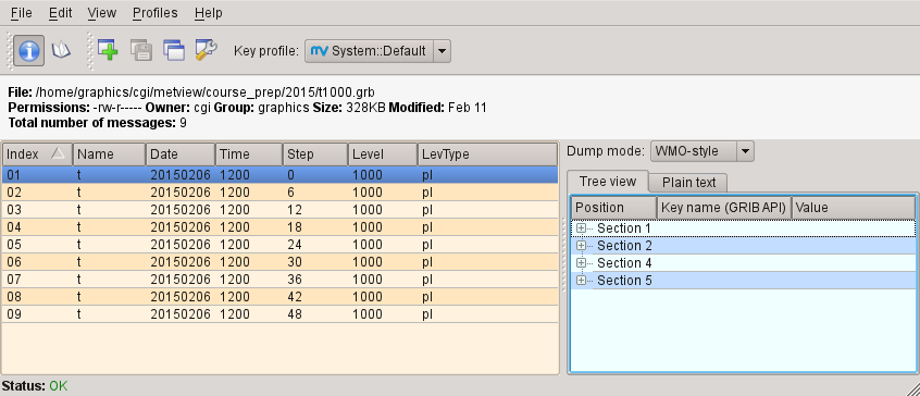
It contains multiple fields, each listed in the left-hand panel of the GRIB Examiner. We will look more closely at this tool later, but for now close it.
To visualise this data, right-click on its icon and select visualise. You will now see the Display Window. Its toolbars can all be moved, docked, undocked and hidden to suit your preferences.

Antialiasing

To the right of the zoom buttons should be the Antialias button. When active, a smoothing is applied to the lines in the plot – it is worth doing although it comes at the cost of a small amount of plotting speed. This setting will be remembered the next time you visualise data. Note that the antialiasing is not carried through to the various export image formats (see later) – it is active only in the interactive window.
Zooming in a Plot

The diagram to the left shows the Zoom toolbar at the top of the Display Window. Click the Zoom button to enter ‘zoom mode’. Now you can select an area by dragging with the left mouse button. You can zoom in as many times as you like. In order to ‘undo’ or ‘redo’ a zoom, click the Zoom out or Zoom in buttons respectively. The Zoom stack provides quick visual access to the current zoom history. Notice that when a new area is selected, the contours are recalculated - you see more detail as you zoom into a smaller area; you may also see more detailed coastlines.
Using the Magnifier

The Magnifier button in the toolbar toggles the magnifier tool on and off. Unlike Zoom, this is a purely graphical enlargement of the plot. It is used mainly to inspect small text such as contour labels. The magnifying glass can be moved and resized using the mouse, and the magnification scale on its left-hand side can also be adjusted.

Animation Steps
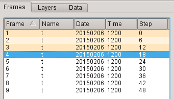
The Frames tab to the right of the plot shows the set of fields contained in the GRIB file. You can move between fields by clicking within this tab, by using the animation control buttons or by using the cursor keys. Note that each plot is computed only when you select a field. Generated plots are cached, indicated in the Frames tab through shading. This can quicken their rendering when the plots are complex. Note that modifying the plot in any way (such as zooming) clears the cache.
Layer Meta-data
There are three tabs in this panel - Frames, Layers and Data. We will look at Layers soon, but for now select the Data tab.
This reveals a page of meta-data for the current layer, including a histogram.
We will investigate these features in more detail later, but for now close the Display Window.

Creating and Editing an Icon
Let’s customise the coastline plotting attributes.
First, create a new Coastlines icon. You can right-click within the Metview desktop to obtain a context menu from where the option Create new icon is available (shortcut: CTRL-N).
![]()
![]()
This brings up a dialogue from where you can find the Coastlines icon; either double-click the icon, or drag it onto the desktop to create a new instance. Close the dialogue.
Edit the newly-created icon by either double-clicking on it or else right-click, edit (double-clicking an icon performs the edit action for most icon types). This brings up the icon editor for coastline plotting. All user-selectable parameters for plotting coastlines are here. Set the following parameters:
| Map Coastline Thickness | 2 |
| Map Coastline Land Shade | On |
| Map Coastline Land Shade Colour | Cream |
For colour-based parameters, there are two small arrows - the one on the right reveals a drop-down list of predefined colours (use this one); then one on the left reveals an advanced colour selection tool.

After making these changes, click the Ok button to save and exit the editor.
Visualise the data again, and drag your new Coastlines icon into the Display Window.
Your Coastlines icon can be dragged into any plot, and later we’ll see how to store useful icons so that they can be easily accessed from anywhere.
So you know what it does, rename the icon to land_shade by clicking on its name and editing the text.
The Coastlines icon is an example of a Visual Definition (visdef) icon. The purpose of these icons is to modify the plotting attributes of various data.
Changing the Map Projection and Storing the Area
Metview's default map projection is Cylindrical. However, meteorologists often use other projections when plotting data.
Create a new Geographical View icon and rename it to polar_europe. Edit the icon and change the following parameter:
| Map Projection | Polar Stereographic |
Save the changes and visualise the icon. Drop the GRIB data icon into the Display Window to see it on the new map. It is also possible to visualise the GRIB icon and then drop the Geographical View icon into the plot to achieve the same effect. Have a look at some of the other projections on offer, then go back to polar stereographic.
Now we want to set the area used in the view. Although we can interactively zoom into smaller areas in the Display Window, we now want to store a particular area so that we can use exactly the same one again and again. Set the Map Area Definition to Corners and click on the Geography Tool button next to the Area parameter (shown in the picture below).
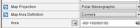
This tool helps you define a region.
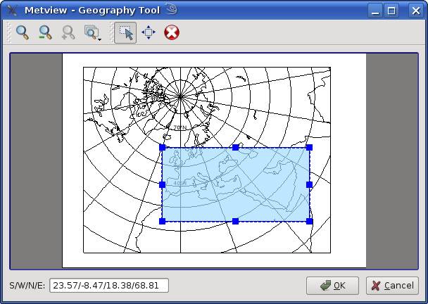
Use the Zoom tools to enlarge the European area and use the Area tool to select a region over Europe. Click Ok to save your selection - your choices will now be updated in the Geographical View editor. Click Apply in the Geographical View editor to save everything. Plot your data in this view to confirm that the area and projection are as desired.

Linking the Coastlines icon with the Geographical View Icon
Although they can be used separately, the Coastlines icon can be linked into the Geographical View icon through the concept of embedded icons.
Notice that a Geographical View icon editor contains a place for an embedded Coastlines icon. If you drop a Coastlines icon here and apply the changes, then the Geographical View icon will use your chosen coastlines.
![]()
Try it with your land_shade and polar_europe icons, and test the result by visualising polar_europe. Note that your two icons are now linked - if you modify land_shade, the changes will be picked up the next time you visualise polar_europe. Another type of embedded icon is discussed in Analysis Views.
Creating a Simple Macro
Metview incorporates a powerful Macro language, which can be used for tasks ranging from simple automation of tasks to complex post-processing of data. We will now create a simple macro which reads the GRIB file and plots it in our chosen projection.
Create a new Macro icon and edit it. This time we see a code editor, custom-built for the Macro language. The editor can automatically translate Metview icons into Macro code, so do the following:
drop the t1000.grb icon into the Macro Editor; a variable called
t1000_2e_grbis assigned to the value of theread()command, which reads the GRIB data. Such variable names are based on the names of the icons used to generate them, but with non-permitted characters replaced by their hexadecimal code (in this case, the dot in the filename is replaced with2e).- rename the variable to simply be
t1000 - drop your polar_europe icon into the Macro Editor
- underneath the generated code, type the following line:
plot(polar_europe, t1000)
This says, "In the polar_europe view, plot data t1000".
Your complete macro should look like this:
# Metview Macro

t1000 = read("/path/to/user/metview/training/day_1/a quick tour/t1000.grb")

land_shade = mcoast(
    map_coastline_thickness         : 2,
    map_coastline_land_shade        : "on",
    map_coastline_land_shade_colour : "cream"
    )

polar_europe = geoview(
    map_projection      : "polar_stereographic",
    map_area_definition : "corners",
    area                : [30,-25,50,65],
    coastlines          : land_shade
    )

plot(polar_europe, t1000)
Now run the macro to generate the plot.
Note that we can put a relative path into the read() command:
t1000 = read("t1000.grb")
Modifying Layers
Now look at the Layers tab again. Drag the shaded Coastlines layer so that it is above the t1000.grb layer – a quick way to mask out the sea points! Imagine looking down through the layers from the top to the bottom in order to understand how they work. You can also select the Coastlines layer and change its transparency value. You can also toggle layers on and off using the checkboxes next to them. Note that these adjustments are not carried through to the various export image formats (see later).
Future versions of Metview will incorporate more advanced plot-editing facilities available directly from the Layers tab. You can close the Display Window again.
Modifying the Contouring

Metview provides many ways to style the contours when plotting data. These are controlled via the Contouring icon. This is another visdef icon. Create a new instance of this icon and rename it to shade. Edit it, setting the following parameters:
![]()
Contour Shade | On |
Contour Shade Method | Area Fill |
Contour Shade Max Level Colour | Red |
Contour Shade Min Level Colour | Blue |
Contour Shade Colour Direction | Clockwise |
Apply the changes, visualise the data icon again (t1000.grb) and drag the shade icon into the Display Window.
Our palette is automatically generated from a colour wheel. Try setting Contour Shade Colour Direction to Anti Clockwise to see the difference in the generated palette.

Creating a Legend
Create a legend by changing the first parameter in the Contour editor and dragging the icon into the Display Window again:
Legend | On |
Fixing the Contour Levels
Now zoom in and out of different areas. What happens to the palette - does it stay constant? The default behaviour is to create contours at 10 levels within the range of data actually plotted. As the area changes, so does the range of values being plotted.
Let's create a palette which will not be altered when we change the area. Copy the shade icon (either right-click + duplicate, or drag with the middle mouse button), and rename the copy 'fixed_t' by clicking on its title. Edit the icon and make the following changes:
Contour Level Selection Type | Level List |
Contour Level List | -35/-20/-10/-5/0/5/10/20/35 |
Contour Shade Colour Direction | Clockwise |
Now when you apply this icon you will see that the palette is fixed wherever you zoom. There will probably be parts of the plot which are not filled; this is because our range of contour levels does not cover the whole range of values in the data. Change the list of contour levels so that the whole plot will be covered - you only need to add one number to each end of the level list to do this (or else change the current numbers at the ends of the list).
Updating the Macro
Edit your macro icon again and drop the fixed_t icon into the editor, aiming the drop so that the code is generated above the plot() command. The code to generate the contouring specification will appear, assigned to the variable fixed_t (the variable is always named after the icon that was dropped). Add this to the end of the plot command:
plot(polar_europe, t1000, fixed_t)
Visual definition variables must appear just after the data variables to which they are to be applied. In fact, now that we have a shaded field covering the whole globe, there is no need to shade the land; we can remove the coastlines element from the polar_europe definition. We will still see the coastlines, but Metview will use the default coastline definition, which is to draw the outline without shading the sea or the land.
Overlaying Another Field

We will now overlay our plot with fields of geopotential.
Copy the geopotential GRIB data file into your Metview directory (~/metview); if you are attending the training course at ECMWF, then you can instead type the following command in a terminal window:
cp ~trx/mv_data/z500.grb $HOME/metview/training/day_1
You should see the new GRIB icon in your day_1 folder. Move this icon into the folder you are working in.
Plot your temperature data by running your macro again, then drop z500.grb into the Display Window. The geopotential field appears as blue isolines (the default contouring style) over the shaded temperature field.
We will now change these isolines to black. Create a new Contouring icon and rename it to black_contour. Edit it and set the following:
| Contour Line Thickness | 2 |
| Contour Line Colour | Black |
| Contour Highlight | Off |
Drop this into the Display Window - the result is not as intended! The new Contouring definition was applied to both fields, not just the geopotential. Close the Display Window and re-run the macro to get us back to the point before we added the geopotential. This time, select both the z500.grb and black_contour icons and drop them together into the Display Window. This forces the association between the data and the visual definition. You might want to remove the temperature isolines by setting Contour to Off in the macro.
Extra Work
Contouring
Spend some time exploring the Contouring icon. Here are some suggestions:
- shade only the values which are below freezing point
- try different types of shading by setting Contour Shade Method and Contour Shade Technique
Coastlines
Spend some time exploring the Coastlines icon. Here are some suggestions:
- adjust the grid lines
- plot country boundaries
- plot rivers
Histogram sidebar

Visualise the temperature data with one of the coloured Contouring icons and view the histogram in the Data tab of the sidebar. At the bottom, there is a control with which you can select to use your Contouring icon colours and levels to compute and display the histogram - try it!