...
| Panel |
|---|
|
Available plot types
| Panel |
|---|
For these exercises please use the Metview icons in the row labelled 'ENS'. ens_rmse.mv : this is similar to the oper_rmse.mv in the previous exercise. It will plot the root-mean-square-error growth for the ensemble forecasts. ens_to_an.mv : this will plot (a) the mean of the ensemble forecast, (b) the ensemble spread, (c) the HRES deterministic forecast and (d) the analysis for the same date. stamp.mv : this plots all of the ensemble forecasts for a particular field and lead time. Each forecast is shown in a stamp sized map. Very useful for a quick visual inspection of each ensemble forecast. stamp_diff.mv : similar to stamp.mv except that for each forecast it plots a difference map from the analysis. Very useful for quick visual inspection of the forecast differences of each ensemble forecast. ens_to_an_runs_spag.mv : this plots a 'spaghetti map' for a given parameter for the ensemble forecasts compared to the analysis. Another way of visualizing ensemble spread.
Additional plots for further analysis:
ens_1x1.mv : this plots a single map of a single ensemble member, the mean or the spread. pf_to_cf_diff.mv : this useful macro allows two individual ensemble forecasts to be compared to the control forecast. As well as plotting the forecasts from the members, it also shows a difference map for each. |


...
Task 5: Cumulative distribution function at different locations
Recap
| The probability distribution function | (CDF)of the normal distribution or Gaussian distribution. The probabilities expressed as a percentage for various widths of standard deviations (σ) represent the area under the curve. |
|---|---|
Figure from Wikipedia. |
Cumulative distribution function for a normal |
|---|
Figure from Wikipedia. |
Cumulative distribution function (CDF)
The figures above illustrate the relationship between a normal distribution and its associated cumulative distribution function.The CDF is constructed from the area under the probability density function.
The CDF gives the probability that a value on the curve will be found to have a value less than or equal to the corresponding value on the x-axis. For example, in the figure
...
, the probability for values less than or equal to X=0 is 50%.
The shape of the CDF curve is related to the shape of the normal distribution. The width of the CDF curve is directly related to the value of the standard deviation of the probability distribution function. For our ensemble, the width is then related to the 'ensemble spread'.
For a forecast ensemble where all values were the same, the CDF would be a vertical straight line.
...
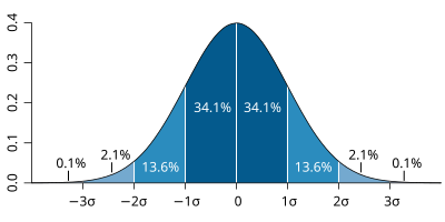
The probability distribution function of the normal distribution
or Gaussian distribution. The probabilities expressed as a
percentage for various widths of standard deviations (σ)
represent the area under the curve.
Figure from Wikipedia.
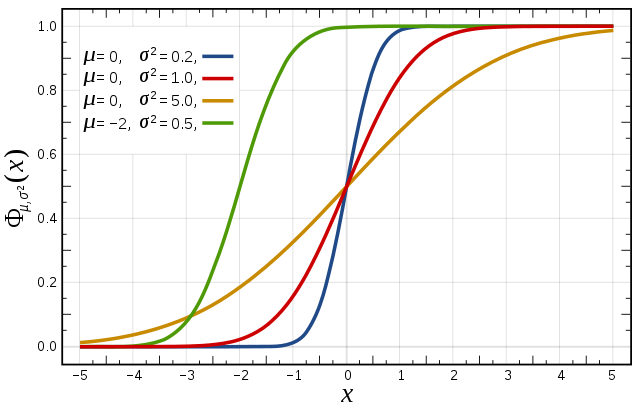
Cumulative distribution function for a normal
distribution with varying standard deviation (σ)
...
CDF for 3 locations
This exercise uses the cdf.mv icon. Right-click, select 'Edit' and then:
...