| Section | ||||||||||||||||||||||||||||||||||||
|---|---|---|---|---|---|---|---|---|---|---|---|---|---|---|---|---|---|---|---|---|---|---|---|---|---|---|---|---|---|---|---|---|---|---|---|---|
|
Recap
ECMWF operational forecasts consist of:
...
Right-click the mouse button on the 'an_1x1.mv' icon and select the 'Visualise' menu item (see figure right)
...
Right-click the mouse button on the 'an_1x1.mv' icon and select the 'Edit' menu item (see figure right).
...
If you prefer to see multiple plots per page rather than overlay them, please use the an_2x2.mv macro.
| Info |
|---|
That completes the first exercise. |
...
Additional plotting tips.
For the an_2x2.mv icon the number of maps appearing in the plot layout can be 1, 2, 3 or 4. This is true of all the icons labelled '2x2'.
an_2x2.mv demonstrates how to plot a four-map layout in a similar fashion to the one-map layout. The only difference here is that you need to define four plots instead of one.
...
| Panel |
|---|
For this exercise, you will use the metview icons in the row labelled 'HRES forecast' as shown above. hres_rmse.mv mv : this plots the root-mean-square-error growth curves for the operational HRES forecast for the different lead times.
hres_to_an_runs.mv mv : this plots the same parameter from the different forecasts for the same verifying time. Use this to understand how the forecasts differed, particularly for the later forecasts closer to the event. hres_to_an_diff.mv mv : this plots a single parameter as a difference between the operational HRES forecast and the ECMWF analysis. Use this to understand the forecast errors from the different lead times.
Parameters & map appearance. These macros have the same choice of parameters to plot and same choice of |

...
In this task, all 4 forecast dates will be used.
Using the hres_rmse.mv icon, right-click, select 'Edit' and plot the RMSE curves for MSLP (mean-sea-level pressure). Repeat for the 10m wind-gust parameter wgust10.
...
Task 2: Compare forecast to analysis
a) Use the hres_to_an_runs.mv icon (right-click -> Edit) and plot the MSLP and wind fields. This shows a comparison of 3 of the 4 forecasts to the analysis (the macro can be edited to change the choice of forecasts).
b) Use the hres_to_an_diff.mv icon and plot the difference map between a forecast date and the analysis.
...
| Panel |
|---|
For these exercises please use the Metview icons in the row labelled 'ENS'. ens_rmse.mv : this is similar to the oper_rmse.mv in the previous exercise. It will plot the root-mean-square-error growth for the ensemble forecasts. ens_to_an.mv : this will plot (a) the mean of the ensemble forecast, (b) the ensemble spread, (c) the HRES deterministic forecast and (d) the analysis for the same date. ens_to_an_runs_spag.mv : this plots a 'spaghetti map' for a given parameter for the ensemble forecasts compared to the analysis. Another way of visualizing ensemble spread. stamp.mv : this plots all of the ensemble forecasts for a particular field and lead time. Each forecast is shown in a stamp sized map. Very useful for a quick visual inspection of each ensemble forecast. stamp_diff.mv : similar to stamp.mv except that for each forecast it plots a difference map from the analysis. Very useful for quick visual inspection of the forecast differences of each ensemble forecast.
Additional plots for further analysis:
pf_to_cf_diff.mv : this useful macro allows two individual ensemble forecasts to be compared to the control forecast. As well as plotting the forecasts from the members, it also shows a difference map for each. ens_to_an_diff.mv : this will plot the difference between an ensemble forecast member and the analysis for a given parameter. |


...
This is similar to task 1 in exercise 2, except now the RMSE curves for all the ensemble members from a particular forecast will be plotted. All 4 forecast dates are shown.
Using the ens_rmse.mv icon, right-click, select 'Edit' and plot the curves for 'mslp' and 'wgust10'. Note this is only for the European region. The option to plot over the larger geographical region is not available.
...
Task 5: Cumulative distribution function at different locations
Recap
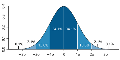
| The probability distribution function of the normal distribution or Gaussian distribution. The probabilities expressed as a percentage for various widths of standard deviations (σ) represent the area under the curve. |
|---|
Figure from Wikipedia. |
Cumulative distribution function for a normal |
|---|
Figure from Wikipedia. |
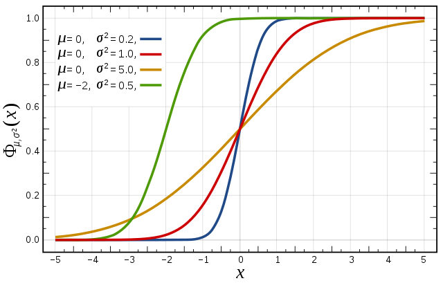
Cumulative distribution function (CDF)
...
| Panel | ||||||
|---|---|---|---|---|---|---|
| ||||||
The different macros available for this exercise are very similar to those in previous exercises.
For this exercise, use the icons in the row labelled 'Experiments'. These work in a similar way to the previous exercises. ens_exps_rmse.mv : this will produce RMSE plumes for all the above experiments and the operational ensemble. ens_exps_to_an.mv : this produces 4 plots showing the ensemble spread from the OpenIFS experiments compared to the analysis. ens_exps_to_an_spag.mv : this will produce spaghetti maps for a particular parameter contour value compared to the analysis. ens_part_to_all.mv : this allows the spread & mean of a subset of the ensemble members to be compared to the whole ensemble. Note that the larger geographical area, mapType=1, will only work for MSLP due to data volume restrictions. |

...
We gratefully acknowledge the following for their contributions in preparing these exercises, in particular from ECMWF: Glenn Carver, Sandor Kertesz, Linus Magnusson, Martin Leutbecher, Iain Russell, Filip Vana, Erland Kallen. From University of Oxford: Aneesh Subramanian, Peter Dueben, Peter Watson, Hannah Christensen, Antje Weisheimer.
...
| Excerpt Include | ||||||
|---|---|---|---|---|---|---|
|