Introduction
In these exercises we will look at a case study of a severe storm using a forecast ensemble. During the course of the exercise, we will explore the scientific rationale for using ensembles, how they are constructed and how ensemble forecasts can be visualised.
You will start by studying the evolution of the ECMWF analyses and forecasts for this event. You will then run your own OpenIFS forecast for a single ensemble member at lower resolutions and work in group to study the OpenIFS ensemble forecasts.
Caveat
In practise many cases are aggregated in order to evaluate the forecast behaviour of the ensemble. However, it is always useful to complement such assessments with case studies of extreme events, like the one in this exercise, to get a more complete picture of IFS performance and identify weaker aspects that need further exploration.
Recap
ECMWF operational forecasts consist of:
- HRES : T1279 (16km grid) highest resolution 10 day deterministic forecast
- ENS : T639 (34km grid) resolution ensemble forecast (50 members) is run for days 1-10 of the forecast, T319 (70km) is run for days 11-15.
Saving images and printing
To save images during these exercises for discussion later, you can use:
"Export" button in Metview's display window under the 'File' menu. This will also allow animations to be saved into postscript.
or
ksnapshot
Printing. If hardcopy prints are desired please use the printer at the rear of the classroom and only print if necessary.
St Jude wind-storm highlights
The case study will look at one of several severe wind-storms that hit Europe in late 2013 (see handout of ECMWF article by Hewson et al, ECMWF Newsletter 139).
- On the 28th October 2013 a small, severe wind-storm named St Jude in the UK, hit the UK & north-western Europe.
- A total of 19 people were killed across Europe, 5 in the UK.
- The return period of the event based on wind-gust observations show the 10yr return period was exceeded along the North Sea coast.
- From the 23rd October, the ECMWF forecast predicted a greater than 70% probability of a severe wind event (greater than 60kt, 31m/s, at 1km) over southern England. A signal for the storm was evident from the 21st October.
- On the 24th October, the UK MetOffice issued an amber alert for wind-speed across southern England placing the potential impact in the highest category.
- The cyclone first appeared as a cold front wave, over the Atlantic, late on 25th October.
- It deepened and moved rapidly east then northeast, with the storm centre reaching southern Sweden late afternoon on the 28th.
- The most rapid deepening occurred between 06-12UTC on the 28th when the strongest wind gusts were observed.
Outline of exercises
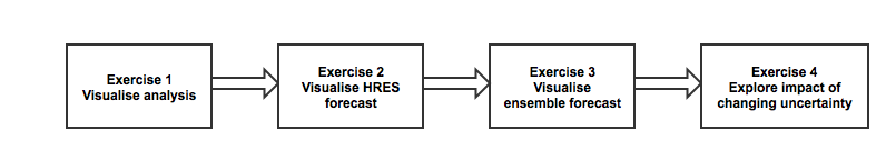
Exercise 1. Visualise the ECMWF analysis
Handout
See map of observations of wind-gust during the storm and the timeseries of maximum gusts.
Starting up metview
metview
Please enter the folder 'openifs_2015' to begin working.
For this task, use the metview icons in the row labelled 'Analysis'

Getting started
Task 1: Mean-sea-level pressure & wind gust
Right-click the mouse button on the 'an_1x1.mv' icon and select the 'Visualise' menu item (see figure right)
After a few seconds, this will generate a map showing two parameters: mean-sea-level pressure (MSLP) and 3hrly max wind-gust at 10m (wgust10).
Use the play button  to animate the map and follow the development and track of the storm.
You can use the 'Speed' menu to change the animation speed (each frame is every 3 hours).
Task 2: Geographical region
Right-click the mouse button on the 'an_1x1.mv' icon and select the 'Edit' menu item (see figure right).
An edit window appears that shows a number of lines of 'Metview macro' code. During these exercises you can change some of these to alter the parameters and plot types.

With mapType=0, the map will cover a smaller geographical area centred on the UK.
With mapType=1, the map will cover most of the North Atlantic
Change, mapType=0 to mapType=1 then click the play button at the top of the window (please ask if you are not sure).
Animate the storm on this smaller geographical map.
Task 3: Plot wind fields
Change the fields plotted to include the wind arrows.
Make sure you have the Edit window showing.
#Define plot list (min 1 - max 4)
plot1=["mslp","wgust10","wind10"]
As above, click the play button and then animate the map that appears. You might also want to change the mapType back to 'mapType=1' to show the larger geographical area.
Discuss the storm development and behaviour with your colleagues & team members.
That completes the first exercise.
If time
- Explore the storm development and passage using the other parameters available on other pressure levels.
- More explanation of how to use the Metview macro icons to alter the fields plotted are shown below.
If you prefer to see multiple plots per page rather than overlay them, please use the an_2x2.mv macro.
How to plot in various layouts
Icon 'an_1x1.mv' produces a single plot on the page.
Icon 'an_2x2.mv' can produce up to 4 plots per page.
Change plot fields
For the 'an_1x1.mv' icon, the plot contents can be changed by editing the plot1 variable in the macro as shown in the above first exercise.
To alter the plotted field, right-click and choose 'Edit'.
It is possible to overlay multiple fields by putting them in square brackets like this:
![]()
You will find a list of available parameters in the macro.
After editing the macro text, you can optionally save using the 'File' menu and 'Save'.
Display the plot by clicking:
Animate the plots in the display window by clicking
Change plot appearance
For the an_2x2.mv icon the number of maps appearing in the plot layout can be 1, 2, 3 or 4. This is true of all the icons labelled '2x2'.
an_2x2.mv demonstrates how to plot a four-map layout in a similar fashion to the one-map layout. The only difference here is that you need to define four plots instead of one.
Right-click on the icon and select 'Edit'. Change the plot layout like this:

Note how some plots can be single parameters whilst others can be overlays of two (or more) fields.
Wind parameters can be shown either as arrows or as feather by adding '_f' to the variable name.
Two map types are available covering a different area.
With mapType=0, the map will cover a smaller geographical area centred on the UK.
With mapType=1, the map will cover most of the North Atlantic
Exercise 2: Visualise operational HRES forecast
Recap
The ECMWF operational deterministic forecast is called HRES. The model runs at a spectral resolution of T1279, equivalent to 16km grid spacing.
Only a single forecast is run at this resolution as the computational resources required are demanding. The ensemble forecasts are run at a lower resolution.
Before looking at the ensemble forecasts, first understand the performance of the operational HRES forecast.
Available forecast dates
Data is provided for multiple forecasts starting from different dates, known as different lead times.
Available lead times for the St Judes storm are forecasts starting from these October 2013 dates: 24th, 25th, 26th and 27th.
Some tasks will use all the lead times, others require only one.
Available plot types
![]()
For this exercise, you will use the metview icons in the row labelled 'Oper forecast' as shown above.
oper_rmse.mv : this plots the root-mean-square-error growth curves for the operational HRES forecast for the different lead times.
oper_1x1.mv & oper_2x2.mv : these work in a similar way to the same icons used in the previous task where parameters from a single lead time can be plotted.
oper_to_an_runs.mv : this plots the same parameter from the different forecasts for the same verifying time. Use this to understand how the forecasts differed, particularly for the later forecasts closer to the event.
oper_to_an_diff.mv : this plots a single parameter as a difference between the operational HRES forecast and the ECMWF analysis. Use this to understand the forecast errors from the different lead times.
Parameters & map appearance. These macros have the same choice of parameters to plot and same choice of mapType, either the Atlantic sector or over Europe.
Key questions
- How does the HRES forecast compare to analysis and observations?
- Was it a good or bad forecast? Why?
- How does the forecast change with the different lead times?
Getting started
Exercise 3 : Visualize the ensemble forecasts and ensemble spread
Recap
Key points
- Sources of forecast uncertainty: initial analysis and model error.
- Initial analysis uncertainty: sampled by use of Singular Vectors (SV) and Ensemble Data Assimilation (EDA).
- Model uncertainty: sampled by use of stochastic processes. In IFS this means Stochastically Perturbed Physical Tendencies (SPPT) and the spectral backscatter scheme (SKEB)
- Singular Vectors: a way of representing the fastest growing modes.
- Ensemble mean : this gives the average of all the ensemble members. Where the spread is high, small scale features can be smoothed out in the ensemble mean.
- Ensemble spread: this gives the standard deviation of the ensemble members and represents how different the members are from the ensemble mean
Objective: understand the forecast uncertainty
Key questions:
- Visualise the ensemble mean - how does it compare to the HIRES forecast and analysis?
- Visualize stamp map - are there any members that provide a better forecast?
- Visualize spaghetti map - see how members spread over the duration of the forecast. How does the spread grow?
Suggested plots:
- 4 per frame: analysis, ensemble mean, spread and 1 other.
- spaghetti plots (multiple plots per frame)
- stamp plots.
- Observations of wind gust + analysis (faked): 1 day only.
Note that as only 6hrly wind gust data is available from the operational forecasts, we have supplemented the 3hrly fields using forecast data
Task ??. CDF/RMSE at different locations
Recap
TO DO: RMSE & CDF (concepts need explanation)
Objective: Understand ensemble reliability.
- Choose 3 locations.e.g. Reading, Amsterdam, Copenhagen.
- Using 10m wind and/or wind gust data plot CDF & RMSE curves using one of the OpenIFS forecasts and the ECMWF analysis data.
- What is the difference and why?
- Repeat for one of the other OpenIFS runs. Are there any differences, if so why?
Questions:
Group A: The Swedish weather centre is interested in giving out useful weather warnings. They want to know the maximum precipitation and wind gusts over Scandinavia and their likelihood (more than XX m/s wind and XX mm precipitation). Would you give out weather warnings and if yes for which days and areas (1 day lead time)?
Group B: The organiser of a garden party at Windsor Castle at a particular date needs to prepare for weather. The Queen will join the party and she is not amused if there are too many tents that are not necessary. However, it will take some time to prepare shelters for rain and wind or to cancel the event (two days lead time). Would you prepare for rain?
Group C: The operator of a wind farm in the northern see needs to know the highest possible wind speeds to shut down turbines (at XX m/s). If the turbines are shut down too early, power production will be reduced. If they are shut down too late, they will break (6 hours lead time). Would you shut down the wind farm?
Task ?? Creating an ensemble forecast using OpenIFS
See separate handout.
In this exercise, OpenIFS will be run on the ECMWF Cray XC30 to create a forecast for the storm at T319 resolution using only the stochastic schemes in the model. All forecasts are started from the same initial conditions based on the analysis.
Aim is to understand the impact of these different methods on the ensemble
Exercise 4. Exploring the role of uncertainty using OpenIFS forecasts
Experiments available:
- EDA+SV+SPPT+SKEB : Includes initial data and model uncertainty (experiment id : gbzl)
- EDA+SV only : Includes only initial data uncertainty (experiment id: gc11)
- SPPT+SKEB only : Includes model uncertainty only (run by participants, experiment id: oifs)
These are at T319 with start dates: 24/25/26/27 Oct 00Z for 5 days with 3hrly output.
Plots:
- as above
- 4 frame: fc-an, fc-fc, pert.fc, ctl-an? *(compare the fc-fc maps with fc-an maps - can we see the uncertainty in the difference?)
- PV maps
Task 1.
Objective: Understand the impact of changing the ensemble uncertainty
Look at ensemble mean and spread for all 3 cases.
- How does it vary?
- Which gives the better spread?
- How does the forecast change with reducing lead time?
Task 2.
Look at different ensemble sizes?
Task 3.
- Find an ensemble member that gives the best forecast and take the difference from the control. Step back to the beginning of the forecast and look to see where the difference originates from. How does this differ between the 3 OpenIFS runs? (with model uncertainty only, each initial state is identical so differences will develop from
Task 4.
Ensemble perturbations are applied in positive and negative pairs. For each perturbation computed, the initial fields are CNTL +/- PERT. (need a diagram here)
- Choose an odd & even ensemble member from one of the 3 OpenIFS forecasts (e.g. members 9 and 10). For different forecast steps, compute difference of each member from the control forecast and then subtract those differences. (i.e. centre the differences about the control forecast).
- What is the result? Do you get zero? If not why not? Use Z200 & Z500? MSLP?
- Repeat looking at one of the other forecasts. How does it vary between the different forecasts?
If time:
- Plot PV at 330K. What are the differences between the forecast? Upper tropospheric differences played a role in the development of this shallow fast moving cyclone.
Further reading
For more information on the stochastic physics scheme in (Open)IFS, see the article:
Shutts et al, 2011, ECMWF Newsletter 129.
Acknowledgements
We gratefully acknowledge the following for their contributions in preparing these exercises, in particular from ECMWF: Glenn Carver, Sandor Kertesz, Linus Magnusson, Martin Leutbecher, Iain Russell, Filip Vana, Erland Kallen. From University of Oxford: Aneesh Subramanian, Peter Dueben, Peter Watson, Hannah Christensen, Antje Weisheimer.