Overview
In addition to geographic map plots, Metview can also generate XY plots including time series.
The possible ways to provide data for graph plotting are:
- Input Visualiser
- Table Visualiser
- NetCDF Visualiser
- ODB Visualiser
The coordinate system is defined by the Cartesian View icon, the visual appearance of the axes by the Axis Plotting icons and the title by the Text Plotting icon. The data points themselves can be modified with the Symbol Plotting (for points) and Graph Plotting (for lines) icons.
A Simple Graph
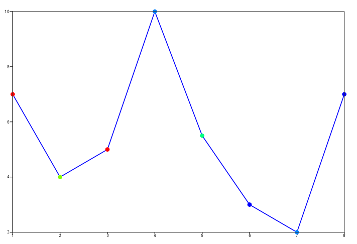
Create a new Input Visualiser icon. Set Input Plot Type to XYPoints and type a list of values (forward slash-delimited) for both Input X Values and Input Y Values (they should have the same number of elements).
Visualise the icon to get a basic plot of the data. You can drop a customised Symbol Plotting icon into the Display Window to change the numbers into markers. If you wish to have a plot where the individual points are coloured according to some value, set Input Values to a list of numbers. Then an appropriate Symbol Plotting icon will colour the markers.
Also try dropping a Graph Plotting icon to get connecting lines between the points. Try changing the plot type to a bar chart.
Notice that the automatically-generated view fits your data so that the 'edge points' are on the axes.
Customising the view

Now that we have a simple plot, we can make it more professional.
Create a new Cartesian View icon. Ensure that X Automatic and Y Automatic are set to Off, then set X Min, X Max, Y Min and Y Max so that they provide some space around your data points. Visualise the icon and drop your Input Visualiser into the Display Window to see the result.
Customising the axes
Create a new Axis Plotting icon and rename it h_axis. Try modifying it to produce a horizontal axis similar to the one shown. Just drop it into the Display Window to test it.
Now create another one called v_axis and make it the vertical axis:
| Axis Orientation | Vertical |
Customise this similarly.
You can bind the axis icons to the view icon by dropping them into the Horizontal Axis and Vertical Axis parameter boxes in the Cartesian View icon editor. Now when you visualise this view icon, it will have your customised axes.
Add a title
We will look in more detail at plot titles, but for now just create a new Text Plotting icon and set Text Line 1 to a suitable title for your plot; drop it into the Display Window to apply it.
Putting it into a macro
Now drop the Cartesian View icon into the editor of a new Macro icon - the Axis icon definitions will be automatically included. Do the same with the other icons and add a plot() command, remembering that the view should be the first argument, followed by a data variable, followed by any visdefs to be applied to it.
Now make it more robust to changing data by computing the X Min, etc extents of the view to be 10% less and more than the min and max data values. These are the steps:
- put the lists of x and y values into list variables at the top of the macro and use these variables in the
cartesian_view()call - to find the minimum value from a list, we need to convert it into a vector variable, then use the
minvalue()function on the new vector- hint:
min_x = minvalue(vector(x_values))
- hint:
- similarly for the maximum
- we need to do this for min and max of both x and y variables to get what we need to set X Min, X Max, Y Min and Y Max correctly.
You should now be able to change the data values at the top of the macro, and the plot should still look ok.
Plotting a Time Series
XXXXXX
We will now extract data values from a particular location for different times and plot as a time series graph. It will be a Macro-based exercise, so create a new Macro icon, rename it time_series and go through the steps below.
Extract the location values from the data
Inspect the supplied t2m_forecast_24.grib icon - this contains a 24-hour forecast for a number of time steps.
Read the data into a fieldset variable and extract the point values into a list with code similar to this:
lat = 51
lon = 1
fs = read("t2m_forecast_24.grib")
vals = nearest_gridpoint(fs, lat, lon)
print(vals)
This will return a list of values, one for each field.
Now extract the dates and times of the fields and combine them into a list of date variables:
d = grib_get_long(fs, 'validityDate')
t = grib_get_long(fs, 'validityTime')
dates = d + (t / 24) # ASSUME the times are in hours
print(dates)
Now construct an Input Visualiser icon which you will drop into the Macro Editor: ensure that the Input X Type is set to type Date and enter some dummy values so that useful Macro code generated. Replace the values of input_date_x_values and input_y_values with your lists of data.
Plot the Input Visualiser variable to get your time series plot. Use the Macro code for a Graph Plotting icon to connect the points with blue lines. If you have time at the end, you can customise the plot further.
Now duplicate the bulk of the code in order to additionally plot the time series for the data stored in t2m_analysis.grib, with the points connected by red lines. The plotting part can be done either with an additional plot() command, or else by adding the new Input Visualiser and Graph Plotting code to the end of the existing plot() command.
In Organising Macros we will see how to put similar code into functions in order to reduce duplication of code.
Extra Work
Customise the time series plot:
- put some extra space around the data points - add a day to each end of the x axis using a custom Cartesian View
- add a useful legend indicating that the blue line is the 24h forecast data and the red line is the analysis data